Just a note about the submission contact form…

I know that the contact form has been spitting out occasional errors to the effect that “Cannot modify header information – headers already sent” yada yada yada.  To the best of my knowledge, I have still gotten all of the submissions which return those errors.

I’ve consulted the support forums for the contact form plugin and make a minor php tweak that should solve the problem.  So rest easy.

The Unseen

The author says:

Lilly and her friends, Hannah and Erin encounter the Spirit realm. Consequently, worlds collide. Spiritual warfare becomes a reality when an unseen enemy stalks and attacks determined to steal their destinies and ultimately destroy them. Young Adult to Adult audience. Set in in the middle of two diametrically opposed worlds, the natural world and the unseen supernatural world.

The unseen front cover

The unseen front cover

Nathan says:

I like it.  I’m not sure how well it works for this book — I’m far more attracted to the cover than to the description, which leads me to suspect that this cover may not match this book perfectly — but I like it.  I think the byline could stand to be larger, and the obvious superimposition of the chain and cross on the forearm gives the impression that the entire forearm came from another source, but other than that, I have no comments.

Anyone else?

The Lost Soldiers of Thera

The author says:

Set 200 years in the future on a massive spaceship named the Aldrin. Obviously it’s Sci-Fi. The target audience is sci-fi fans that enjoy Battlestar Galactica and Star Trek. Do I need a picture of the Aldrin on the cover?

Lost Soldiers of Thera 2

Lost Soldiers of Thera 2

Nathan says:

Short answer: Yes.

Or people inside the ship. Or outside the ship.  Does it all take place aboard the Aldrin?  Are there space battles?  (The title has at least the implication of military SF.) Do they explore alien planets? Is there something you could show that’s more than just space?

Freedom to Rarity

The author says:

In Bologna, Italy 1600 Katsi Cataldi is betrothed, but when a Queen is killed almost a continent away. It has far reaching consequences for her family. She will team up with a reluctant royal, Rhea Von Holt to clear her parents name. But the witch Drusilla has other plans for them.

cover design

cover design

Nathan says:

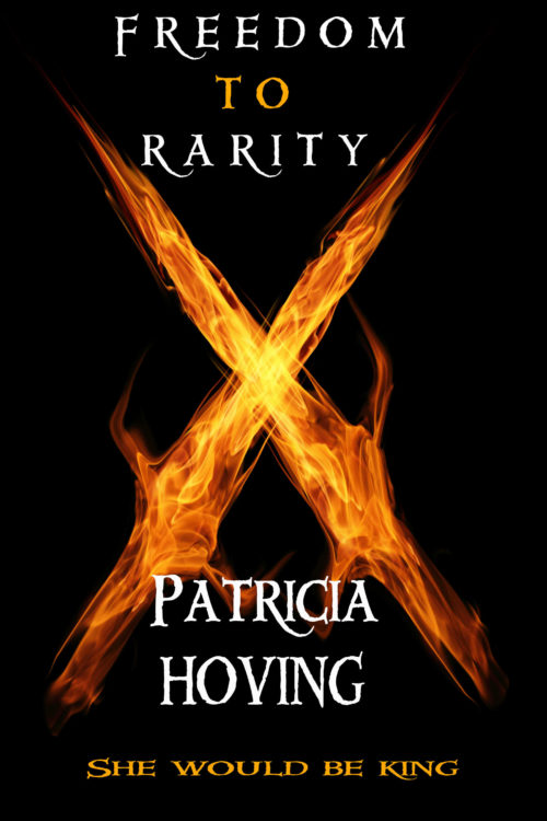
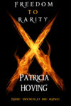
Before I read the description, before I knew anything about the book, my very first thought on glancing at the cover was, “Flame doesn’t work that way.”  Even after figuring out that they were swords of fire, my initial impression sticks.

More than that, though, I think you’ve got a cover that doesn’t advertise the book you’ve written. 17th-century Bologna is an opulent, visually enticing setting; some of that should be visible on the cover.  What you’ve written leads me to believe that romance is a big part of the book; I should be able to see people on the cover.  And not only does the font you use say “LOTR-flavored high fantasy” rather than “Italian fantasy,” the three variations you use — spaced, vertically stretched, horizontally stretched — don’t work well together.

(And this is beside the point, but I hope that the book itself is much better copy-edited than the description you gave me, which a half-dozen punctuation and grammar problems in 50 words.)

My Dear Dress

The author says:

This book is about a young woman get to know her mother’s long hidden secret through the red dress that her mother owned but never wore.

1

1

Nathan says:

The illustration’s very good.  I can’t tell from your pitch who this book is aimed at, so I’ll tell you what I see: This looks like it’s aimed at the chapter-book demographic (middle-grade or so)l it’s a style of art you find on that shelf.  If that’s not the target audience — if, for instance, this is a dark 300-page tale about family secrets and inter-generational drama — this is not the right cover for this book.

(I assume that “Arthur” is a jokey placeholder for “Author.” I would very strongly advise you to switch out that font for something that feels more like the rest of the cover.  Perhaps the upper-and-lowercase version of the title font.)

Anyone disagree?