The author says:
Lilly and her friends, Hannah and Erin encounter the Spirit realm. Consequently, worlds collide. Spiritual warfare becomes a reality when an unseen enemy stalks and attacks determined to steal their destinies and ultimately destroy them. Young Adult to Adult audience. Set in in the middle of two diametrically opposed worlds, the natural world and the unseen supernatural world.
Nathan says:
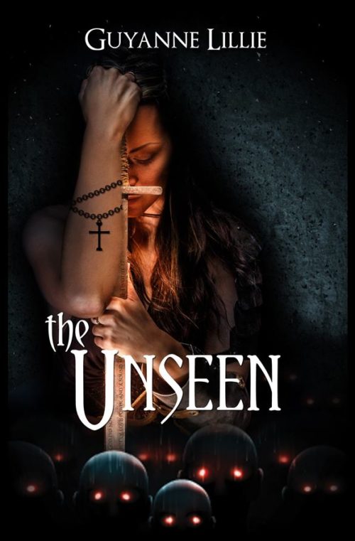
I like it. I’m not sure how well it works for this book — I’m far more attracted to the cover than to the description, which leads me to suspect that this cover may not match this book perfectly — but I like it. I think the byline could stand to be larger, and the obvious superimposition of the chain and cross on the forearm gives the impression that the entire forearm came from another source, but other than that, I have no comments.
Anyone else?


I think it’s very good, but I would like to see the title slightly larger and perhaps slightly more boldfaced. Other than that I think you did a fine job.
On the whole, your synopsis was pretty much what I expected from my first impression when looking at the thumbnail. Indeed, if anything, your synopsis seems a bit understated for what’s on the cover; by the look of things, I’d say the protagonist(s) must have accidentally opened a gate into Hell itself, unleashing a demonic invasion. Even leaving aside that “The Unseen” is one way to translate the term “Hades” from classical Koine Greek, your book’s cover leaves us no doubt that this is a religious horror novel.
All I have against your cover are a few nitpicks. First, as the man says, you’ve got plenty of space for your byline, so don’t be shy! Splash your name and the title across the cover as big as you can make them without obscuring too many vital details or bleeding off the edge.
The other nitpick is that yes, while it’s not so obvious in the thumbnail or even on a closer viewing, you clearly did cut and paste your protagonist’s arm from somewhere else. On my closest examination, the anti-aliasing between it and the sword is a bit ragged and uneven. Besides, even if your protagonist is a regular muscle-bound Amazon, the arms are just a little too big to be proportionate to her; if I were you, I’d either make her a bit bigger or the arm a bit smaller and then soften and sharpen the whole picture evenly in order to conceal your cutting and pasting.
One final detail: this is a good display cover for this site, but I do hope you’ve got a bigger version of it for your final draft. Smashwords and other sites typically want covers for their e-books to be at least 1600 by 2400, and wouldn’t disdain anything even larger than that. As the saying goes these days, “Go big, or go home!”
I like it…but the type seems oddly placed. One of the problems is that part of the title falls across one of the busiest parts of the artwork.
The heads at the bottom bother me a little…mainly because they are so much smaller than the girl’s head. I think they would read better if they were larger.
(I have to agree with the others that you need to work more on integrating the different elements of the artwork. This includes the chain and cross.)
Obligatory point that there’s no such thing as a “Young Adult to Adult audience.”
I like your graphics (aside from the cut-and-paste bracelet), but they could draw the eye better; at thumbnail I can’t even see the face. I’d brighten it up and enlarge the artwork so we can get a better look at it. Bigger type treatment wouldn’t hurt, either. Also, lose the black border.
I don’t have comments that would improve on those already here, about the arm, etc. Generally, though, a definite cut above.
I would consider playing with the font COLOR. I think if you try a shade that is something like FFE9F1, or FFD7C9, you’ll get a nice warm contrast. Very pale colors that will sort of come off as white on the cover, but will have some oomph.
I don’t know if you can pop in a little series of tiny lens flares, for the skull/head/ghost/demon eyes, but a small increase in the contrast area would, I think, not go amiss.
OVERALL, however: I like it quite a bit. My comments are all tweaky little kibitzes. Well done.
Wow, what a striking cover! The base image of this cover seems seamless and professionally rendered. The only thing bothering me about the image is how left-heavy it is. That’s not necessarily bad; it just means that you will need to find some way to balance it.
The text, in contrast to the image, does appear a bit amateur, especially for your intended genre. I think the title font is good, but I would recommend experimenting with some sort of metal effect. THIS TUTORIAL is a good place to start experimenting from. I would also experiment with the title placement (particularly the “the”) to see if you could balance out the image. A short subtitle spaced down along the right side of the image would also be a good way to balance the image. I’m not a fan of the author name font. I would try something shorter, and spaced further out at the top.
Overall, though, a good start! I think that after some typographical work, this cover will be indistinguishable from a professionally made one. Well done!
This is an excellent cover. It’s spooky and weird with a center of focus. There’s even a small cross to show you where the main center is and then there’s the sword to work as a secondary center. I love the sea of mushroom heads with blowing eyes just below the girl.Very good.