The author says:
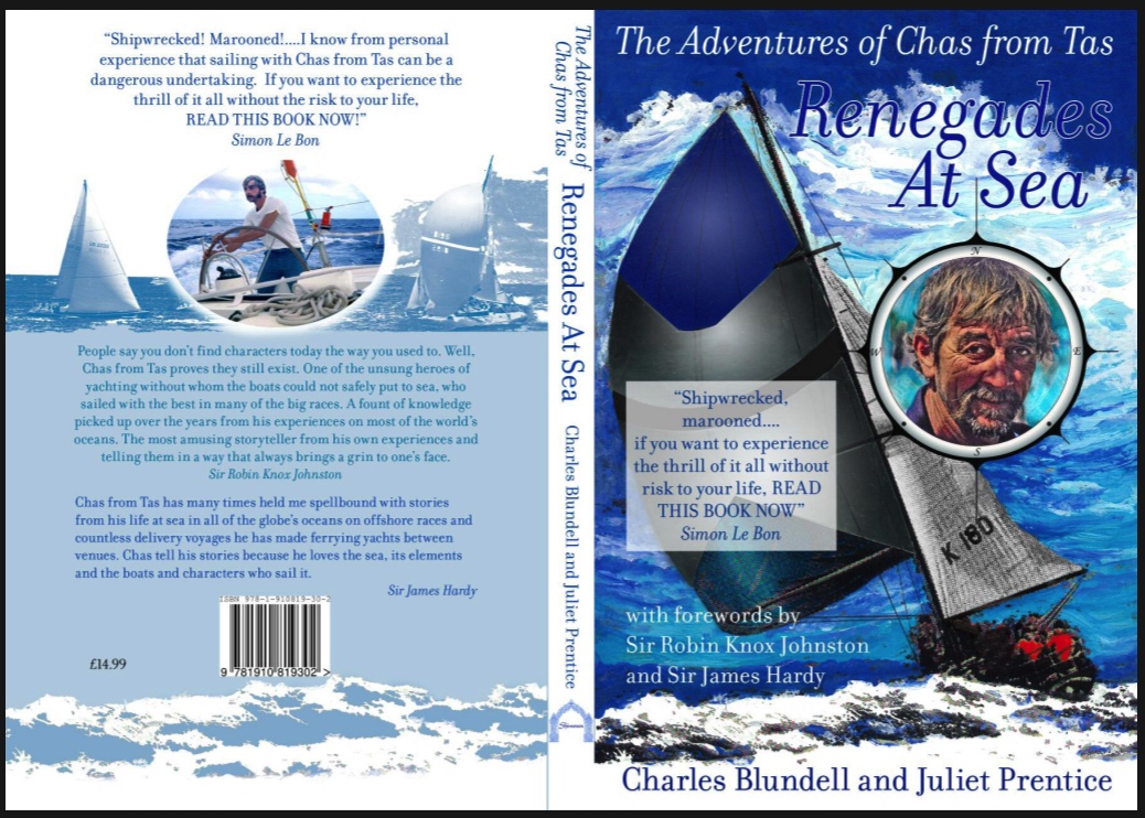
Renegades at Sea is vol one of the Adventures of Chas from Tas. Chas has sailed on racing yachts all his life , racing and delivering them to all the oceans of the world. The book is about the scary,dangerous, amusing,or downright hilarious adventures that he has had.He is a true gypsy of the sea.
Nathan says:
You’ve got a very good, very active illustration. You need to make sure that the type supports instead of conflicting with it.
- You’re using very sedate fonts (which is a nice way to say “dull”). These would be great fonts for interior text, but they underperform on the cover.
- At the very least, you should be able to read some words from the title at thumbnail size. Here, thanks to the combination of thin lines and color blend, I can barely tell that the title exists at thumbnail size.
- You already have Chaz’s face overlapping the main image; you don’t want the second intrusion, the white square with the blurb from Simon Le Bon (!) to clutter it further.
- Remember, the point of the cover is to intrigue the reader enough to either flip the book over and read the back or scroll down and read the online description, depending on the venue. Trim down the blurb, the credits for the forewords, etc. so that the impact of the main image isn’t diluted.
Any other comments?