The author says:
In Bologna, Italy 1600 Katsi Cataldi is betrothed, but when a Queen is killed almost a continent away. It has far reaching consequences for her family. She will team up with a reluctant royal, Rhea Von Holt to clear her parents name. But the witch Drusilla has other plans for them.
Nathan says:
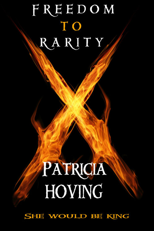
Before I read the description, before I knew anything about the book, my very first thought on glancing at the cover was, “Flame doesn’t work that way.” Even after figuring out that they were swords of fire, my initial impression sticks.
More than that, though, I think you’ve got a cover that doesn’t advertise the book you’ve written. 17th-century Bologna is an opulent, visually enticing setting; some of that should be visible on the cover. What you’ve written leads me to believe that romance is a big part of the book; I should be able to see people on the cover. And not only does the font you use say “LOTR-flavored high fantasy” rather than “Italian fantasy,” the three variations you use — spaced, vertically stretched, horizontally stretched — don’t work well together.
(And this is beside the point, but I hope that the book itself is much better copy-edited than the description you gave me, which a half-dozen punctuation and grammar problems in 50 words.)


I disagree with Nathan on the flame. He’s right that normal flame doesn’t work that way, but magic flames might. The image is fine, I actually like it; it’s an eye-catcher. However, unless the story is set in Japan and they fight with Sai, you might want examine some pictures of medieval era European swords. Also, the fonts are not happening at all for me. They look like the text on the cover of a totally different book that was stuck on this one. I would start from scratch and resubmit.
It looks like a good cover for some kind of book; just not necessarily your book. Flaming swords bring to mind the Balrog from Tolkien’s Lord of the Rings and other fantasy novels with things like demons and cursed swords forged in Hellfire in them. Unless that witch Drusilla doing some foul flaming sorcery is the main focus of the story and everything else in your description is just peripheral, I’d recommend choosing some different kind of imagery for your cover: romantic imagery if the main story is a romance, political imagery if it’s a political tale, etc. Also, even if Drusilla’s sorcery is the main focus of the story, I’d use some specific burning occult-looking symbol rather than just a generic pair of flaming swords.
The font you’re using looks like a decent fantasy-themed font, but as the others say, quit squishing it, stretching it, spacing it out, and otherwise messing with it. If it needs to fill more space, make it bigger; if less, make it smaller. Distorting fonts, like distorting the cover picture’s aspect ratio, is a big no-no for people who want their books’ covers to look professional.
Yeah, what others have said. The cover feels like dark fantasy to me, not historical fantasy.
And the SHE WOULD BE KING tagline under the author’s name makes me think that it’s the author who should be king. I’d suggest moving it under or above the title.
While I completely agree, you should really double-check your own text when you’re calling out someone on SPaG ;P
Dagnabbit…
^_________^
As a list of Paradoxical Writers’ Rules I remember reading once said, “Always check to sure you any words out.”
The art is OK, I guess. The typography is so random and has so many inherent problems that it really overwhelms anything I might say about the art itself.
First, it looks like one of those covers where the designer feels obligated to not cover up any of the art with anything pesky such as the actual title of the book. Instead, everything is crowded to the margins.
But is there anything meaningful left?
Second, the typography is poorly designed, with no apparent attention being paid to spacing, placement or size.
And what is that line under the author’s name? I can only assume that “she would be king” isn’t a self-description.
OK…the art. Does it say anything at all the reflects the description of the book? Sadly, no. I’ve often said that one test for a cover is to imagine the text as being in a language you do not understand. Would you still be able to learn something about the book, what kind of book it is or what its themes might be? In this case, I think the answer would be “no.”
My comment got eaten.
It was very tasty.
Somehow nothing in the cover does it for me, not even the title (what does Freedom to Rarity mean?? – not the point I know.) The flame things are OK as artwork, but firstly in thumbnail it looks like a badly drawn X and close up – what are they meant to convey? Maybe I would think it as horror or some sort of dark demon slaughter fantasy, but does not seem to fit the description. The uniform black background just seems uninteresting. The font is also quite dull, even putting aside the mangled aspects. Just having the text same size all caps, arranged symmetrically, is not helping either. Not that minimalism cannot work – but here it does not.
If I’m honest, I’d say scrap this cover and start from scratch, or hire a professional. To me, your description reads “historical fantasy”. You always want your cover to make it easy for readers to tell what genre your book is. Remember- your cover isn’t just a pretty picture on top of your book. It is a major marketing tool and a huge part of selling your book.
When I think of historical fantasy, covers like these-
Grave Mercy, Highland Raven, (a personal favorite) The Mists of Avalon, and Thieftaker
are what come to mind.
If you don’t want to hire a professional, I would strongly recommend that you study covers of a similar genre carefully, until you can recognize the nuances and similarities that define that genre of book covers, and working on refining your photoshop skills before starting on your cover’s next draft.