Geo

The author says:

Elevator Pitch- Geo (a rock) and his friends (also rocks) leave their underground city for the first time to try their hand at camping. After proving themselves to be utterly incapable of such a task, they end up lost in a wilderness full of strange beasts for which they are ill prepared. As they struggle to find their way home, some long-held secrets make Geo wonder if he even wants to go back.

Setting- Remote island with uncommon levels of biodiversity. Present-ish day.

Genre- Middle Grade Adventure

Audience- 8-12yrs

Cover_TopherAllen_GEO

Cover_TopherAllen_GEO

Nathan says:

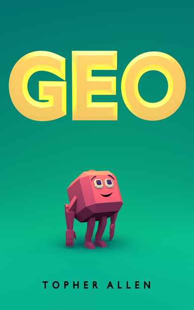
So… when you say that he’s “a rock”… I mean, you realize that what’s on the cover isn’t just “a rock,” right?  it’s a mostly-cubic rock-creature, I guess, but…

Actually, I like it. I like the cover a lot more than I thought I would when I read the description.

I may not be competent to judge the cover of a book in which the protagonists are rocks, but there it is. I like it as it is.

I’ll leave it to someone else to say something of possible use.

Becoming Bearserk

The author says:

Stressed-out lawyer Ellie dreads having another nervous breakdown. When she passes out in a museum after touching an ancient artifact, Ellie finds herself in Viking-age Iceland, certain that she’s just dreaming while her over-worked body lies in a hospital bed somewhere. But after meeting sexy berserker Aron Hrossbjorn, she is thrust into a war that is more real than she could imagine. Sparks fly, but can their relationship withstand the powerful forces pulling them apart?

This is a full-length novel with paranormal elements (including shifters), based loosely on a story from the Icelandic Sagas. A sweeping romance for fans of Outlander with a Viking twist. (I have not decided on a subtitle yet, but I will be adding one to the cover.)

becomingbearserk

becomingbearserk

Nathan says:

Again, we’re running into the fact that I’m not a fan of the genre, so everything I say must be received with that in mind.

That said: How did “man looking at his own junk” become a cover pose?  I’ve seen it on a dozen books, and I’m still puzzled.  My own inclination would be to have a man looking straight out, or off to the side like a catalog model, but if genre conventions mean that he has to check to be sure he’s still packing, I guess run with it.

All right, useful comments:

  1. One too many fonts.
  2. No Viking fonts.  Couldn’t one of them look at least a little bit runic?
  3. The tattoo doesn’t look like a tattoo. (If it’s supposed to be a brand instead of a tattoo, that’s another whole problem — I don’t think brands that cover so much skin leave the skin looking so smooth.)
  4. I have no idea what that thing is behind him, and if it takes up so much real estate it really ought to be something identifiable.
  5. From the thumbnail, you can see that it’s a little murky. I know that ancient Northern Europe was a cold, bleak place, but maybe adding some bronze highlights to his skin would help it pop.

I’ll leave it to the other commenters to tell how on the mark I am with my suggestions.

Whiskey

The author says:

20 years after nuclear war collapsed civilization and unlikely heroes Hood and Whiskey defeated the despotic Kaiser, new kingdoms and factions have arisen in the rebuilding civilization of the Americas. Whiskey’s life as a Ranger for the Sons of Liberty has been thrown back into war again, a war he refuses to fight after the harrowing trauma of the first war so many years ago. When someone from Whiskey’s past makes themselves known in a cryptic message, Whiskey must range far into the borderless lands to try and answers, and some sort of redemption.

Copy of WHISKEY

Copy of WHISKEY

Nathan says:

Because this is the second book of a series, I went looking for the cover of the first book on Amazon:

cover[1]

While I have some complaints on the first one — mostly having to do with the byline font which clashes with the rest of the type — I think it’s generally a solid cover, by virtue of (a) the central image and (b) the color scheme.

Unfortunately, the second cover does away with both of those positives, and brings nothing in their place.

(a) The image: It’s entirely pastoral and uncivilized.  There’s nothing to signify the post-apocalyptic milieu, or indeed any milieu; if I were to guess without the benefit of “a post apocalyptic novel,” I’d think it was a memoir of backpacking or other wilderness travel, or at best a Jeremiah Johnson-style frontier tale.  The rag-wrapped gun from the first cover, which is the visual clue as to genre, has no counterpart here.

(b) The color scheme: I cannot think of a more peaceful, idyllic, conflict-free color scheme — and that doesn’t sound like it matches your novel.  The color that dominates the first cover suggests both military drab (the color of choice for post-apoc cosplayers) and the sickness of vegetation undernourished and past its prime.  By contrast, the second cover could easily be used for a CD of meditation music.

And there’s still the clash between byline font and the rest of the type that was my main complaint about the first cover.

Other thoughts?

Wolf’s Cross

The author says:

Wolf’s Cross is an urban fantasy novel rooted in Norse Mythology. The series unfolds as the doom of the gods onsets. It will appeal to fans of Ilona Andrews and Patricia Briggs.

Pageflex Persona [document: PRS0000035_00033]

Pageflex Persona [document: PRS0000035_00033]

Nathan says:

It’s a very eye-pleasing cover. I don’t know, however, if it’s going to strike your target audience as something aimed at them.

My first thought when I look at this cover is that it’s a straight historical novel, a la Bernard Cornwell — not a mythologically-influenced fantasy, and certainly not something that belongs on the same shelf with Ilona Andrews…

andrews

…or Patricia Briggs:

patricia

Does your book look like it would be brought to the Barnes & Noble counter in the same armload as these books?  If not, how will your target reader be able to determine — in the split second that he or she will see your cover before flicking his or her eyes to the cover next to it — that it’s meant to appeal to them?

You may think that getting more targeted cover art is gonna cost you an arm and a leg, but really, all you need (judging from these examples) is a colorful valkyrie. In fact, we recently had a cover here on CoverCritics.com featuring just such a character; the author had paid a small amount to use an artist’s pre-existing artwork. A quick search for “valkyrie” on DeviantArt gives me over 98,000 results. A lot of them are manga-influenced, and I’m sure a goodly proportion are artwork that was produced as work-for-hire and is just reproduced on DeviantArt as a portfolio piece, but there will also be plenty which the artist produced for the heck of it, and most of those artists would be happy to get fifty bucks for the right to use artwork that they had made in the first place for free.

Remember: Your book cover is a marketing piece. You gotta go after your market.

Free Apps and Hacks

The author says:

It is a printed workbook for web authors and writers who want to know where to go and try the best productivity apps – includes 150 sites, or video’s, infographics (social media image sizes for example) with space to write their own comments, or add their own apps they use – always carry it with you.

apps book cover final 3jpg

apps book cover final 3jpg

Nathan says:

I think you can guess everything I’m going to say by looking at the thumbnail. The title is hard to read, the subtitle is impossible to read, and the byline might as well be invisible.

This is the second nonfiction title with abstract imagery on the cover that we’ve look at in the last little while (here’s the first), and while there’s nothing wrong with abstract imagery per se, especially for a book for which there really isn’t an image or class of images that gets the point across, that also means that the text has to do the heavy lifting here — it’s got to inform the reader of genre and appeal, as well as give specific information on the contents of the book.  That means it MUST BE READABLE.

I mean, yes, it’s a neat image, but you really don’t have to be careful about covering up “important” details with text, do you?  Make the title large enough that it takes up two lines: “Free Apps / and Hacks.” Enlarge the subtitle so that it extends practically from edge to edge. And for heaven’s sake, don’t hide your byline in itty-bitty type. You wrote the book — let people know it!

We could squabble about specific font choices — I’m not sure the kindergarten-penmanship font works for the subtitle — but even that is secondary to simple readability.

Other opinions?