The author says:
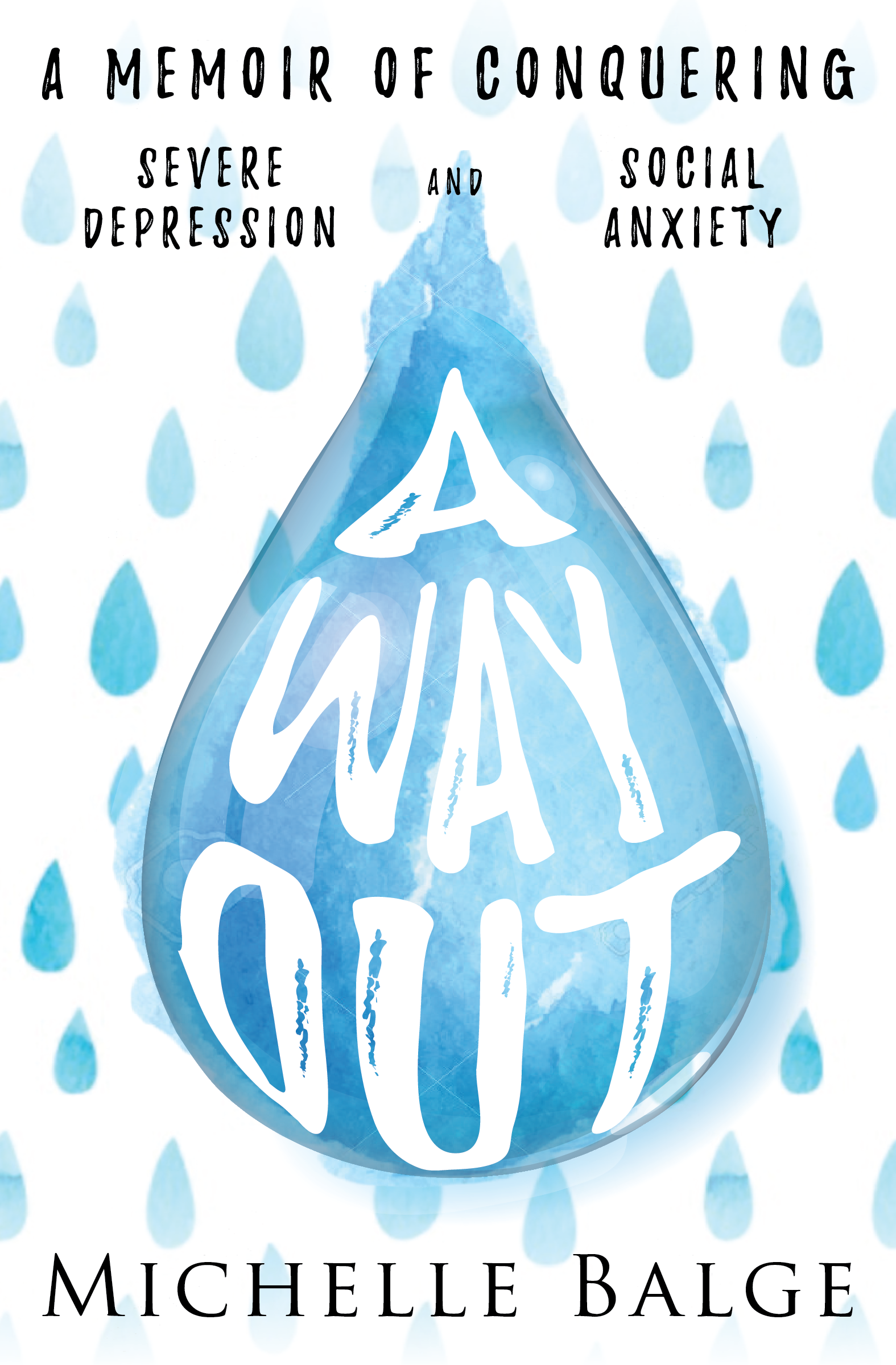
This is a memoir about a woman (me) facing and overcoming depression and social anxiety. There are very dark points in the book but I also want to show a message of hope. It’s for those experiencing their own mental health difficulties, those who have overcome them, and those who would like a better understanding. The current cover is a concept demo as I still need to purchase images to replace the current ones and make all parts of the main teardrop fixed/complete.
Nathan says:
I think the first thing to note is that, until one reads your description and sees the words “teardrop,” one assumes that he’s seeing raindrops. That’s not as big as it seems — rain certainly is an image that relates to depression — but you should know that what you think you’re putting out there isn’t necessarily what’s understood.
Other notes:
- Setting the background as a cool gray will not only temper the “bright” feel of the color scheme, but it will also define the edges of the cover.
- Something about the way “severe depression” and “social anxiety” are separated into their own areas bothers me, and I definitely think that they shouldn’t be in smaller type than the line above.
- Using Trajan font for the byline definitely clashes. I’d recommend just using the same font as the subtitle.
Other comments?