The author says:
Colden Frost, nineteen years old gaming genius has always day dreams of ‘better’ worlds, like the ones in his games he plays – and wins. When he finds himself transported to a different world in a different persona, he is elated. But is it the world he has always dreampt of or a dark reflection of his own world encased in ice. A reflection that holds something much darker, much deeper? Will Colden be able to clear this game? Or will he be consumed by his own personal Ragnarok?
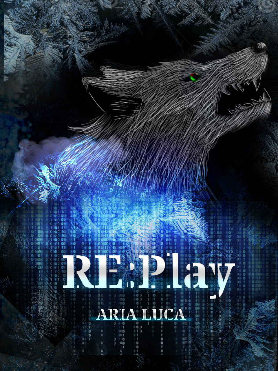
Nathan says:
You’ve got a good balance between “techno” and “archaeo” elements here. However, the wolf’s head looks more juvenile than primitive. You could play with filters to make it look etched in stone etc., or you could just replace that with an actual Norse carving of a wolf’s head.
The other thing I’d say is make the title and byline bigger; there’s no benefit to leaving unused space around them.
Other comments?
I really like the concept and colors of this! I agree though that the execution on the wolf’s head needs to be a bit better.
(Also, hopefully not too off-topic, but is “Colden Frost” the character’s screen/user name? Because I couldn’t quite take it seriously as an actual, given name.)
Agree on refining or redoing the wolf. It just doesn’t really look intentionally simplified. I’d push him to the left a bit, too, because he’s nearly touching the edge, which is distracting. I quite like the blue effect – maybe the wolf could also have a blue highlight, so that he doesn’t get overshadowed by the effect? Maybe the Matrix-like numbers could be a tad bigger, though it’s not like they’re wrong as is. Otherwise pretty nice.
Looking at this closer, I think my main problem with the wolf is that the eyes look somewhat goofy. It makes me think more of a stuffed animal or a fursuit than either a real wolf or a chilling, dignified icon. I think if you’re going for an iconic rather than a realistic style, it would be better to nix the pupils/irises and just show solid, glowing green eyes, like jewels set in a stone carving or etching.
You have some interesting things going on here. I would suggest these steps in any design project:
First decide what is most important about your image. It looks like the wolf eye right now.
Next split up your space into three equal parts either horizontal or vertical or make a grid with both. I like to use the ruler grid in photoshop.
Find a spot that is 2/3rds on the page using your lines. Start your design here and build out. Put each element from your design near one of these lines or cross points thus effectively splitting the image into three distinct areas. Remember your text is one of these elements and the most important.
Other things to remember black and white or strong contrasts automatically create a focal point.
Keeping all this in mind I recommend:
Use your frost texture over the whole image
Less black around the wolf head
The eye isn’t working right now. Darken, lighten, enlarge, change shape. Try all these things and see what works.
I agree with Nathan about the wolf head. play with some filters/lighting
I like your font and the glow you gave it. Make it bigger and play with its placement more.
Try a different font for the writer’s name or a different color. Play with the placement. Centering is not usually the most effective.
Try a border to help unite the whole design.
This one is going good and looks close to being great. Keep it up and good luck!
I basically agree with everything that everyone else has mentioned here. Just maybe highlight the wolf in some way- make it brighter, or make just the teeth (the dangerous part) brighter like on a real wolf, or put a highlight around it like Blue said.
I also noticed that part of the computer-number-cloud cuts off before the edge of the cover, so you might want to make sure that it goes all the way off the page.
This actually is pretty well done already, but (of course) no matter how good the cover, there’s always some way it can be better. The wolf is actually pretty well-drawn (if a bit amateurish), but in a computer-world setting, it would make more sense for him to be a rendering rather than a drawing. This is another of those occasional examples we see here of a novel cover on which putting one of the “pseudohumans” (or, in this case, pseudo-animals) we see over at Lousy Book Covers would actually be a good idea; just be careful, if you do that, to use good rendering rather than blocky old graphics that look like something out of the very first edition of World of Warcraft.
Alternatively, as our host mentioned, an old Norse carving of a wolf might suffice; or, considering the setting, a rendered simulation of an old Norse carving of a wolf might work even better. Your title’s technical font and the cloud of binary code in the background certainly drop a big enough hint to your readers about the setting already, but that’s no reason not to make the rest of the cover obviously (if nonetheless somewhat subtly) computer-generated as well. Consistency between the graphics and font should be enough to give your cover that extra bit of selling power you want it to have.