The author says:
Genre: Urban fantasy
Short blurb: Aria Cooper… High School student, Angel, Reaper, and apparently, a magnet for supernatural creatures. Ones that want to eat her. Aria is one month from her eighteenth birthday, on which she will finally become a Reaper. Her life has always been about one thing; death. As a Reaper, she will lead souls to their resting place. But someone seems determined to stop that from happening…
Target readers would be a mix between those that like the Mortal Instruments by Cassandra Clare and Deadly Beauties by C.M. Owens.
Nathan says:
Really, this hits the bullseye for the target market.
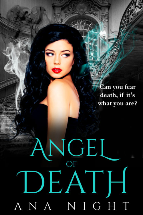
I would play up the wisps of smoke so they’re more visible in the thumbnail; they’re the clearest marker of magic/spirit/otherworldliness here.
Other than that, I’d just play with tweaks like the upper edge of her hair (which seems to clash strangely with the background) or the straight quote in the one-liner.
Good job! Other comments?


I would beef up the title and by line a little, because they are too thin at the thumbnail size. Add a thin stroke.
Make sure you use the correct ‘ (apostrophe) in the subtitle.
Nicely done. I really like that aqua color used in the title and mist.
She looks a little cut and paste there in her hair. maybe try softening her edges and maybe add some aqua to the white mist too. It might look cool to stagger the text, not center it on the quote.(to match the angle of the stairs) I’d also pick a font that matched the author name a bit more for the quote and add the barest gradient to aqua in it. I might even add a hint of lighting effect to the word angel too, to match the lighting angle on her back.
overall I really like it though, it has a great mysterious dark vibe to it.
Lovely. It’s also a color scheme I really enjoy (: There’s a bit of a weird shadow on the back, but I can’t tell if it’s muscle or a mark or a shadow. Maybe I’d smooth it out, but that’s seriously a detail. Another small detail is you can see where the image cuts when viewed at full-size (just below the G and on the right side). One soft brush stroke will fix that if desired. Real good work overall though.
Her hair kind of looks like it is giving off cartoon stink. I’d consider have the “magic waves” coming off the title and framing her face.
On the type, I think “Angel” could be a bit larger and shifted down and to the left so the scythes on the ‘A’ and ‘L’ sort of slice into the “DE” and the “H” and create some tension. “Of” can be moved if need be, maybe into the space after the ‘L’. I don’t remember if that font has small caps or not, but “of” could be heavier so it doesn’t disappear visually.
The byline might be a tad narrower so it looks the same width as the title.
The tag line can be nudged down so it’s entirely over black and the ‘C’ doesn’t merge into the background image. I think it would be OK to omit the comma, too, but I’ll have to defer to punctuationists on that (and of course use a curly apostrophe). I think I would also try the lines flush left instead of centered.
I like the colors, background and smoke, but I don’t like the model. She seems too old, too self-assured, and too glamorous. I’d expect an 18-year-old, coming of age, and taking on such big responsibility to look fresher, more open, less…sultry. Too put together and not teen enough. And that hair is, I don’t know exactly, but it’s distracting me from the importance of the girl. I do like the comp overall, the colors, and vibe!
It’s funny…I had a similar reaction to the girl. To me, she feels all vamp (by which I mean, vamping it up, not vampire) and sultriness, not an 18-y.o. by any means. If this is intended to appeal to the YA/NA market, she does feel a bit too polished, too old and well, just a teeny bit sleazy. I cannot help it, but every time I look at her, all I can see is Jessica Rabbit, saying “I’m not bad, I’m just drawn that way,” with the ubiquitous 1950’s femme fatale thing over the shoulder.
HOWEVER, I really like the rest of the cover, generally. I agree that you might want to play with the title placement, and I would definitely play with the placement and punctuation on the quote. I’d either lose the comma, or, I’d add ellipses, to give it that pause that I think you’re hearing, in your head. (Or an emdash, perhaps?).
I like Red’s suggestions on the typography and I like SM Savoy’s suggestions, subtle as they are, too. All those little tweaks will really amp it up for you.
Sorry that I didn’t love the model. I tried!
Very nicely done, but as others are recommending here, it could use three tweaks:
1) The byline and title need to be a bit thicker. I can see “Angel” and “Death” but not the “of” in the thumbnail shot, where I can also see that your book has a byline, but not what the name in that byline is.
2) The anti-aliasing of the gal with the background could be a little less obvious; softening and then sharpening the image to make her blend in is good, but be sure to do it consistently.
3) If the gal is supposed to be eighteen, I’d say she’s undergone a bit of Dawson Casting: as in, Hollywood’s practice of having teenage characters be played by people a decade or so older. The main giveaway? People’s faces tend to be slenderer when they’re teenagers than when they’re twenty-somethings; even before I gained the “freshman fifteen” and my hair began to recede and thin out, people in college could tell I was no teenager anymore because my face was beginning to spread. If you want your obviously twenty-something gal to look like a credible eighteen-year-old, try narrowing her face just a little bit.
Now that blue pointed it out, I can’t stop seeing the line across her arm where the shading starts. That’s a super simple fix though to smudge the line and blend it so it isn’t straight.
There is nothing about the cover that overtly and unambiguously conveys much of anything of the book you describe. The blurb helps a little (and replace that apostrophe with a typographer’s mark), but it is still ambiguous.
I think you need to make the fantasy/horror nature of the book absolutely clear to the potential reader rather than just hint at it as you have done here. The faint wisps of vapor are not nearly enough.
On a technical side, I certainly agree with everyone else that the figure looks much too cut-and-paste—and probably far too glamorous.
I think this is spot-on. YA urban fantasy constantly does “mysterious girls in gowns.” The Dawson casting is totally common too. It would fit right in beside your comp titles.
Things I might tweak:
-It might be nice to have a bolder color palette that makes more use of that cyan.
-Like Peggy mentioned, slightly thicker or larger fonts to help with thumbnail readability.
-Change the font of the logline. No Times New Roman, please.
Otherwise I think it’s great!