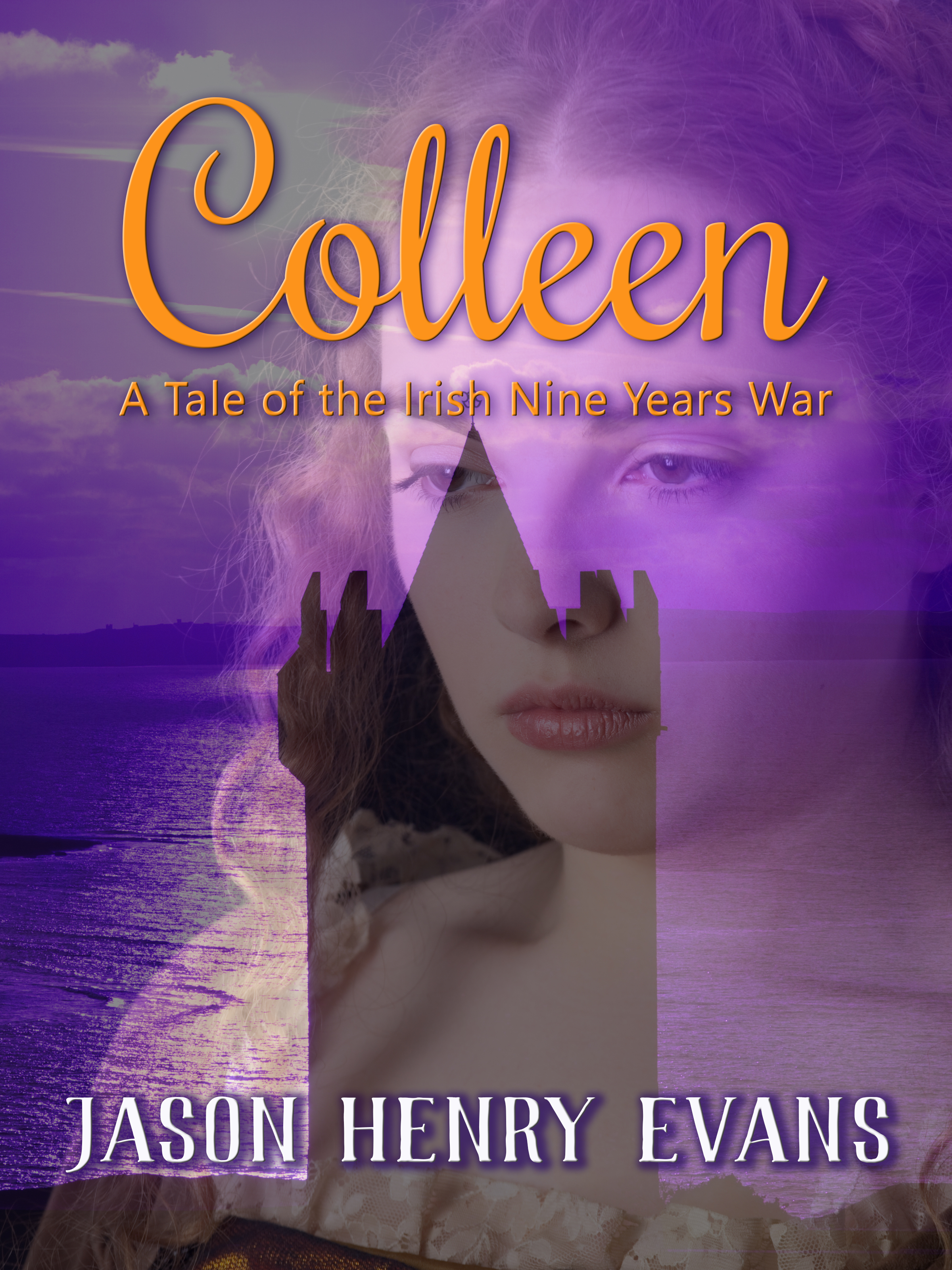
Among Us

The author says:

This is a low fantasy book set in the early 2000s (think cell phones but not smart phones if that helps). The target audience is currently set at Young Adult, but that might change. This is simply a concept mock up, not anywhere near the final draft. Beyond that, I’d really like to know what specifically you love or hate or feel ambivalent about it, because it could be that the reason you hate it is because it accomplishes what I’m going for. Thank you!

Nathan says:

Well, if the reasons we hate it might be what you’re going for, then you’re deliberately going for low reader appeal and low sales.  A bit counterintuitive, no?

Here’s what I see as problems:

  • Can’t read the font at thumbnail size, and it’s still not easy at full size — the combination of ornate type and high contrast bright colors behind it work against readability.
  • I can’t see “fantasy” in this image.  Could be fantasy, could be a contemporary coming-of-age story or coping-with-divorce story, could be a fictionalized chronicle of mental illness.  Nothing in what I see tells me who the story is for.

Other comments?

Resurgence: Embers of Teleev

The author says:

Sci-fi novel and series debut. In a galaxy struggling to rebuild after an interplanetary war that ended with the destruction of the neutral world of Teleev, a task force is formed to apprehend the vengeful survivors of the shattered planet. This is the final draft of the cover.

Nathan says:

Aw, don’t tell us that it’s the “final draft,” because that means all you want to hear from us is, “Good job, don’t change a thing.”

I think it’s a solid foundation, but it looks awfully murky thanks to the color scheme.  Giving a deep navy tone to the non-explody parts would lend some much-needed color contrast.

I don’t understand why both the title and byline are so small — there’s so much space to play with (see what I did there?), and it’s not like you’re in danger of covering up an important detail like a character’s face.  And that would help with readability; a relentlessly square font like this is in danger of causing eyes to skip across the letters.  Not that you have to change to something with upper and lowercase, but even some space between letters might help slow down those skipping eyes.

So the byline is “Fen and Frances Ixx”?  That’s… an awfully hard surname to read, and the size doesn’t help.  You might want to change that font to something that (a) has upper and lower case, and/or (b) looks less like a Roman numeral.  Unless that’s supposed to be a Roman numeral, in which case I’m hopelessly confused.

Other advice?

Construction: Guide to Health and Wellbeing

The author says:

This is a text/reference book and is the 5th book in the series on health and safety – this time focussing on the construction industry in the UK. I have recently had this template made which I will use for rebranding the other 4 books that have gone before – and selling them as a boxed set – so the design is for each book. The book includes law references, case studies, best practice and my experiences of advising the construction industry at a senior strategic level. My other books haven’t sold very well so wonder if I can make the book series more appealing. Do you think I should add an image of a crane or digger in silhouette somewhere on the page? Any comments gratefully received.

Nathan says:

This subject matter isn’t really one that depends on “curb appeal” for book sales (it’s definitely not recreational reading, nor is the field as super-saturated as, say, paranormal shifter romances); the only thing that the cover needs to convey is professionalism, which I think is covered well.

That said, couldn’t the template designer have included something that connoted construction?  A blueprint or schematic, a photograph of heavy equipment or workers in hardhats… It just seems to me that the template was constructed with the conscious intent of avoiding any portrayal of the subject matter.

But still.  A professional reference manual is not one which depends on cover design to attract potential buyers, so you’ll get a lot less mileage out of cover redesign.  If covers have been slow, you might do well to concentrate on other marketing efforts: direct mail to contractors, industry association endorsements, etc.  Best of luck.

Other comments?

A Way Out

The author says:

This is a memoir about a woman (me) facing and overcoming depression and social anxiety. There are very dark points in the book but I also want to show a message of hope. It’s for those experiencing their own mental health difficulties, those who have overcome them, and those who would like a better understanding. The current cover is a concept demo as I still need to purchase images to replace the current ones and make all parts of the main teardrop fixed/complete.

Nathan says:

I think the first thing to note is that, until one reads your description and sees the words “teardrop,” one assumes that he’s seeing raindrops.  That’s not as big as it seems — rain certainly is an image that relates to depression — but you should know that what you think you’re putting out there isn’t necessarily what’s understood.

Other notes:

  • Setting the background as a cool gray will not only temper the “bright” feel of the color scheme, but it will also define the edges of the cover.
  • Something about the way “severe depression” and “social anxiety” are separated into their own areas bothers me, and I definitely think that they shouldn’t be in smaller type than the line above.
  • Using Trajan font for the byline definitely clashes.  I’d recommend just using the same font as the subtitle.

Other comments?

How I Survive a Brain Tumor

The author says:

It’s an autobiography on how I survived a brain tumor in the year of 2014. Would love to get some feed back on my cover. I already know that the Paragraph that is on the back needs work on.

Nathan says:

Congratulations on your victory!  Book publishing and any other activity pales next to that.

I think the biggest question for you is who your audience is.  If you expect that most of your readers will be family, friends and acquaintances that already know you, then the cover is fine.  If, however, you expect it to be read outside that circle, you need to look at it like a marketer.  An advertiser.  A filthy capitalist. 🙂

Think of someone who doesn’t know anything about you coming across this cover in a bookstore or on Amazon.  What do they see? A generic picture of someone they don’t know.  Where’s the appeal?  Where’s the hook?  What catches their eye?  Answer: nothing.  They would already have to know you and your story to be interested in the cover, which is opposite to the way it needs to work.

The generic but dramatic images you see on motivational posters (the real ones, not the snarky “demotivational” posters) are actually what you want here.  Sunlight peaking through heavy cloud over mountains, flowers springing from a log in an old-growth forest…  These images are common but popular because they portray the universal theme of blessings through adversity.  There are plenty of those images available for free (try FreeImages.com or Pixabay.com for starters).  Remember, your cover needs to appeal to readers before it can inform readers.

Good luck.