The author says:
Colden Frost, nineteen years old gaming genius has always day dreams of ‘better’ worlds, like the ones in his games he plays – and wins. When he finds himself transported to a different world in a different persona, he is elated. But is it the world he has always dreampt of or a dark reflection of his own world encased in ice. A reflection that holds something much darker, much deeper? Will Colden be able to clear this game? Or will he be consumed by his own personal Ragnarok?
[original submission and comments here]
Nathan says:
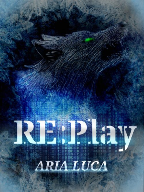
I like it — it builds on the strengths of the original cover. The only thing I would recommend is to brighten the “up” side of the wolf so that it shows up better in thumbnail.
Other comments?


Very nice indeed, but for the fact that even at full size the wolf is extremely difficult to see. This could probably be fixed simply by enhancing the contrast. This might also help toward alleviating the overall sense of murkiness. You might want to also consider making the eye of the wolf a little larger and a little brighter.
I’m tempted to still suggest experimenting with a different wolf style, although toning done the line effect has greatly improved it. Things are looking much more balanced, and I’m sure it’ll be even much more so if Nathan’s suggestion of brightening up the wolf’s upper part is implemented.
Right now the eye looks a bit like it was drawn in with the basic soft brush; I think its contour should be crisp, and then a subtle green glow can be added to it. I’m wondering if making the green just a little bit more blue might harmonize it more with the rest of the cover.
Still, it’s lookin’ pretty good (:
This is a little dark on my monitor, and if you boost the contrast, that actually might make the wolf darker and even more difficult to see. What this cover actually needs is a simple gamma correction filter. Here is a quick edit of your cover with the gamma correction set at the 1.40 level; much easier to see, yes?
Sorry, but I don’t like it. I don’t think it improves on the fundamental issues with the first version. (These comments mostly apply to both, since I didn’t comment on the first one.)
-The wolf’s head still just looks amateur, not primitive or tribal. Either a photo or a stylized vector drawing would look way better. I strongly believe you can never fix subpar art with filters–it just looks like you KNOW it’s subpar and are trying to disguise the fact.
-The whole thing is very low-contrast, and the one lighter patch is in the lower middle, where there’s nothing to look at, rather than on the wolf, which should be the focal point.
-The only hint of computers/gaming I get (other than the title) is those ones and zeroes, which are barely distinguishable even at full size. The feathers/ice/lace in the background I can’t make out at all.
-On an otherwise monochrome cover, the day-glo green wolf’s eye is way too much. If you want a contrasting color for the eye, I think red would look a lot nicer–or just bright blue-white.
The concept is good, but the execution still just isn’t professional.
I like it! I’m not any kind of professional artist or designer, and I’m sure there’s merit in other people’s suggestions, but for me just changing the wolf’s originally derpy-looking eye improved this cover by at least 100%.