The author says:
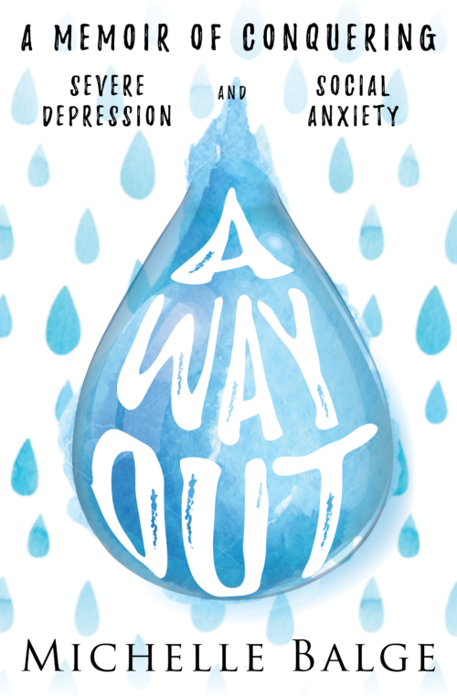
This is a memoir about a woman (me) facing and overcoming depression and social anxiety. There are very dark points in the book but I also want to show a message of hope. It’s for those experiencing their own mental health difficulties, those who have overcome them, and those who would like a better understanding. The current cover is a concept demo as I still need to purchase images to replace the current ones and make all parts of the main teardrop fixed/complete.
Nathan says:
I think the first thing to note is that, until one reads your description and sees the words “teardrop,” one assumes that he’s seeing raindrops. That’s not as big as it seems — rain certainly is an image that relates to depression — but you should know that what you think you’re putting out there isn’t necessarily what’s understood.
Other notes:
- Setting the background as a cool gray will not only temper the “bright” feel of the color scheme, but it will also define the edges of the cover.
- Something about the way “severe depression” and “social anxiety” are separated into their own areas bothers me, and I definitely think that they shouldn’t be in smaller type than the line above.
- Using Trajan font for the byline definitely clashes. I’d recommend just using the same font as the subtitle.
Other comments?


I think this looks great and I love the art! I agree about the byline and the second line of the logline; I’d like to drop the “severe” from “severe depression” (sounds too clinical to me) and just say “depression and social anxiety” all in the same size.
I actually prefer the white background to light gray–if you want the edges to be more sharply defined, I would get rid of the fade out on the top and bottom edges.
As someone who deals with chronic illness and depression first hand, I must say that I find this cover really misses. The nature of the art lends itself far more to a lighthearted subject than the one your book is about. I also agree with Nathan’s remark about raindrops.
You are dealing with a serious subject. I suggest you start over and create a cover that reflects that.
The basic idea is very nice, but I have to agree with Nathan: the first thing I saw was rain…which I continued to see even after discovering the subject of the book. Perhaps one reason is that there are so many teardrops. I’m pretty sure people don’t cry in showers like you see on your cover.
I would delete all but the main teardrop. It is all you need.
(And for some reason the ragged top to the teardrop bothers me.)
You might want to work on the line breaks in your subtitle. It does not read as “A memoir of conquering severe depression and social anxiety” but rather as two separate statements: “A memoir of conquering” and “Severe depression and social anxiety.” I would suggest making the subtitle read continuously—not breaking the second line into two parts as you have done would help.
I’m with Ron Miller on this one: the one drop should be sufficient, and the rest are superfluous and distracting. Also, this being just a concept cover, be sure to go with a hyper-realistic actual drop of water for the actual cover. Having it be a drawing makes the cover look more like it belongs to some kind of fiction, whereas something real at least holds out the suggestion that this is non-fiction.
One other problem: your title as it stands seems a bit passive and non-committal, as in “Well, if this way out doesn’t suit you after all, you can always just go through with that suicide you’ve been contemplating.” I’d recommend modifying it to seem a little more active and assertive, something like A Better Way Out or The Way Out to say “Don’t cheat yourself; suicide is a poor substitute for the far superior solution I’ve discovered.” Whatever ups and downs your memoirs may have, you should–for best results–start and end on an upbeat note.
Hmm I’m a bit torn. First of all, great cover, very nearly there.
Firstly, but most importantly: I really hope you bought the stock image, and that this is a mockup, because the shutterstock watermark is still showing! Their little camera logo is clearly visible under the ‘O’ of ‘Out’, and the gridmarks they use.
I don’t think the repeated raindrop/teardrop pattern is working.
However, I don’t think a plain white background would work, because it would flip it into more objective Malcolm Gladwell/pop psych aesthetic.
And I don’t think grey would work eitherm personally. At present it’s got a nice serious-but-not-maudlin tone.
Maybe a pale blue – actually maybe a watercolour texture? Like this… https://www.shutterstock.com/image-illustration/watercolor-background-blue-white-soft-pastel-373010068?src=6EDzpT2uYFuC9EQiEzuYkA-1-7
Like Ron, the treatment of the synopsis/subtitle bothers me. It’s hard to describe, but the treatment is too light-hearted. It’s the way you might treat a line on a poster like ‘For a limited time we are also offering FREE LINE RENTAL and HALF PRICE DOMAINS’
Like you’d make these phrases lockups to draw attention to them as attractive selling points. Given the subject matter it just looks odd.
I’d go for a more sober treatment of having the whole thing laid out more conventionally:
A memoir of conquering
depression and social anxiety
I wouldn’t worry about overlapping with the very top of the illustration with that text, it actually brings all the elements more together to have them interact a little.
I’m also not quite convinced by the font of the line. I think it’s because the handdrawn looks allies it to the title treatment but the black colour allies it to the byline. I’d make it a strong, darkish blue to more firmly tie it to the title.