The designer says:
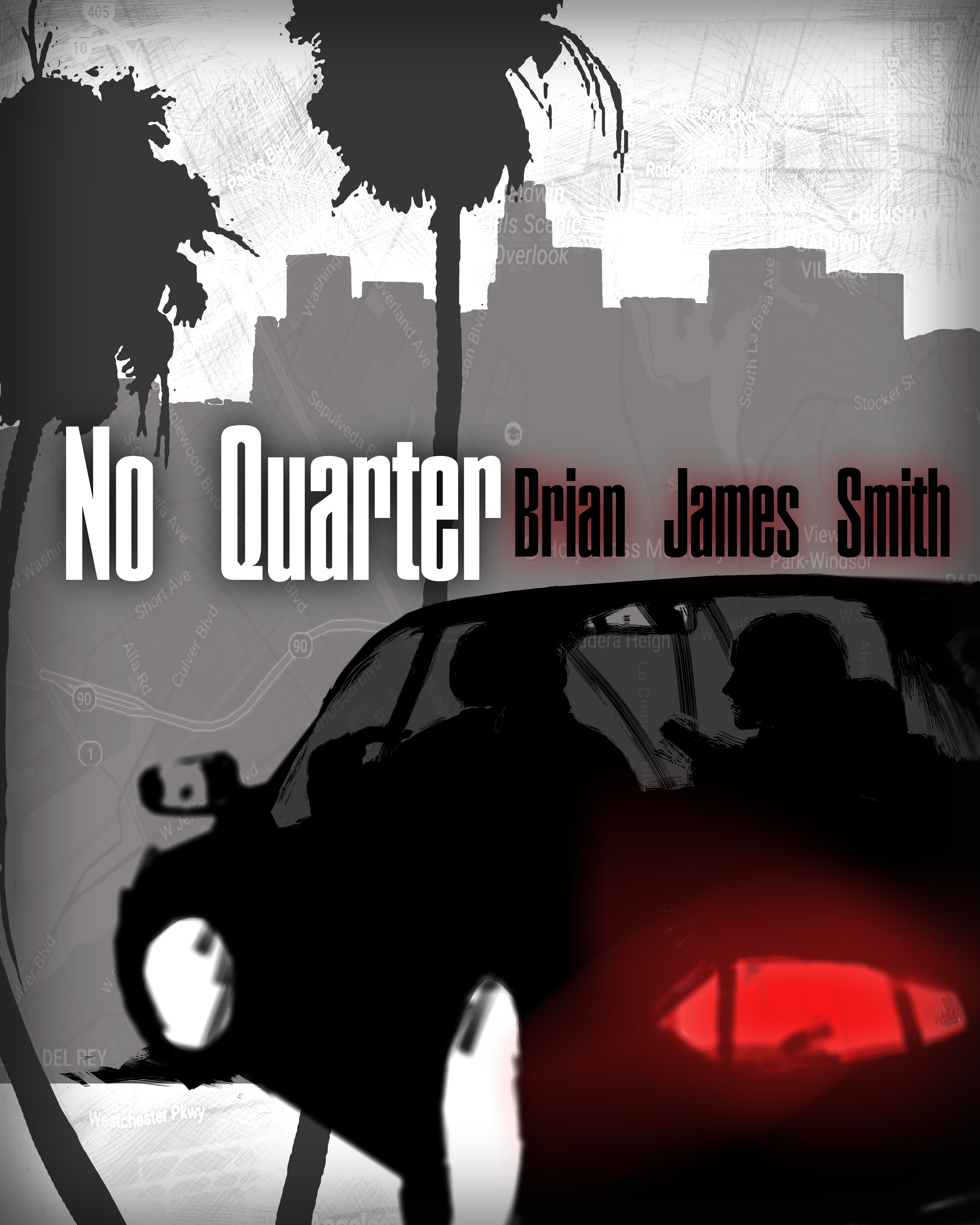
This is the cover I designed for my husband’s first book. No Quarter is a chase thriller set in LA in present time. People who like the Reacher novels or Bourne Identity might like No Quarter.
Nathan says:
Is this the final or a mockup? I’ll assume the latter, so I won’t dwell on things like odd resolution and inconsistent edges.
Obviously, the problem with designing a cover meant to appeal to fans of blockbuster authors like Lee Child and Robert Ludlum is that the most important cover elements for either of them are the names “Lee Child” and “Robert Ludlum.” However, their current covers are also firmly in the current tradition of covers for thriller novels: Bold type that fills the cover, with anything else as a secondary feature.
Here’s my five-minute redo, which also changes the proportion a bit (since Ludlum’s and Child’s books always seem to come as tall paperbacks). I also added the “Series Character” placeholder — since both of those authors are famous for their series characters, that’s probably the same thing you want to promote.
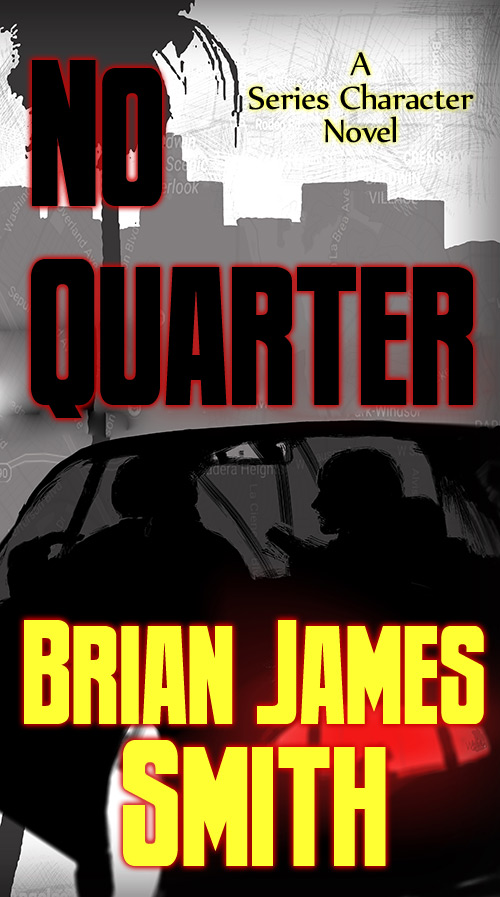
Now, this still has plenty of problems — I think the original gray-dominant color scheme probably causes more problems than it solves — but I think this gives you a good starting point.
(Also: Lose the map texture. It doesn’t really add anything, and it actually adds confusion.)
Other comments?