The author says:
Genre: Horror/Urban Fantasy – Silent Hill meets Supernatural. Comparable book: Dresden Files
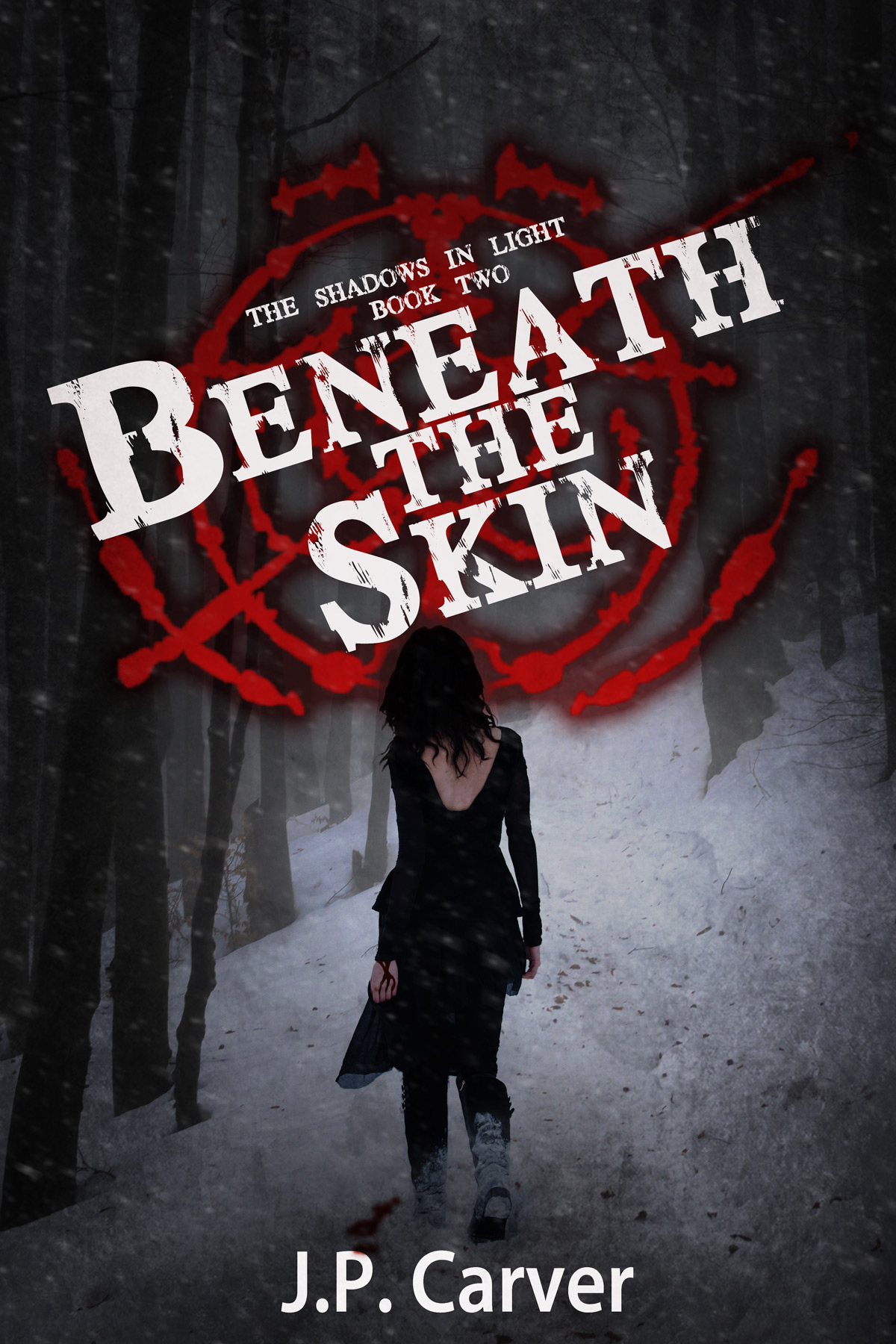
Publishable, but feel like something is off or missing in the design. May use too much white.
Elevator pitch: In the second book, Iris and Ben find themselves in a small mining town in the middle of a snow storm. An old friend called them there due to strange murders that could be related to a shape-shifter they are hunting.
Nathan says:
Now, because this is the second in a series, I didn’t want to give any advice which would run counter to branding, so I looked up the first book in the series:
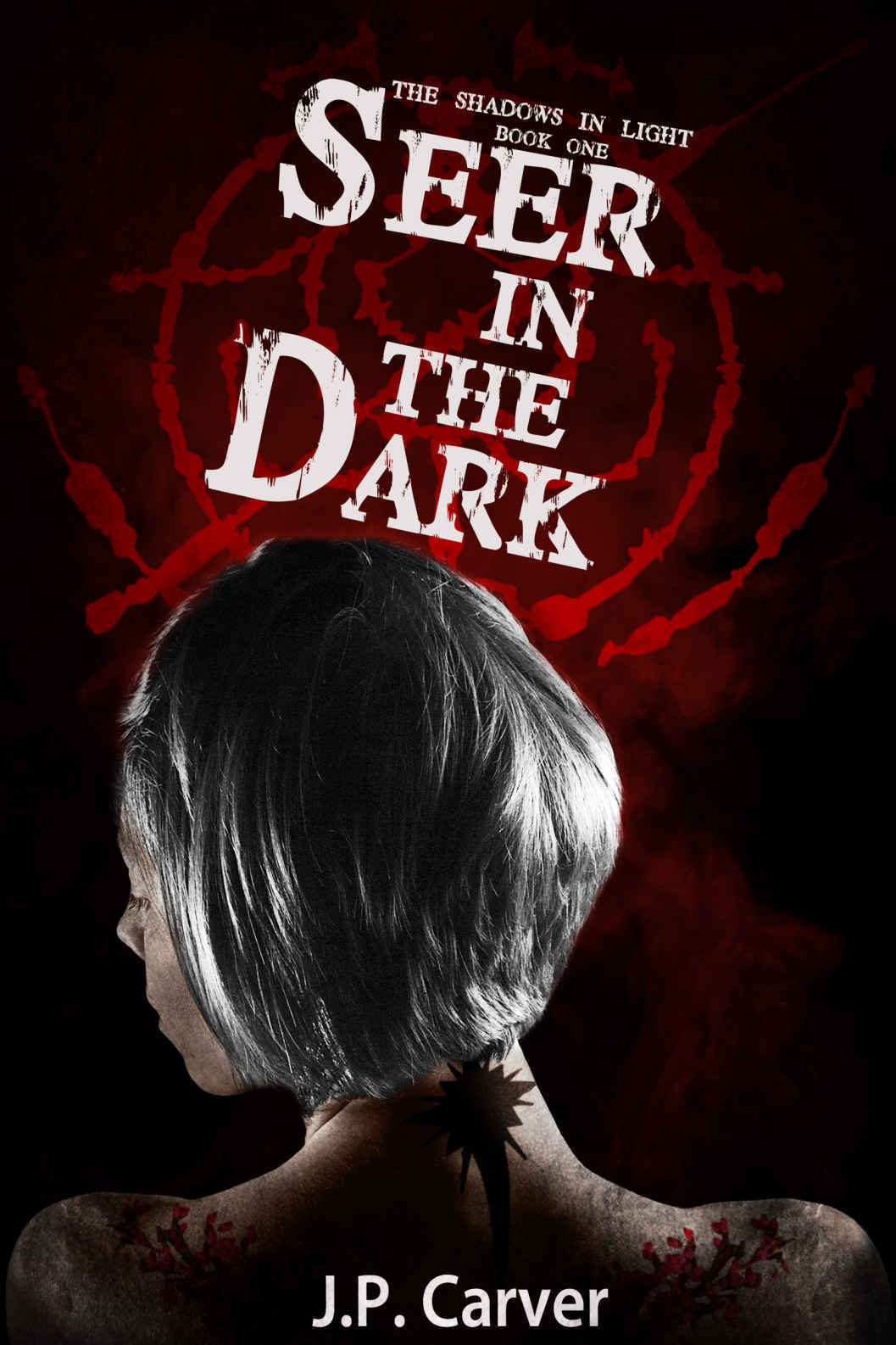 So far, so good. I like that you both kept the title font and sigil behind it, while varying other details like the angle of the title and the size of the figure.
In fact, my biggest suggestion is both simple and, frankly, one that you will slap yourself over:
Move the title up.
Not only will that help match the layout with the first book, but it will isolate the woman’s head from the title and sigil. The figure will seem more stark and purposeful if her head is more clearly separated from both title and background.
Looks good! Any other suggestions?