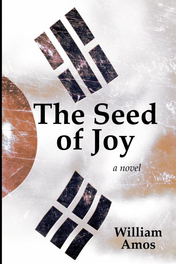
Digital Tart

The author says:

Genre: Science Fiction/Thriller

Setting: Near future

Clare Farral answers a call, expecting to talk dirty to another customer, whilst coaching the fledgling artificial intelligence of the DigiTart chat service. Instead, she gets a psychopath laying the groundwork for the next cyberwar, using bullets as well as bytes. Now she has an online stalker. One of the first casualties is Clare’s friend Kyla, a medically-retired ‘cybercop’, an enhanced officer injured in the line of duty. Kyla’s former partner Officer Lianne Medway investigates the murder, herself getting badly injured by someone trying to disrupt the investigation. Clare is sent to challenge her stalker in person; Medway, on light duties, hunts Kyla’s killers. The two converge on the same target, a ruthless mercenary drawing them in to be pawns for his own mission.

Nathan says:

Your reach exceeds your grasp on a lot of fronts here.

  • The overlapping figures: You’ve seen it work on other book covers and (especially) movie posters, but you’re missing the rest of the equation.  It works when the figures depicted form a hierarchy, not just in who’s in front of whom, but who’s higher than whom, so that the size differences convey information about the characters.  Here, it just looks like an awkward overlap.
  • Color scheme: The two figure photographs are presented as photographed, with no modification.  Especially if you have figures who obviously aren’t in the same photo or shown at the same scale, you need to have a unifying color scheme so that they are visually related.  Again, look on movie posters to see how this is done right.  Remember that, in thumbnail size (which is the size at which most potential readers will first encounter it), the color scheme gets noticed before the text, or even before the imagery.  It’s important.
  • The font: Not terribly suspenseful, and it doesn’t have a lot of visual weight.  If you look at the thumbnail, you can see that the title almost seems hesitant, taking up as little space as it can, despite having tons of space beneath it.
  • The less said about the bullet casings thrown in to add to the “danger” quotient, the better.

Back to the drawing board, I’m afraid.

Any other opinions?


The Sacrifice

The author says:

Eira was conceived for one purpose – as a sacrifice for her narcissist mother’s plans. As the time approaches, can she overcome her conditioning and escape to the freedom she desires? Can she then return and put paid to the mother that has kept a land in misery and thrall? Genre: fantasy/horror

Nathan says:

I can’t tell from your synopsis what the setting or milieu is supposed to be… but that’s okay, I guess, because I can’t tell it from your cover, either.  Is this high or second-world fantasy?  Urban fantasy-horror in a modern setting?  I dunno.  There’s certainly nothing that indicates magic or the paranormal in your cover.

The other main problem is that nothing is readable from thumbnail, not even the title.  Glancing at the thumbnail (which is the way most people will first encounter the novel) just gives a monochromatic impression of snow.  It could be suspense, police procedural, or even a slice-of-life or coming-of-age literary novel.  There’s simply nothing there to grab the attention of the target audience and tell them, “This novel is for you!”

Zombieclypse Series, Vol 1

The author says:

This is the cover I made for my book collection. (Release date end October) Three novels about Ralph and Sarah; telling the story of their survival during the zombie apocalypse. They go from being quarantined and escaping their imminent death, to struggling with other survivors to survive and ending in them trying to bring down a corporation up to no good. It’s a young adult zombie series, set in the near future during a zombie apocalypse. The target audience are zombie fans who love horror, carnage, and fast-paced action.


Nathan says:

The problem with “horror” fonts like this is that they now connote a goofy, winking self-awareness.  Unless your novels have a self-deprecating B-movie tone (and it doesn’t sound like it from your description), you’re not giving the right impression with your cover.  Plus, it’s hard to read in two ways: one, the “clypse” doesn’t contrast well with the background behind it, and two, you’ve split “Zombieclypse,” which is a marginally readable neologism at best, leaving “Clypse” to be read as a separate word. Anything you do that makes it harder to instantly comprehend your cover is something that decreases reader interest.

Also: The title, as I gave it above, is my best guess, but it could more easily be read as Vol 1 Zombie Clypse Series,” which is just ungainly.

My advice:

  1. Give the title as “Zombieclypse Volume 1,” on two lines:

    ZOMBIECLYPSE
    Volume 1

  2. Use a modern, distressed font for “Zombieclypse” instead of something from Nightmare Theater.
  3. For your second font, I would either go with the non-distressed version of the “Zombieclypse” font, or something entirely different, like a handwritten font.  (Remember also this rule of thumb: The smaller the text is, the more readable the font needs to be.)
  4. My instinct is to left-justify all of the text, to balance out the zombie hands on the right (nice image, by the way).  If “Zombieclypse” won’t fit on one line without overlapping the hands, then I’d consider setting it on a cock-eyed angle.

Other comments?

Beneath the Skin

The author says:

Genre: Horror/Urban Fantasy – Silent Hill meets Supernatural. Comparable book: Dresden Files

Publishable, but feel like something is off or missing in the design. May use too much white.

Elevator pitch: In the second book, Iris and Ben find themselves in a small mining town in the middle of a snow storm. An old friend called them there due to strange murders that could be related to a shape-shifter they are hunting.

Nathan says:

Now, because this is the second in a series, I didn’t want to give any advice which would run counter to branding, so I looked up the first book in the series:

So far, so good.  I like that you both kept the title font and sigil behind it, while varying other details like the angle of the title and the size of the figure.

In fact, my biggest suggestion is both simple and, frankly, one that you will slap yourself over:

Move the title up.

Not only will that help match the layout with the first book, but it will isolate the woman’s head from the title and sigil.  The figure will seem more stark and purposeful if her head is more clearly separated from both title and background.

Looks good! Any other suggestions?

A Way Out [resubmit]

The author says:

This is a resubmission for A Way Out. I’ve taken some feedback and came up with this as a possible final product. I’d just need to purchase the flower image so please ignore the watermarks. This memoir is about overcoming depression and anxiety, and finding happiness on the other side. The cover is meant to show hope, that beyond the tears and storms in my mind, it’s possible for recovery and your life can turn into something beautiful.

[original submission and comments here]

Nathan says:

You’ve done a great job of integrating the comments given with the original submission.

The biggest thing that sticks out to me is that the waterdrop is now off-center, but not so much off-center that it appears intentional.  I would bring the drop back to the center; there’s still enough of the face showing on its left to make the flower silhouette recognizable.  In fact, I’d make the drop bigger — with the title enclosed in the drop, the whole title has gotten a little smaller and harder to read since the last version; I’d make the drop large enough to stretch from top to bottom across that empty space, then play with exactly where the head silhouette should be behind it.

The other thing that strikes me is that having “A MEMOIR OF CONQUERING” in larger type to fill the line makes it seem louder or more important than the next line, which it isn’t.  I’d make the type in the first line the same size as the second line, and not worry about it extending side to side.

Good work!

Any other comments?