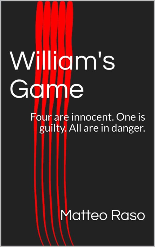
The author says:
After the death of businessman William Schulz, five people receive a letter saying that they are receiving a portion of William’s fortunes in the inheritance. When the five people meet at the mansion, they soon find themselves in a sadistic game of William’s imagination. Locked inside, they have to find the murderer and kill them before they’re killed.
Nathan says:
You may be doing something clever here with the five red stripes, but that’s negated by the fact that you’re also using a variation of the most generic and most boring ebook cover template. At least you didn’t choose the even-more-generic variation:
Really, the only advice here is to start over and treat your cover as something that deserves thought and effort, rather than something you don’t care about.


The color scheme is nice— black on red. I’d maybe opt for a twilight vibe here and use chess pieces on a bloody board. Make the board fade to black for the title and author placement. With shadow and lighting, you could have a really striking cover and it wouldn’t cost a thing. Your fonts are wicked boring. Google free horror fonts, there are a ton of really nice free ones.
Also, not related to the cover but the back blurb. Don’t use what you did here as it gives away the ending…lol
I agree with S. M. Savory, the colour scheme is nice; the red streaks on black did catch my attention from the thumbnail but Nathan’s right, the cover is very boring and it’s too plain to give me a sense of what genre it is. (Especially with that text!) I really like the way you went with the red stripes thought but if you want to use it, then it shouldn’t be your only element.
https://postimg.org/image/5ph5o8k11/
Here’s a quick mock-up cover I did that plays on yours. I added more visual interest with the cards (I used a stock photo, so bear with me) that went in line with your story. The black spot references the death warning. I’m not entirely sure what your genre is; horror, thriller or murder mystery, so I went with a murder mystery look. It’s not perfect but I hope it gives you a sense as to what I mean.
When you have something in mind, hire someone to make the finalized cover, the professional look will pay off in the long run!
It is not only generic, it says nothing whatsoever about the book–which is worse. Tiffany’s suggested re-do is an excellent idea (though I would leave out the red stripes as being an unnecessary element: less is more!).
In any case, you need to rethink the cover imagery from scratch.
I’m another vote to use something like Tiffany’s remake, but NOT with that title font–the kind of cursive one. But other than that, it’s excellent, and it conveys the idea far, far better than your original.
If you could drop by and give us a hint about the real, final genre of the book, that would help too. I’m not clear on whether it’s mystery, action-adventure, men’s adventure, etc. If we knew, we could all help more. 😉
So, see if Tiffany says okay, and see if your cover designer would take that as an excellent starting point. I’m happy to help with fonts, once we have an idea about the genre, too. 🙂
…and once you’ve processed what everyone above has been saying, please make sure the apostrophe in the final version is a nice turned typographer’s one, not a straight typewriter one. At that sort of size it’s really noticeable.
I was imagining some kind of Saw-style image of bloody handprints dragged across a distressed background. But I guess that only makes sense if it’s actual horror. If it’s a mystery, then I agree with the idea of something game-related.