The author says:
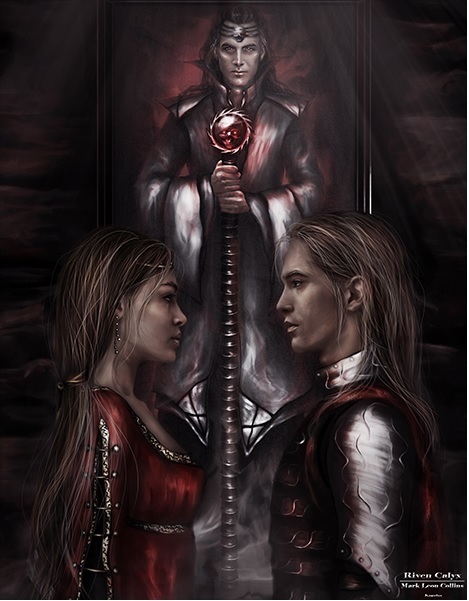
Riven Calyx is about a young ambitious knight who has been commissioned by the king to find a wizard. The knight doesn’t get all that he expects and soon find that he and the wizard have different agendas.
[original submission and comments here]
Nathan says:
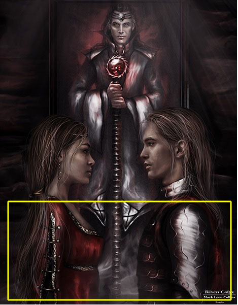
The artwork is like night and day. Now you just need to figure out what to do with the type. Given the proportions of the artwork (unless the artist cropped out some background that you could use), you have roughly this much space for the title and byline:
(If you have a series tagline or subtitle, you could use those open areas to the left and right of the wizard’s head.)
Good luck!


Gorgeous!! This would definitely make me click to see more (: The wizard character looks mysterious and important, and the other characters look like relatable hero types. Not sure why the title (?) is tiny in the corner.
Like Nathan said, if the image has been cropped from a slightly bigger one, things could be moved down an inch and have the author name at the top, but this is manageable, especially given the fairly short title.
I’m tempted to suggest the artist adds a rim light on the top of the front characters to separate them from the background (and/or brighten them a notch), but that’s nitpicking.
Hi Nathan,
Now I do have the text and it fits just as you say. It’s a great improvement over the original pic, and I think this is perfect.
SO much better! However, there’s a white line on the right and bottom edges of the image; make sure that’s gone in the final version.
There are other options to text placement beside the bottom. It would be simple to extend the coloring on the top(and bottom) whether or not the original picture had the room or not. Side borders could be added, split text is an option. The entire thing could be placed in a decorative border and inset to a contrasting color background with space for text. There are lots of choices.
Its a great picture!
The artwork is nice but lacks contrast. When I first saw the thumbnail, I was barely aware that there was an image there. The overall effect is a little too murky and nearly monochromatic (in fact, it looks as though it were created with only two colors: black and red). I would fix this before worrying overmuch about type style and placement.
Surely that’s something a little gamma correction could fix? (Here’s my revision with the filter set at 1.25.) I’m assuming the tiny title and byline down in the corner (which I smudged out in my revision) are for the artwork itself, and not the cover; for that, we definitely need something much larger and more legible.
Also, am I the only one who thinks the 7:9 ratio looks a little squat? If the artist or editor can manage it, a 2:3 ratio might work better.
I don’t think it looks significantly improved.
I tried a rim light & levels adjustment… But maybe I just like rim lights. https://image.ibb.co/dE9d95/rimlight.png
Oh yes, this definitely helps
This is not only better but adds room for paperback trim and bleed. The original version presented does not.
BL, now you’re replying to a TWO-year-old thread!
Hitch
I can thank my growing dementia, which is why my latest novel will not see the light of day.
Mark:
SO glad that you redid this. This cover is only about 5,000% better than the last one. Well done. I’d pay attention to Ron’s thread, above, about the darkness/dimness, and the revamps that Blue and RK did. I would lighten it just a bit, but, WELL DONE!!!
Something else I would note about that: as with a number of other covers we’ve reviewed on here, the details on this cover are showing up much better on my laptop’s screen than on my PC’s monitor for some reason. If possible, the author should try previewing this cover on several different platforms, especially those of a reader tablet and cell phone of the sort many prospective readers will be using. Now that the art’s good, it’s best to check to make sure it’s visible.
I think the issue is a little more than a simple lightening. There needs to be more color and value contrast…and a little more attention paid to color overall. The cover is very nearly monochromatic: in traditional printing it could be duplicated with only two colors of ink, red and black. This not only works against the figures themselves, it contributes to the overall murkiness of the artwork.
Ohhh LORDY! Thanks for the link to the previous. I’m with Hitch! (do we have a little girlmance going on here? LOL) 5,000% better, if a little dark/flat/murky, but I’m seriously concerned about where you are going to place your text. Where Nathan suggests, while seemingly the only place TO put it, will cover up that stunning dress.
That’s the trouble with some illustrators. While they might be stunning artists, they don’t always think about copy space.
Nice image though. Soooo much more appealing than the last version.
Hey, Tamian! (Girlmance? Feminance? Hmmmm…) Anyway, S Savoy is right, though–it would be simplicity itself to add a banner area, top or bottom or both. Yes, it would diminish the amount of space that the gorgeous artwork would display, but…at least, he wouldn’t be stuck covering up the dress, etc., with the title/author name. And possibly, the banner-borders could add color to lift it a bit, too.
I agree, that is the problem with many illustrators. They don’t give any thought to title text placement or byline. It’s incredibly frustrating–I see this time and again. An author falls madly in love with a piece of artwork, but there is no place to put the text.
And yes–it’s massively better than the previous!
Another text option: Put the two words of the title on either side of the wizard’s head. Then you would only need to put the byline at the bottom.
This is more or less what I have been talking about.
https://s26.postimg.org/64ed85zg9/Untitled-333.jpg
I don’t know if you’re the artist yourself, Mark, but I’m going to address you as if you are for the sake of simplicity!
This is a massive improvement but there are still adjustments to make before this can become a usable image.
For me the picture is nicely drawn but FAR too muddy, especially at thumbnail. This is a common issue with this style of digital illustration. The more you work to get in shadows and highlights, using black and white shades, the more the whole pictures becomes monochrome. What you have here is essentially a greyscale picture with a few red bits.
Furthermore everything here also exists with the same narrow range of light/shade rather than having a focal point/s to draw the eye.
These issues add up to making a well-composed and drawn picture boring and confusing. But it doesn’t take much to fix this:
https://www.kathrynrosamiller.com/single-post/2017/09/03/Riven-Calyx
I’ve linked to a version where I’ve worked on the issue spoiling your art, and I’ve attached notes!* I’ve ended up with a version that’s going to look far better at thumbnail size especially as the detail.
Below it I’ve mocked up the cover with a title and byline treatment.
But the best version is the bottom image on that page because it introduces a second contrasting colour (or third really, since I brought a yellow-brown into the picture in the faces). You can see how it immediately lends depth and interest to the image.
*In case you can’t read them at the size linked, the gist is this: you need to identify where you want the viewer’s eye to be drawn (the main character’s faces) and use light, contrast and colour to make that happen. You need to notice where stuff is drawing the eye away from that (a highlight at the edge of frame etc) and tone those down.
You need to add depth and interest to the picture by making clearer that the wizard and the couple are existing in different spaces (And the wizard may be a painting instead of literally in these scene? Hard to tell). The foreground figures should be crisp and high-contrast, the background figure should be softer.
You need more colour/s. Even a sombre, darkly-lit image should still have colour in it and currently everything is essentially black and white but for the red spots. More colour int he faces makes them look alive and interesting instead of like zombies, and as mentioned above, using a contrasting blue brings the whole image to life.
@Kata: very nice work.
I was wondering if tinting the white lettering mightn’t lend a hand, as well? If you tinted that text with a very, very pale yellow…or even a pink (and I mean, the slightest hint, not a dollop but a whisper), it might pick up and effectively “reflect” the color to the cover. Not literally, of course; it’s not a reflective surface, but it might aid in what we’re all trying to do here.
Personally, I’d also try a very pale ice-blue, adding a tiny bit of that ot th ewhite as well, to see what that might yield.
Just a thought. I’ve noted, over time, that text colors can oftentimes be overlooked, being relegated to standarized colors or white or “just” yellow, instead of playing with tints and shades to see if it’s possible to get a lot of bang with very little tinting or shading buck. 🙂
Thanks! And yes, certainly – the text is only meant to be a quick mock-up to show placement – the final text treatment would need more work than I’ve given it here.
Of course–I wasn’t actually suggesting that to you; I was suggesting it to the cover designer who hopefully will see these comments.
😉
Looks like you and I did exactly the same corrections to the original art! All of your suggestions are excellent!
Thanks! And sorry you’re quite right – I only spotted your version after my post! Your job on the colour and contrast is the better, love the warm skin tones. I really hope the designer/artist sees what we mean with these edits!
Thank you. I love when covers here have all the ingredients to be great and just need that professional eye to put it all together.
Why are the links dead?
BL: This thread is a year old?
Is it? It popped up in the recent list.
Using my bleed mask this is really the only way I could get the text to fit, even with a condensed typeface. This is the rim light version of the image linked above, with a tweak at the top to get it to paperback proportions.
https://i.imgur.com/ZnCox0x.png
Too bad. I went and looked at the Amazon listing and the cover looks terrible even with this art.