The author says:
Genre: Horror/Urban Fantasy – Silent Hill meets Supernatural. Comparable book: Dresden Files
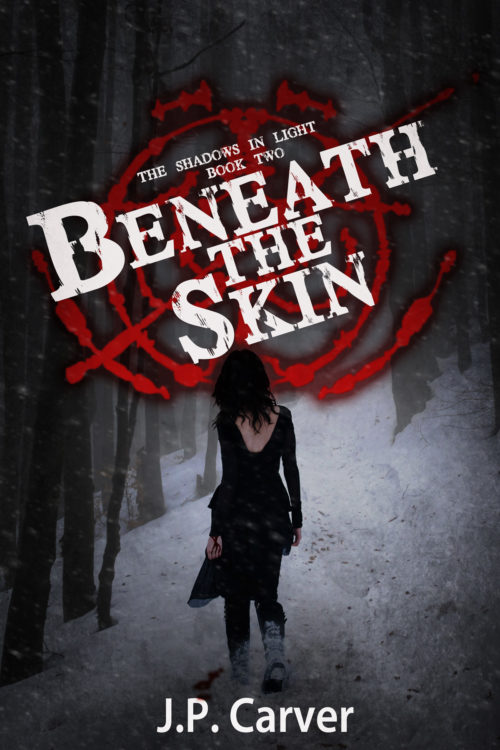
Publishable, but feel like something is off or missing in the design. May use too much white.
Elevator pitch: In the second book, Iris and Ben find themselves in a small mining town in the middle of a snow storm. An old friend called them there due to strange murders that could be related to a shape-shifter they are hunting.
Nathan says:
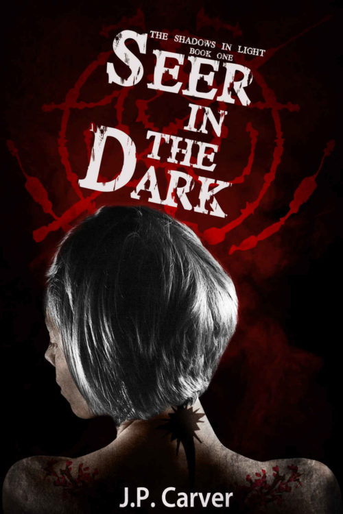
Now, because this is the second in a series, I didn’t want to give any advice which would run counter to branding, so I looked up the first book in the series:
 So far, so good. I like that you both kept the title font and sigil behind it, while varying other details like the angle of the title and the size of the figure.
In fact, my biggest suggestion is both simple and, frankly, one that you will slap yourself over:
Move the title up.
Not only will that help match the layout with the first book, but it will isolate the woman’s head from the title and sigil. The figure will seem more stark and purposeful if her head is more clearly separated from both title and background.
Looks good! Any other suggestions?


Moving the title up is nice and simple.
You might also consider the branding implications of tilting the text in the opposite direction from the first. I like the idea of the titles sea-sawing back and forth across the series, but there are also arguments for the same direction providing a more consistent image (like a logo). On the other hand, too much same-ness across the covers could make the series (when viewed together) seem less interesting.
Part of this might depend on the final number of volumes you anticipate. If there are at least x4 covers there should be enough for the viewer to notice a pattern in the sea-saw motion, and think it clever. With only x2 they at least can look like book-ends for one another. With x3 it might just look like one title is out of place.
Thanks for taking the time to comment! At the moment I have plots for about two more novels and about three novellas (the series has an overarching plot but the books are a bit stand alone-ish). I figured switching the text would make it just distinct enough while following the branding, as well as allow it to move a bit with the the flow of the other elements, like following the rise of the landscape and the slight rise of her right shoulder.
But, I’d like to hear other opinions on the matter and if you think that would be enough to not make it look odd.
Yes, this is pretty much my advice as well. I did think, when seeing the thumbnail, that this cover looked a bit like a movie poster. On seeing the cover to the first book and that this was a sequel, I started thinking it also looks a bit like an advertising poster for a television serial; which, in this age when movies and high-budget television shows are getting more difficult to distinguish from each other, should work just fine so long as this is a series.
If you’re going to make a whole series out of this, I might also recommend rebranding the books ever so slightly by moving the series title up to the top and making it a bit larger than the “episode” titles. Other than moving the second book’s title up as our host recommends, everything else should pretty much stay right where it is: your imagery pretty much suggests a “horror in the dead of Winter” aesthetic, which fits the content and target audience perfectly.
It’s nice! My one nitpick is the blood on the snow, which was obviously drawn on with a soft edged brush. Use a nice splatter brush and foreshorten it. I don’t know if it’s supposed to be overlapping the P; if it is, I’d like a bigger overlap so it looks intentional.
I knew I’d miss something even after looking it over a dozen times before submitting and I’ve noticed a few things that need fixed that I’m sure others will point out, lol.
Nope, the blood ‘bled’ into the font and I didn’t notice, just gonna move my name up a layer. I do plan on spending a bit more time on the blood, so thanks for the feedback! I’m gonna take your advice with the splatter brush and fix that up.
Nice design, though I’m not 100% sure if it is not just a little too murky. Perhaps just a wee tad more contrast would set the figure apart from the background without losing the mood.
The only thing that might really be improved is the placement of the author’s name, which seems crowded into the bottom when there is so much space at the top. Moving it there would also make a little more room between the figure’s feet and the bottom edge. Right now, the overlapping of the feet and author’s name doesn’t work well. Doing this might not keep the cover entirely in accord with the previous book, but I think that this is a minor difference. The “branding” lays mostly in the over all design and handling of the title and whatever the red graphic is.
I think I agree, it’s a bit too murky. I’m playing around with some options right now, I am probably going to go with your suggestion and make things brighter around the figure. I like the darker edges and think it draws the eyes the center where everything is.
With the title moved up there is not much space, but I did try the name at the top when doing mockups. It feels a bit strange to me as there would be too much space at the bottom. I could move the figure down but then I worry there would be too much space in the middle. I kind of like to keep things in a tight line from the title on down as I think it draws the eye to all the important elements fairly quickly and from my reading most readers pay more attention to the title than the name, unless you’re a big name author. I’ll give it another shot, though and see what I think. Thanks for taking the time to comment!
I second the murkiness remark. I know it’s supposed to be dark, but this might be a bit too dark and lacking contrast.
Also, the girl looks a bit like a cardboard cutout. Anything you can do to integrate her with the background a bit more?
Type pickiness: I think the ‘AT’ of ‘BENEATH’ needs kerning closer; there’s too much space between those two characters.
Man, good catch, there does seem to be a bit too much between the A and T. I’ll tighten that up on my next pass of the cover. Thanks!
I like the way the first book didn’t require a drop shadow to make that logo(?)/insignia(?) stand out. It just glowed out of the darkness. The drop shadow to me muddies it up a bit. Otherwise, I agree that moving the title up and kerning would help tremendously. Nicely done.