Trailer Park Pack

The author says:

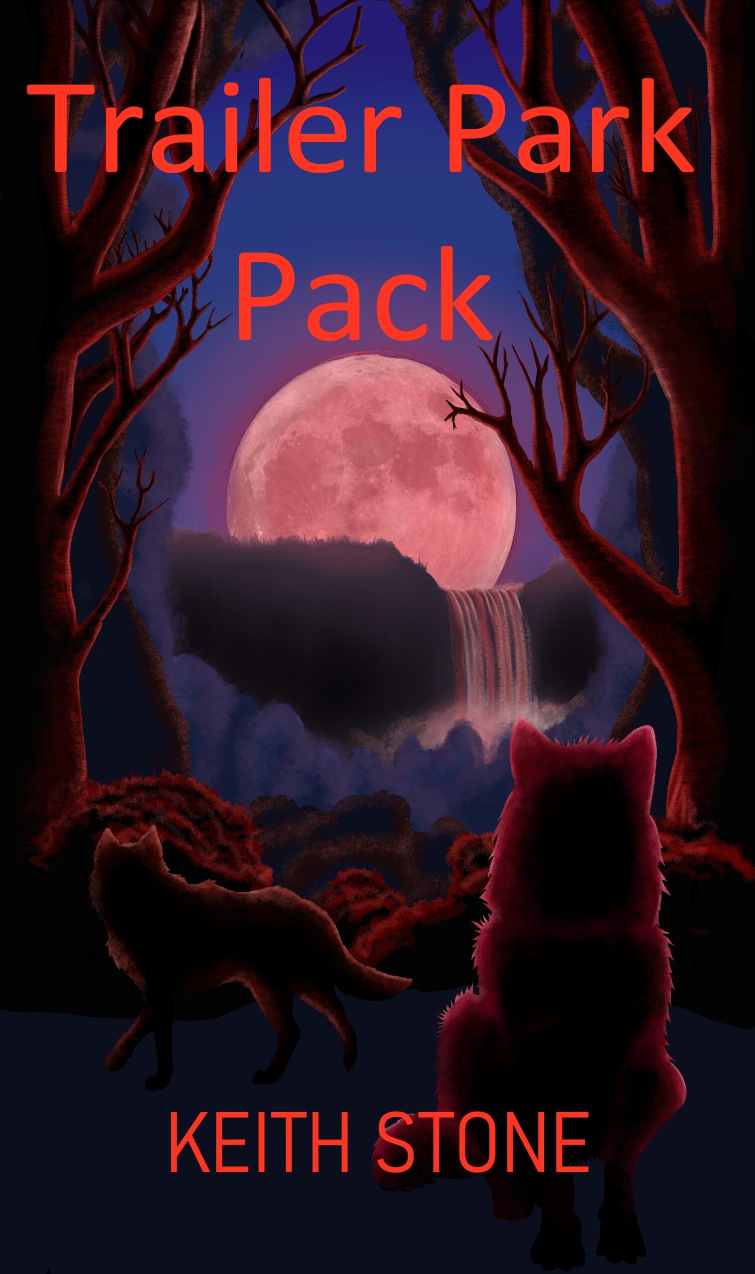
A fantasy fiction about 2 women that happen to be werewolves. One is a retired alpha grandmother that finally gets a chance to live life how she wants. The other women is her 21 year old granddaughter that get drug into shenanigans and a life on the run thanks to her grandmothers actions. She is dealing with some ptsd from seeing her grandmother rip her boyfriends heart out after a murder attempt. The book is a bit bloody with hints of adult themes so id say it would be rated YA or older.

This is my first attempt at a cover. I want to know if my skills are good enough or if I should just pay for someone to do it.

Nathan says:

Your skills are good enough; you just need some guidance.

The first thing that leaps out is that nothing leaps out. All of the color values are moderate, which means that nothing catches the eye — especially in the thumbnail, where the moon is sorta visible but not really eye-catching. Even at normal size, the wolves can be easily overlooked.

And the font used adds nothing.

I can’t tell some important details from your description: Is it a family drama with werewolves? A domestic comedy with werewolves? Action-comedy? This is important info to convey on the cover, not just that there are werewolves in it.

Here’s a first draft of what I would do with your existing artwork, assuming we were going for a “classic monster, not too scary” vibe:
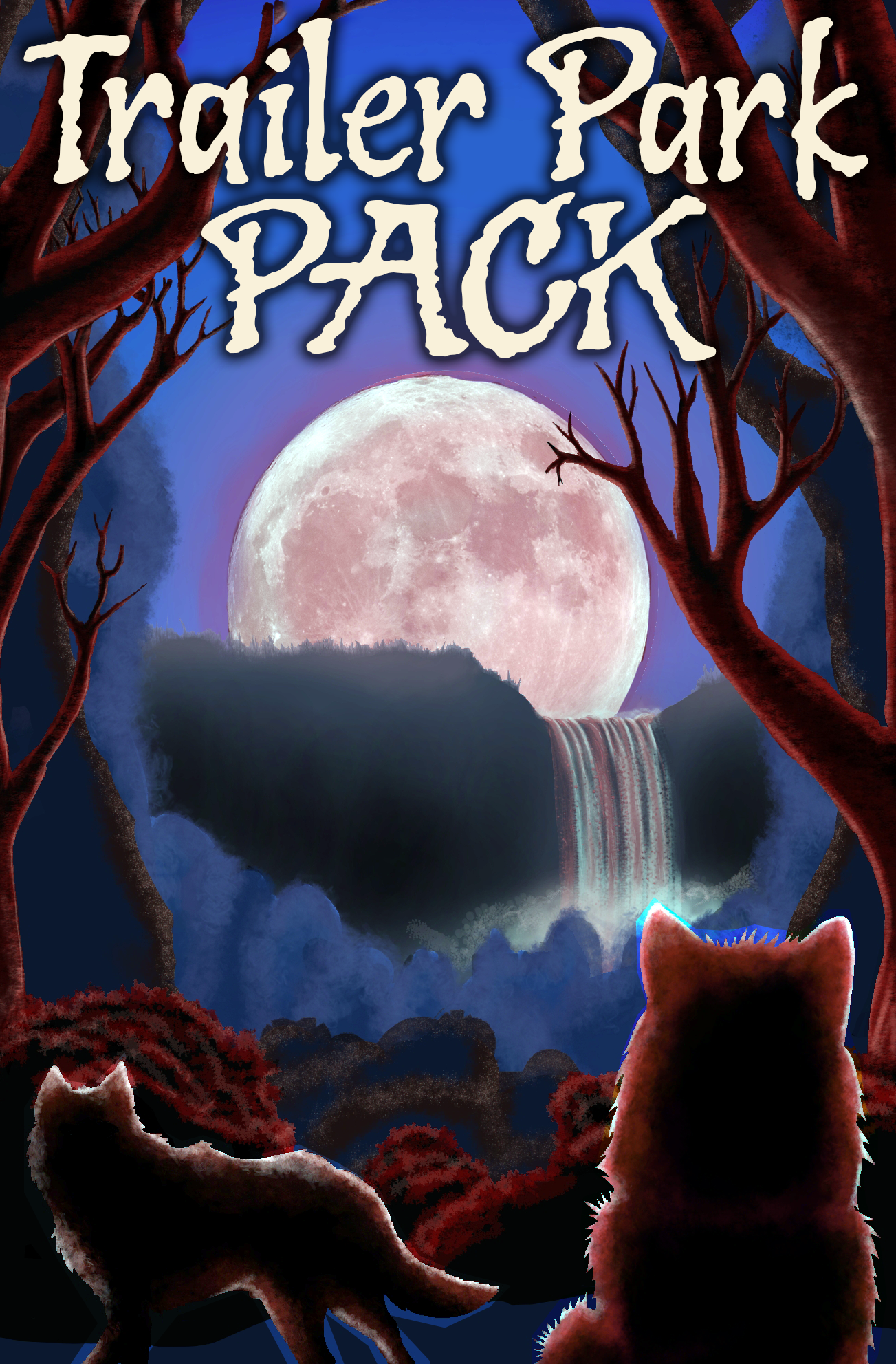
  • Cropped the unused space so the important elements are larger.
  • Made the lights and darks “pop” more.
  • Made the title pop, and used a font with some character.

Things I would still do.

  • You have, by my count, four layers of landscape between the moon and the wolves. Lose at least one (that light blue one that stands out strangely) so the moon and wolves are closer together.
  • With that blue forest layer removed, you’d be free to limn the wolves in more bluish light to have them stand out.
  • Change the title font to something that more closely matches the novel’s mood.
  • (And of course, put your byline back in. I just got lazy.)

Other comments?
 

Lightbeam

The author says:

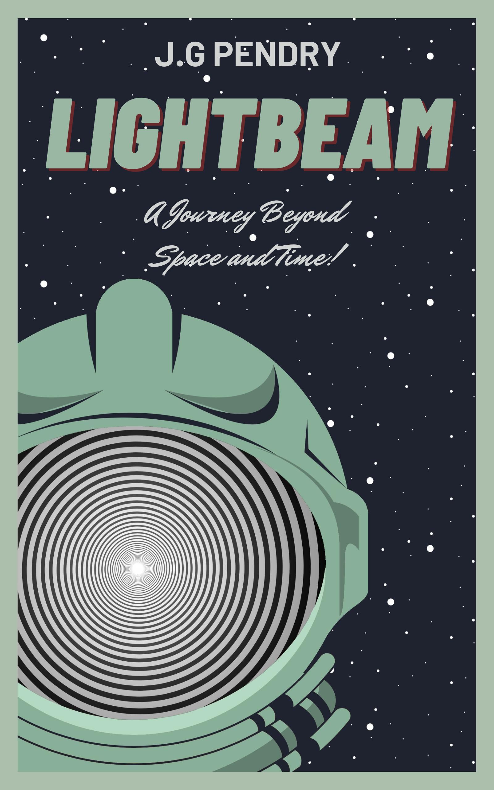
Sci-fi/Space Opera action/adventure story. Targeting older children/pre-teens. Newly qualified Captain Aurora Starlight sets out on a time and space-bending adventure to save a uncontacted race of aliens from annihilation.

This is final and published cover, but returning back to the writing world after a long break and considering a redo.

Nathan says:

Consider that redo! This cover may win some nostalgia points among readers who are old enough to remember the simplified covers of SF for young readers in the ’60s and ’70s, but that’s not really your target audience, is it?

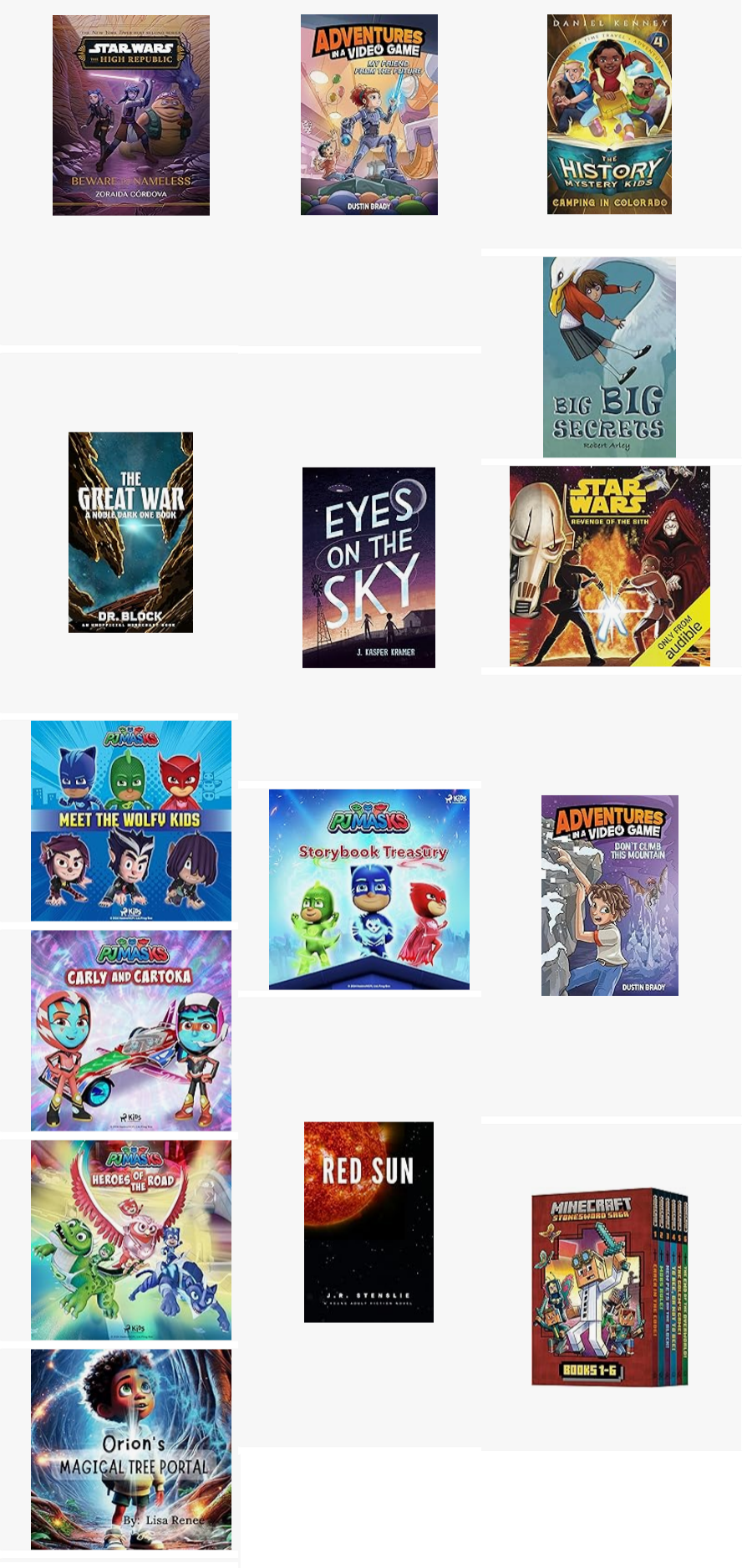
I just looked at the top-selling science fiction books for readers age 9-12 on Amazon. (Click to see it larger.)

What I see is colorful, dynamic artwork, mostly with figures in action. (Red Sun is an outlier — in other words, that’s statistically not the example you want to follow.)

The good news is, this is exactly the kind of thing that A.I. is good for. Play around with it; see if you can come up with an illustration that evokes the kind of reaction you want in your readers.

Good luck!

Dolphin Melody

The author says:

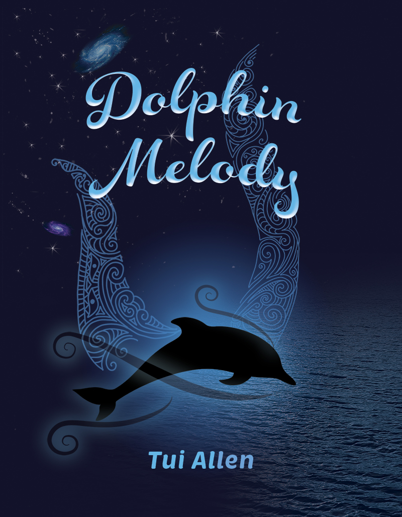
In the vast depths of the oceans, Hinemoana, the Māori Goddess of the sea, watches over all marine life, narrating the poignant tale of Melody, a dolphin born in the Bay of Islands, New Zealand. Melody’s life, marked by tragedy and music, turns dark after the loss of her mother and her baby to human hands. Haunted by a freezing spectre of hatred, she struggles to find peace and a voice to communicate with mankind.

Onshore, the artist Manaia faces her own battles, mirroring Melody’s pain and loss. As Melody seeks solace through astral journeys and divine promises, her path intertwines with Manaia’s, leading to an extraordinary alliance with Manaia’s husband, Rōreka. Through acts of sacrifice, love, and interspecies communication, Melody finds hope and healing.

A journey of sorrow, redemption, and the powerful bond between humans and dolphins unfolds, revealing the potential for unity and understanding between worlds.

Nathan says:

Conceptually, if the “hook” of the novel is the interaction and relationship between human and dolphin, make that visible on the cover (by which I mean, use a human).

Technically, I have two comments about the current cover:

  • I understand that the ocean depths are dark. However, giving more bright spots for contrast will help this cover be visible.
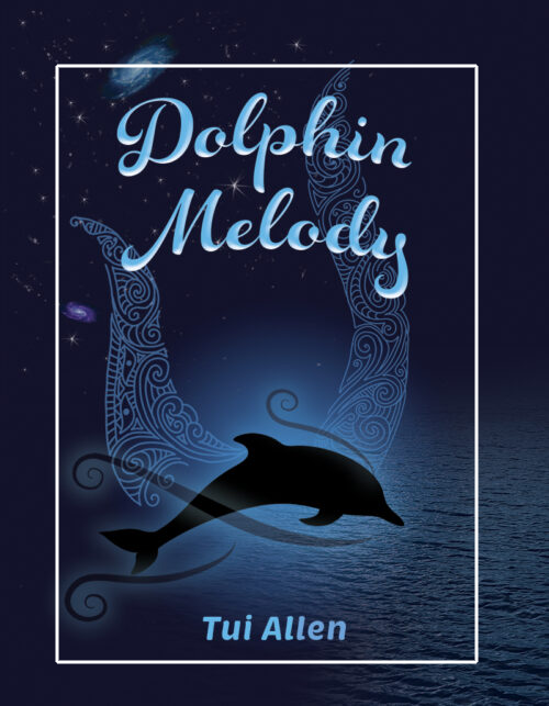
  • There’s a lot of unused space. Nothing would be lost if you trimmed the live area roughly like this:

(It may seem that I have a problem with open space. Not so; I have a problem with open space that doesn’t add anything to the whole.)

Other comments?

Terminally Immortal

The author says:

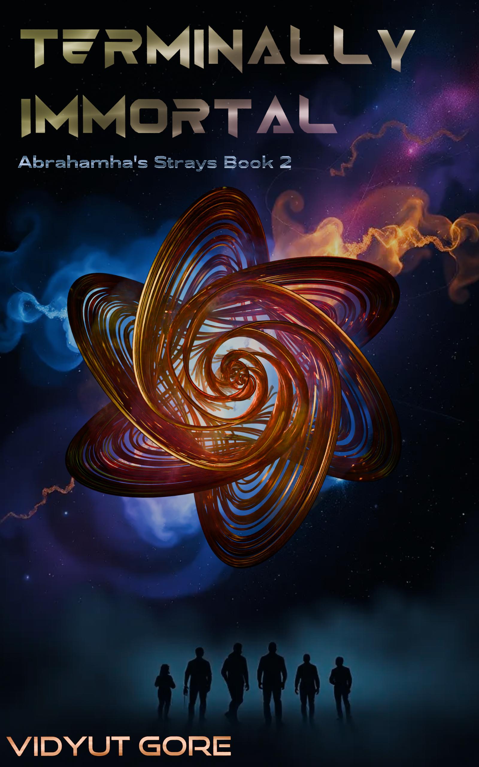
Book 2 of the Abrahamha’s Strays series: Terminally Human. Sci-fi set in the 25th century. Large cast. Symbiotic microorganisms in humans grant them longevity and rapid healing (the thingy in the center is supposed to represent how a few can perceive them). A few have extraordinary powers, that come with considerable limitations. The first book had solved a mystery and rescued an ancient hero. This book is a quest for her original attacker.

Nathan says:

I haven’t looked up Book 1 to see how you’ve maintained the branding, because even if Book 2 follows Book 1 visually, it’s still got a major problem:

I CAN’T SEE ANYTHING.

Remember, most readers are going to see your cover first at thumbnail size, with other books’ thumbnails on either side of it. And what do I learn about your book from the thumbnail? Nothing. I can’t read the title, I can’t recognize any image. As a reader, I might not even register that your book cover is there, because of more intelligible and attractive covers to the left and right.

Even at full size, the reflective tricks on the title only add another half-second to my comprehension, which is a half-second you can’t afford. The “thingy” doesn’t stand out from the background, and the one intelligible part of the image — the human silhouettes at the bottom — blend into their background.

You need to start over with a single question in mind: “What can I convey to my target audience in the limited time and real estate of the thumbnail that will get them to stop and find out more?”

Other comments?

Riven Calyx

The author says:

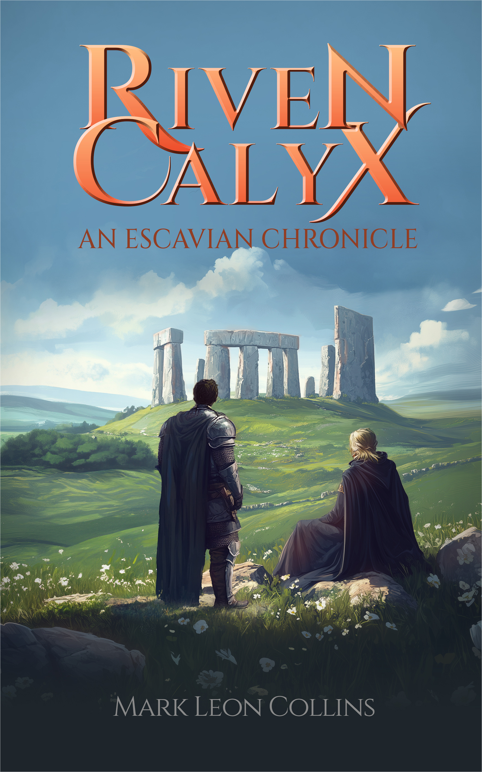
Riven Calyx details the rise of a knight haunted by the children he was forced to kill. He is commissioned by the equally haunted king to find a wizard to remove a curse affecting them both and the area just conquered. It should appeal to young adults and all fantasy fans.

Nathan says:

While there’s nothing technically wrong with anything on this cover… it’s not terribly dynamic or exciting, is it? For a book with “haunted” and “forced to kill” and “curse” and “conquered” in the description, the cover just seems like two people on a springtime picnic, enjoying the ruins.

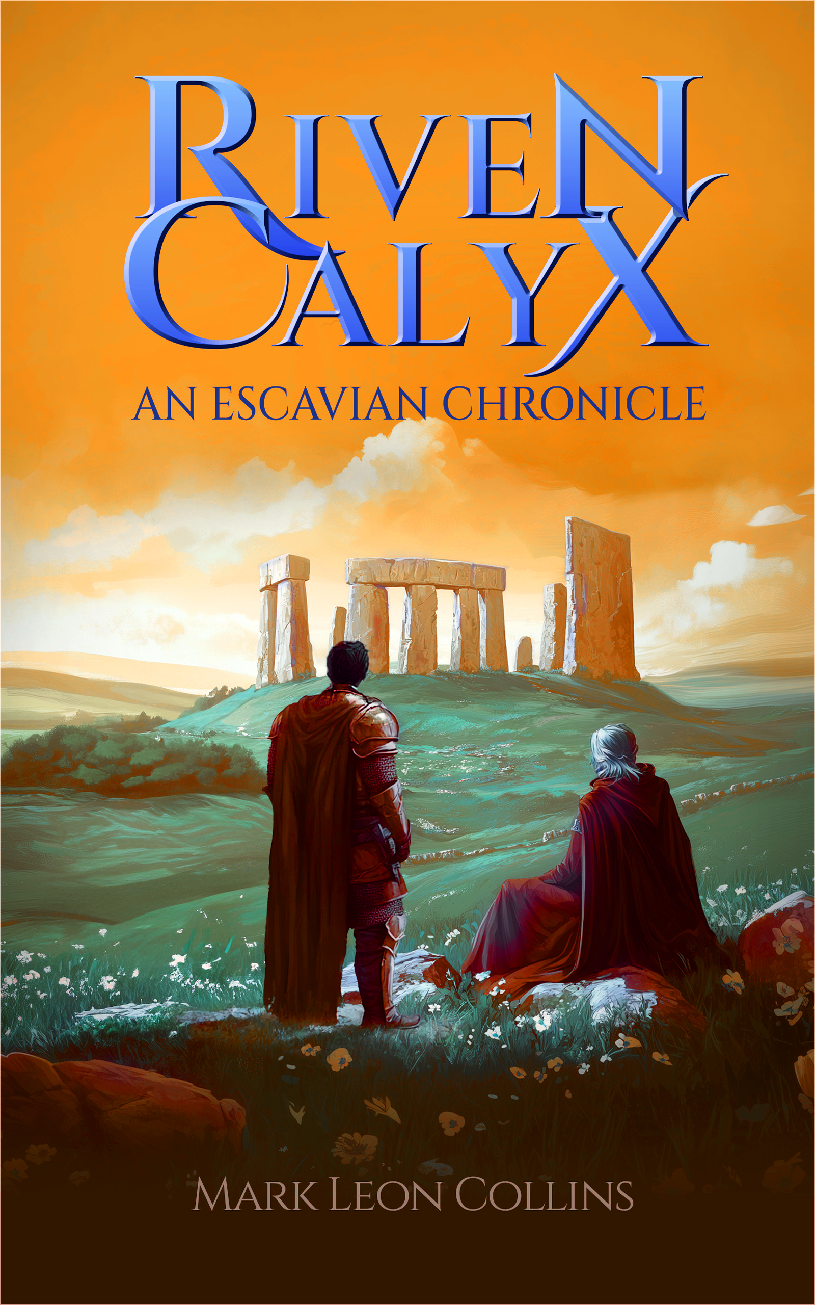
A more dynamic scene is definitely the best course, but even playing with the color scheme of your current artwork boosts it:

(This is only an “open Photoshop and grab a filter for an example” version. It is not the best possible example.)

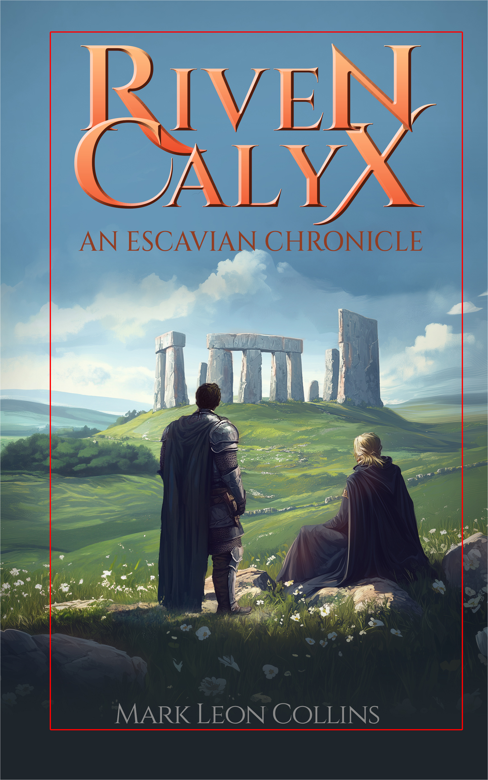
The other advice I have, if you’re still planning on using the current artwork, is to decrease the dead space. Remember, 99% of readers will first encounter your cover as a thumbnail; thus, make the important elements — including the type — understandable at that size.

If you move the byline up, you can crop even more and still lose nothing important.

Other comments?