The author says:
Although still in love with George, Colette has dumped him so he can be with his ex-girlfriend, and mother of his baby, Jeanette. In this book (#2 in series) accomplished musician and songwriter, Colette, starts a new life in Norfolk with best friend and boatyard boss Leanne. When Colette joins an all-girl band and falls for lead guitarist Candy, she has doubts about completing her gender transition. She has an emotional decision to make when an unexpected turn of events makes it possible for a reunion with George. Action romance with a transgender main character set in 1968 UK (no explicit sex scenes)
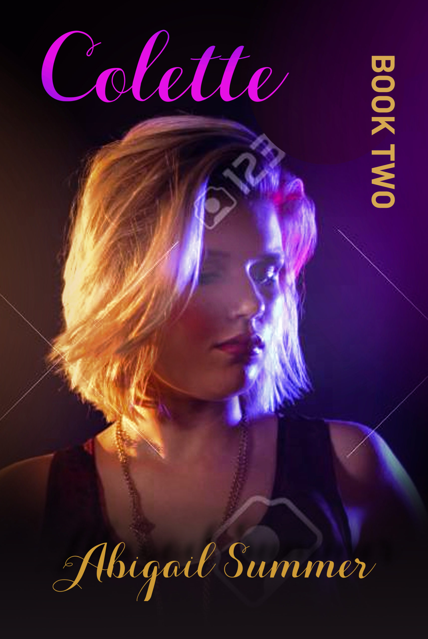
Book two follows on from book one, but can be read as a standalone novel. This is a concept cover in the same style as book one already published on Amazon.
Nathan says:
You just know that I’m going to have to find out what book one looks like. Here it is:
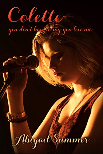
Keeping the first cover as a reference, I’d say: Good job in keeping things consistent for branding, with both the layout and the cover model staying consistent. The biggest problems are where you break the template — no subtitle, and “Book Two” standing out by itself.
By advice would be to add a subtitle like this: “Book 2: only good girls rock” or whatever. Keep it all on one line (which means, with the addition of “Book 2” to the line, the actual subtitle needs to be shorter than the first).
Other comments?
I am glad that Nathan posted the cover for Book 1. It is the best of the two.
I realize that there is an effort here for consistency…but the covers still need to be informative. That is, they still need to stand on their own. For one thing, you can’t always depend on a potential reader being already familiar with the earlier books in a series. Since you say that Book 2 can in fact be read as a standalone story it makes it even more imperative that the cover tell the potential reader something significant about the book.
In both covers I have the distinct impression that you found a photo you really liked and were reluctant to cover up any of it with type. The result is that the title is shrunken and tucked into the top of the cover. The small size combined with the ornate script makes the title very difficult to read: the thinnest lines tend to disappear into the background.
While the first cover at least suggests something about the character’s role, even if generically, the second cover is nothing more than a photo of an attractive person. There is not even so much as a hint about the book’s themes or ideas. About all anyone might be able to tell is that it might be about a blond named Colette. That’s not enough.
There is certainly nothing whatsoever—in either cover—to suggest the time period or the fact that the main character is transgender or that the book might concern her “doubts about completing her gender transition.” In fact, there is nothing at all to indicate what the book might be about or what themes might be driving it, let alone that it is supposedly an “action romance.”
I have to concur with everything that Ron’s said, above. This 2nd cover says nothing about the series, or any of the topics or themes, other than “blond(e) named Colette.”
I’m not going to lie–my immediate, initial reaction upon seeing the cover was, “get another model.” I realize from what Nathan’s said that’s not viable, but to me, s/he doesn’t look attractive, s/he looks like s/he’s sulking. When I see sulky, I immediately move on. That look just irritates me. I am inferring that you were going for “smoldering” or hot, (or sad/depressed, maybe?) but it’s not coming across to me. Just the sulk. I may well be the Lone Ranger on that front, but if I’m not, how many prospective buyers will you turn off? Presumably, 123RF has more images of this person that you can use?
And yes to the rest of what Ron said. Applying the Miller Test, if you saw this cover, with all the text in Serbian–quick! What’s the book about? What genre is it? Can you tell? if not, then neither can your buyers. There’s nothing about it being a transgender romance; there’s no clue to that withe the model; There’s nothing that says just plain old romance, either. It’s just…it’s a picture of someone with text on it, that’s all and not very informative text, either.
Sorry. I wish I had something more upbeat to say, but I don’t. Some remedial work might help, by using the text cues, as Nathan mentioned (“Book 2: something something here”) and possibly even going so far as to add “A transgender romance” as a tagline, but that’s about the best suggestion I can make, other than finding a different image of the same model and a better tagline/subtitle. You’re stuck with the fonts, due to Book 1, so…that’s my $.02.
Thank you Hitch, I’m sorry if the model’s look irritates you. It is meant to portray sadness; obviously I haven’t got that right. I’ll definitely go with the text additions/changes Nathan made. Your suggestion of other images of the same model is welcome, I’ll take another look at them to see if there’s one more suitable. I tried to convey in the description that this book is not a transgender romance, it’s a romance with a transgender character. Most fiction with a transgender tagline gets labelled as erotica. I’m trying to avoid that With this series.
I understand that the book is not a transgender romance…but it is evident from the description that the lead character’s issues with her gender change are a major element of the story. The book is also described as an “action romance.” I think both of these themes need to be reflected in the cover.
After all, these things seemed to be important enough to be singled out in the description, as when you point out that “when Colette joins an all-girl band and falls for lead guitarist Candy, she has doubts about completing her gender transition” or, later, when you underscore the fact that the book has “a transgender main character.”
I also understand that you were hoping to convey “sadness,” but I don’t think that is quite enough. (Aside from the model looking more pensive–or even possibly half-asleep—than sad.) There should be some suggestion as to why the character is sad. That is, there ought to be some idea of what the cause of that sadness might be. That in turn would suggest that there is a story. Otherwise, all anyone gets from the cover is that there is a girl named Colette and she seems to be sad.
Hi, Abigail:
Well, it’s patent that the sulky/sad/sultry (?) thing is part of that person’s look. (I don’t know if that’s a biological female or not; I suspect that s/he is, b/c I can’t discern an Adam’s apple. Of course, not every biological male has a prominent one.) For the nonce, I’m going to say she, as it’s obvious that either she is, or s/he identifies as a she. (Whew!).
I don’t think you can say that it’s not a transgender romance. You have a transgender character who is in love with another woman and starts to question his/her transition. How can that possibly not be a transgender romance? At the very least, it’s a transgender…what, drama or Lit Fic, with strong romance elements? Whereas you’ve just said, it’s a romance with a transgender character. Given what you’ve said, I don’t think I agree with you, which of course, is asinine, as it’s your book and you should of course be able to say what it is, over some random stranger on the Internet.
If it’s LitFic, then her identity is a major part of it. I don’t know, I haven’t read the book, but…that’s how it feels to me, based upon what you’ve said.
Anyway…don’t take what I said about the image of her to heart. Others here think she looks sad or sultry, so…it’s just one person’s opinion.
But, yes, definitely, please look for something else in the image, or background, or something, to add some interest and some text so that people aren’t guessing. Remember, Miller Test. It’s partly why you’re here; if the cover had been dead nuts on, you probably wouldn’t have bothered. You’d just feel it and know it, right? So…Miller Test, always. When that works, you’re home. 🙂
Hi Hitch, thank you for responding.
I hadn’t intended to get bogged down with the he/she thing about whether the model is biologically male or female. But since you’ve taken the trouble to bring that up, all I will say is that for a cover image does it really matter? The model is clearly presenting as female, so you are right, the pronoun should be ‘she’.
I know genre is important, but some books don’t fall into one genre or another. Most books ‘about’ transgender (fiction or otherwise) should rightly be classified as transgender something or other. But, if a book just happens to have a trans main character, even with trans issues, that doesn’t necessarily make it a book about transgender. For example, if a romance had a disabled character, even with issues about his/her disability, would it be classified as disability fiction?
I’ve now looked at other images of that model and there are one or two I like, but she is wearing modern headphones. I’ll download one and see if I can disguise them to look more 60s.
All in all, the critique here is helpful. The tagline and series number suggestions are appreciated. Thank you.
The real issue, I think, is whether or not the cover conveys anything significant about the theme, idea or nature of the book. Other than apparently being about a young woman named Colette, there is very little to suggest what the book is actually about. There is certainly little to suggest anything of your description.
And I am always against depending upon taglines to get across the idea of a book. For one thing, a cover should not depend on what amounts to a caption for it to make sense. For another, a potential reader has to want to stop and look at the book first, before they read anything about it. A tagline can support a cover, it can worth with the art to add some intrigue and information…but it should not be a crutch: the cover should not depend upon it in order to work.
In any case, both Hitch and myself have only your description of the book to work with when discussing your cover. And the sexuality of the main character is raised twice…once as, apparently, a main plot point. In fact, of the 103 words of the description, half are devoted to the character’s gender choice. So it would seem to me that the book doesn’t “just happen” to have a transgender character.
Whatever genre you would like to place the book in, the cover really needs to convey what seems to be two important themes: the 1960s UK setting and that the story involves a relationship and a character’s “emotional decision”… whatever nature those might be. It may not even be particularly important to explicitly illustrate the fact that the main character is transgender. It may be enough to do no more than establish the period/setting of the story and the fact that it involves a complex or emotional relationship.
One last comment, about the time-period–we all know that hairstyle, that makeup, is not 60’s. I was there, for what it’s worth and that doesn’t pass muster as a Sassoon, which was THE short hairstyle then. Otherwise, her hair should be QUITE long and probably straight.
I do appreciate the attention to the timeframe detail, but if the headphones just look like headphones, you might want to just bite the bullet and use them. That hair ain’t 60’s and the tank top is barely passing as 60’s; if she’d been wearing a peasant blouse, you’d have had a home run on the time-period, at least from the collarbone down.
Maybe you can find something to slap in the background that might signal 60’s–like a Peter Max poster, or the like.
Lastly, in my dithering on the pronoun, it was in my reference to the MODEL, not the character. Didn’t want to err. That’s all.
Thanks again, Hitch.
I’m not sure where you were in the late 60s, but in the UK, short ‘mod’ hairstyles were still fashionable, and by 1967/8 many girls were influenced by Twiggy, Lulu, Judy Geeson, and other trendsetters for both hairstyle and makeup. In ’68, I was growing my hair out from a short mod style and often wore my hair similar to that of the model.
The headphones I mentioned are really modern. I tried, but can’t disguise the fact that they are not historically correct. I like your idea of something in the background, and I could overlay a period microphone.
Anyway, I think I’m done with this now. Your comments and those of others have been very helpful, thank you all.
Well, in fact, I was a fashion model in NYC, in the late 60’s, early 70’s. I worked both runway and photog, so I have some familiarity with the hairstyles of the day.
Good luck with it!
Without comparing with the earlier book, my biggest criticism is that photo is boring to me. She isn’t really doing anything, just looks sad or pensive. I also don’t like how Book 2 is laid out on the page, with its typeface and positioning it looks off to me. I do like how the purple in her hair reflects the color of the title, but the title looks a little squished.
Comparing with book 1, I like the photo in the earlier book a lot better. It’s more dramatic with the lights and darks, and it takes (a little) liberty to cover part of the photo with typeface. Also even though she has a similar expression, she’s at least doing something in the photo. On the other hand, book 2 is essentially the same photo. I mean, in sequels, it’s good to entice the reader that something different and interesting is going to happen – same character but not the same expression and environment.
Eh, I thought this title seemed familiar from somewhere, and so it was: we critiqued an early draft for your first book two years ago. On the whole, I’d say your current model’s a better choice, but a fellow does rather have to squint to notice bit of a man-jaw on that she who’s still kind of a he. More to the point, that mic you’ve got on the cover of your first book at least gives us some idea this is some kind of singer, while the lighting and choice of clothing suggests at least something other than country or folk or any other kind of “clean and wholesome” kind of music (though without any context, I could easily believe “traditional torchlight singer in a sleazy nightclub” as one of the possibilities); without that on your second book’s cover, I’m mostly just seeing “sleazy nightclub patron” there.
I wouldn’t say a guy trying to be a gal really ought to be conventionally attractive, especially when you’ve clearly stated on several occasions this is not supposed to be an erotica; as a straight up hetero dude myself, I’m certainly not seeing the model as particularly attractive, but that’s mostly because of the vaguely trashy clothing and overabundance of makeup. To be fair, that is actually the way a lot of guys trying to be gals tend to dress: like they’re making up (if you’ll pardon the terminology) for their lack of femininity by trying to look as much like a female sex object as possible. One of the problems with that is… well, when an actual gal dresses that way, it’s almost always because she’s a hooker; and for those of us who don’t find a gal attractive for dressing like a hooker, we certainly aren’t going to think any better of a guy trying to be a gal by dressing that way.
When you speak of this being an “action romance” in your description, am I right to presume the “action” in question mostly refers to being busy working in the music industry in general, and being on tour with a girl band specifically? If so, I’d definitely recommend pulling back a bit and having a mic or a guitar or anything related to the character’s occupation in the shot, and also at least one of the other band members standing next to the character somewhere in the shot to provide some context. If this is about a love triangle having the guy thinking twice about wanting to be a gal due to having a (more or less) heterosexual interest in the gal named Candy while still having an interest in being a gal to romance that (heterosexual?) George guy, you might also want to hint at this by showing Candy and George standing on either side of your protagonist (which thereby shows the character being quite literally “caught in the middle” between them).
As for the model’s mood… well, to my eye, that sulky expression pretty much is the “perpetually depressed Judy Collins” shot that was rather in vogue for a number of female singers’ album covers during the 1960s. Whether that’s what your prospective readers would actually want to see, I can’t really say for sure; they’re a niche market, and I’m just never really going to be in that niche. As long as you’re doing an “action romance” here, though, I’d definitely recommend showing a little more action (in the form of having your protagonist appearing to be doing something rather than just standing there sulking) on your cover at the very least.
Apart from that, as long as you’re trying to be consistent in your branding here, you should definitely try to give your second book’s cover an intriguing (if somewhat vague) sub-title just like you did with the first. (“I Only Want To Be With You” comes to mind.) Just saying “Book Two” isn’t very intriguing, and doesn’t follow the branding from the first. Besides, if it works as a standalone as you say, I don’t really see any reason why the numbering needs to be displayed on the cover.
Exactly.
You can’t hint at the period or setting of the story. It needs to be unambiguous and immediately recognizable.
Ron, dear, I believe your reply went walkabout. Not sure where you were meaning to reply, but…this one seems to be lost. 🙂
H.
It was supposed to have been a reply to your most recent post (the one regarding hair styles). Don’t know why it wound up where it did.
Silly posts. You have to keep an eye on them all the time or you never know what they will get into.
Thank you all for your helpful advice. Taking account of your suggestions, especially those from from Hitch, I think I’ll go with a different image of the same girl and insert a subtitle. It still needs tweaking as I’m not completely happy with the way I’ve disguised the headphones to look less modern. I put a draft copy on my dropbox if anyone wants to take a look. https://www.dropbox.com/s/mp4wh6hskzvmf6u/Colette%20book%202%20-demo%207.jpg?dl=0
The new cover is certainly an improvement in that it is better related to the first book and that it makes clearer the relationship of the character to music. In that regard, it is almost identical in every way to the cover of book one.
But…
The cover still has many of the problems it had originally.
There is no suggestion whatsoever of the time period.
Neither is there any real suggestion about the theme of the story. Certainly not anything that sets this book apart from a thousand others. The image tells us that music and a girl are probably involved. But even with the tagline, which is not especially informative other than suggesting a romance, there is really no hint of anything you describe as being important themes of the story. As I mentioned in an earlier post, half of your own description of the book focuses on your character’s issues with her gender identity (“When Colette joins an all-girl band and falls for lead guitarist Candy, she has doubts about completing her gender transition. She has an emotional decision to make when an unexpected turn of events makes it possible for a reunion with George. Action romance with a transgender main character set in 1968 UK.”)
Finally, as before, the image dominates the cover, so that the title is still small and tucked into the top of the space. In fact, I think that the tagline pops out more and is easier to read than the title.
I agree that this cover is a MAJOR improvement. I do think that Ron’s other comments are valid. Nonetheless, MAJORLY better. 🙂
Thank you, Hitch. I agree the title and subtitle positions and tone need fine tuning, but apart from the headphones, I’m happy with the background image now.