The author says:
This is a somewhat darkly satirical take-down of the premise on which the movie Teeth (2007) was based, mainly intended to appeal to its detractors (and people who probably would be its detractors if they’d seen it).
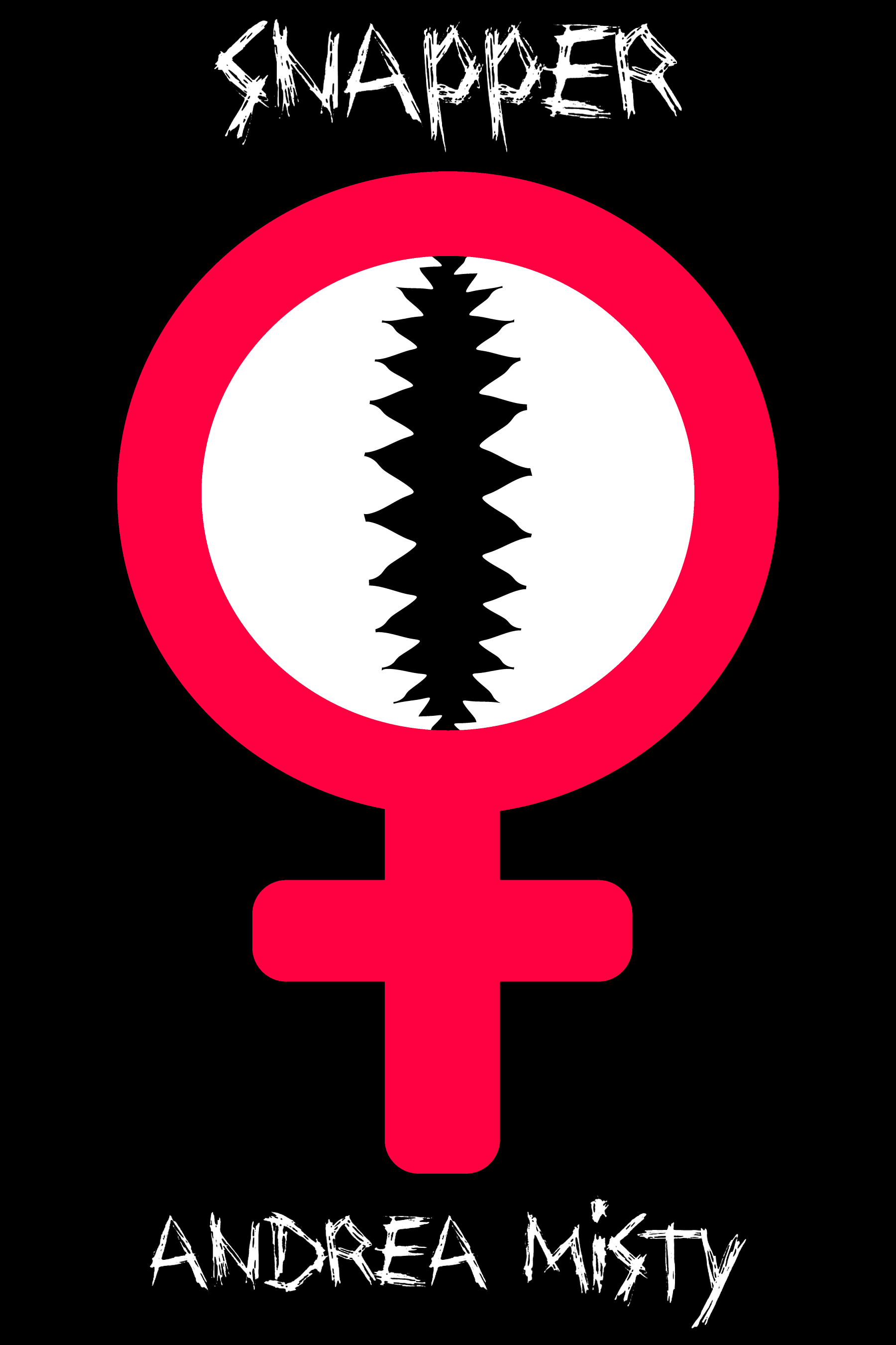
In this story, the girl April Winters has a literal “snapper” down below: a fully functional vagina dentata complete with retractable teeth. While this provides her with a very effective rape deterrent (as one might expect), she gradually comes to realize it’s not very useful most of the time to a girl who doesn’t happen to be living in a Lifetime Movie of the Week, and actually quite a hazard to both her romantic prospects and the children she’d like to have someday.
Nathan says:
Well, THAT’S a niche audience!
I think the biggest problem here is the disconnect between the clean, blocky icon and the scratchy font used; a handdrawn font with more solid lines would tie it together better.
Beyond that, I think I’ll let the usual commenters do the heavy lifting. Have at it!
In addition to changing the font, I’d recommend playing around with negative space a bit and shrink down the main icon. Right now you have the title and author name right up against the edges – aim for a pleasing margin (maybe a half inch) so there is space between the text and edges of the cover. Also, you can shrink down the author name just slightly (once you’ve picked a better companion font) and try to make the title about three times taller than that. If you shrink the main image to a half or 2/3rds its current size, you should have space enough and a more pleasing use of the black negative space.
Well…I kind of like this. It’s certainly striking.
I agree with Nathan that where the cover falls down is on the typography. Not only is the typeface inappropriate, both title and author name look like an afterthought, tucked into place in what little room was left after the art was done. I don’t think that overlapping the art and text would work very well. Reducing the art a little smaller would probably the thing to do, so that the title at least could be at least half again larger. The size of the author’s name is fine.
I’ve seen that type of simple, symbolic type of covers a lot lately, particularly for poetry. The image should be smaller, the title bigger, and with space for the margin above, at the least. Others have already commented on font.
I know you’re not copying the movie, but when I look at the movie posters (https://pics.filmaffinity.com/Teeth-212484280-large.jpg) it doesn’t leave much doubt about the symbolism. Yours is a little more vague.
I like simplicity in book covers, and this is certainly bold and striking. I agree with everyone about the text. A bold type treatment would compliment this bold graphic well. One of my personal favorite bold, condensed typefaces right now is Balboa Condensed (https://fonts.adobe.com/fonts/balboa), which I think would go well with this style.
In terms of the design of the icon, I might simplify the “teeth” slightly to match the ultra simplicity of the female icon. Additionally, I might sharpen some of the round corners of the female icon so they match the sharpness of the teeth. And as others have pointed out, the icon will need to be shrunk overall in order to accommodate a type treatment that balances the design. Overall, I think these small changes plus a typeface change will help your cover look professionally simplistic.
I whipped up a quick revision of the cover using Balboa for the typeface and sharpening the edges of the icon like I suggested. Its far from perfect, but I think it demonstrates the impact that good font choice and making some small adjustments can have for your cover: https://i.ibb.co/9Hn167r/Snapper.jpg
Y’know, I’ve been staring at it, trying to think about just the right font and even after however many days, I’m still not sure. I like Balboa, don’t get me wrong.
I was just wondering if a taller/thinner/condensed face might work better, tracked wider.
Dunno. This is one of those circumstances where you want the titling and bylines to get out of the way of the image.
I like Emma’s suggestion very much…and I think that Hitch might have a good idea in experimenting with alternate typefaces.
My only thought might be to try to maintain the strong vertical symmetry established by the graphic.
Yes, and that’s why I was thinking that a taller, thinner/condensed font, tracked a bit wider, might suit. Hard to know without playing with it.
I agree with everyone that you’ve got a strong visual ideal here, but the styling (especially the typography) isn’t there yet to quite support it.
The graphic is clever and joins a proud tradition of book covers that find a visual joke or metaphor that manages to clearly say ‘vagina’ without being censored https://www.bustle.com/articles/170719-9-scandalous-book-covers-that-take-suggestive-to-a-whole-new-level.
I think one thing you could usefully do here is to think about how your cover’s bare bones relates to some relevant horror cover tropes. Your book may or may not play within horror, but it’s springing off a schlocky horror film/idea so it makes sense to tie to that.
I’d look at some classic covers for Stephen King and James Herbert but perhaps especially laughable authors like Guy N. Smith BECAUSE they’re terrible – these books sold on the strength of what their covers promised so you know the covers were really effective!
What you’ll generally see is a single spot illustration surrounded by black, and illustration which really gets to the brass tacks of what this book is, the big scary Thing at the centre of it.
And then they pair that with gorgeous hand-crafted typography and a strong byline lockup.
I’m not saying you want to copy or parody these kinds of covers, but I think it’s worth taking a steer from them on how to elevate a strong central illustration that gets across an idea strongly and turn it into a great cover.
One thing I’d also think about is colour. With such flat and simple graphics I’m not sure the black/red is the best approach, it can look a bit cheap. I wonder about pink for female symbol pink might push the suggestiveness of the cover away from being fun and too much into lasciviousness but it might be worth experimenting with
I do want to say that Kata’s idea of making the symbol pink is very appealing and I agree that it would be, at the same time, both more evocative and less stark.
And I might consider a different shade for the background, too–once you go to a deep or medium pink, you’d have many more choices.
Offered FWIW.
Thanks to everyone here for the feedback and suggestions. So, full red combined with a quarter blue doesn’t look at all pink to you? Maybe it’s just my computer screen, but I got the impression the “hot pink” (full red combined with half blue) on my image editor looked a little too purple; if that looks pinker to you, though, I’ll gladly bump the blue up to half.
Emma, while I agree with you that sharpening the edges of the feminine symbol would make it more consistent with everything else on the cover, please understand that the effect I was seeking was one of contrasts: the soft, warm, squishy, cuddly feminine flesh on the protagonist’s exterior as contrasted with those cold, hard, carnivorous, sharp little shark-like teeth lurking inside her. I figured the title and byline should also share the qualities of the teeth, so…
Speaking of the lettering, I really did go looking for fonts in the “teeth” and “bite” and “shark” (and so forth) categories on a number of font sites, but they kept coming up with stuff completely different from the “toothy letters” effect I wanted. So the I tried looking for something “scratchy” or “thorny” instead, and this font was the closest to what I wanted. Considering it’s not very close to the effect I was seeking, I’m open to suggestions, as long as the font is something… you know cold, hard, carnivorous, and sharp something like shark teeth. (Like the protagonist in the movie Teeth, those are the kind of teeth the protagonist of this story has in that “snapper” of hers.)
Since posting this cover draft, I did find one font called “Alpha Dance” somewhat closer to what I had in mind (in the “sharp” category), but I still don’t think it’s quite there yet. Here’s my five minute revision using that font, if any of you are interested.
No. It didn’t look pink at all. And I am not sure how adding blue to red is going to result in anything like pink.
You may have been overthinking the typography. The artwork makes the point you are after. There is no need to hammer it home by making the type look “toothy.” Keep the type simple and let the artwork do its job.
Ron:
I can see some very slight hints of pink, in the red. But it’s because I sat down and looked at it, hard. Nobody would notice the pink, I don’t think, unless they were so doing.
@Andrea Misty: Is it possible that your monitor’s color calibration is off? Most of the
crackpots, er, experts that post here have color-calibrated monitors, to one extent or the other. (Mine, for example, is technically calibrated, but I’m sure not as well or expensively as are Ron’s and Kata’s and Nathan’s.)If you’re seeing a strong suggestion of pink, I’d recommend recalibrating it, because here, it really does look RED RED RED. And, did I mention, Red?
Since you seem to be so unsure about it, that’s pretty much red.
It’s certainly bold! The graphic is strong and imposing, which is great.
But do you know there’s an Irish film called Snapper? About a young girl who gets pregnant by her dad’s friend? It’s a rough film, you may want to get familiar with it in case you want to rethink your title.