The author says:
A fantasy fiction about 2 women that happen to be werewolves. One is a retired alpha grandmother that finally gets a chance to live life how she wants. The other women is her 21 year old granddaughter that get drug into shenanigans and a life on the run thanks to her grandmothers actions. She is dealing with some ptsd from seeing her grandmother rip her boyfriends heart out after a murder attempt. The book is a bit bloody with hints of adult themes so id say it would be rated YA or older.
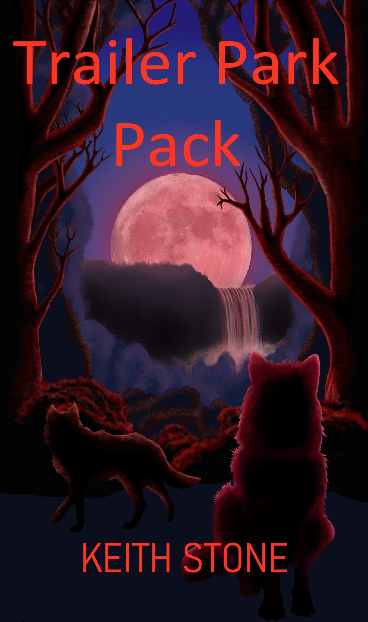
This is my first attempt at a cover. I want to know if my skills are good enough or if I should just pay for someone to do it.
Nathan says:
Your skills are good enough; you just need some guidance.
The first thing that leaps out is that nothing leaps out. All of the color values are moderate, which means that nothing catches the eye — especially in the thumbnail, where the moon is sorta visible but not really eye-catching. Even at normal size, the wolves can be easily overlooked.
And the font used adds nothing.
I can’t tell some important details from your description: Is it a family drama with werewolves? A domestic comedy with werewolves? Action-comedy? This is important info to convey on the cover, not just that there are werewolves in it.
Here’s a first draft of what I would do with your existing artwork, assuming we were going for a “classic monster, not too scary” vibe:
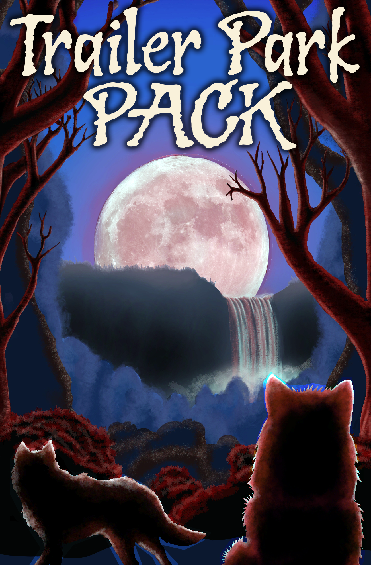
- Cropped the unused space so the important elements are larger.
- Made the lights and darks “pop” more.
- Made the title pop, and used a font with some character.
Things I would still do.
- You have, by my count, four layers of landscape between the moon and the wolves. Lose at least one (that light blue one that stands out strangely) so the moon and wolves are closer together.
- With that blue forest layer removed, you’d be free to limn the wolves in more bluish light to have them stand out.
- Change the title font to something that more closely matches the novel’s mood.
- (And of course, put your byline back in. I just got lazy.)
Other comments?
The idea is nice, it just needs some fine-tuning.
In addition to what Nathan has suggested…
The cliff face comes off more as a dark cloud hovering in the sky. Perhaps the mist at the bottom of the falls could be significantly lighter.
The photo of the moon is at odds stylistically with the rest of the art.
Back views are always iffy, whether of people or animals. They can tend to be dark holes in a cover. Perhaps if your wolves were seen in more 3/4 view.
I thought the wolves were cats, LOL.
Honestly? The cover artwork and typeface do nothing for me. It looks cheap. I did a quick search on Shutterstock for werewolf and immediately came up with a dozen much more dynamic, professional looking images. They’re cheap enough to buy, around $14. Add in a better font and you’ll have a much better cover.
https://www.shutterstock.com/search/werewolf?orientation=vertical
I did a quick comp for you to show you what I mean:
https://ibb.co/2ZbTrsL
As I see it, the main problem with your cover draft is what plagues a great many cover designers when they’re just starting out: too much obvious cut and paste (as it’s tagged on Lousy Book Covers) work. Cutting and pasting imagery from disparate sources into one image without leaving any obvious seams is difficult in any event, but is especially difficult when working with fabric and fur. In your specific case, I do see that you put some effort into making this look like roughly penciled/painted artwork with the wolves portrayed in silhouette with a full moon at their back to explain the rough edges on their fur (always a major “tell” when beings with any kind of hair are cut and pasted); but even if the cutting and pasting looks to have been done by hand the old-fashioned way (similar to the film layering technique 1980s and earlier movies used before computer compositing was widely available), this draft very much has that art for a refrigerator (also a Lousy Book Covers tag) vibe to it.
Now bear in mind, art for a refrigerator is not necessarily inherently bad art: I’m not particularly ashamed of any of my pencil art from my college art courses I’m keeping in the attic, nor any of my late mother’s amateur-but-well-crafted paintings still hanging on the walls of our family’s house. I just wouldn’t try to put any of them on the cover of a book (not even the painting she made from the book covers of her British edition of the Lord of the Rings trilogy; that’s already on the books’ covers, and copying it to another book’s cover would be brazen plagiarism). Likewise, even if your composited artwork here actually might be good enough to hang as a painting (or print) in one of your house’s rooms (probably one with lots of wood paneling), it’s not sufficient for your book’s cover.
More to the point, even if you had paid—say—Alex Ross a million dollars to draw and paint a professional version of the scene on your cover such that all elements of it were appropriately eye-catching and immediately recognizable and seamlessly integrated into the full image, I doubt people would immediately recognize what kind of book this is. With a long careful look at the cover (the kind your prospective readers browsing through thumbnails on Amazon or Barnes & Noble or any other retailer’s site are never going to spend enough of their time to give it), I see a moonlit waterfall in the background framed by some trees in a forest (apparently) with a pair of wolves in the foreground—one loping off to the side and the other sitting on its haunches—both staring at the viewer. What I don’t see is any indication that these wolves are in fact werewolves, or any signs of the trailer park where your pitch indicated they were living; only your title (which uses a rather boring and unattractive font, I might add) says anything about that, and even reading that, one could forgive a casual browser for thinking this might be a story about pack of ordinary not-at-all-supernatural wolves who survive by scavenging from a trailer park.
As our esteemed host notes, your pitch also doesn’t really mention what kind of tone your story has: is it adventurous, comedic, dramatic, erotic, tragic, or some combination thereof? From what you said about the maturity rating (in movie parlance, I’d say that’s roughly PG-13 primarily for violence), I surmise this isn’t just another sleazy porn-with-just-enough-plot-to-pass-as-erotica piece, but that doesn’t necessarily preclude it from being e.g. a slightly raunchy adventure comedy or a slasher with some soft-core sexploitation thrown in. While the slightly offbeat combination of werewolves with trailer park dwellers (or “trailer trash” as some of the rather snobbish and uncharitable individuals in my social circles refer to them) does also strongly suggest there’s at least some human-city-slickers-just-don’t-understand-our-rural-werewolf-lifestyle comedy involved, you could just as easily be telling a purely dramatic werewolf-country-girl-turns-her-dissipated-life-around story dead straight.
Either way, I’d recommend clarifying these three elements in your cover’s imagery: the genre, the setting, and the tone. While you haven’t given us enough information about that last one, I did feed the parts of your pitch about this being a story about a couple of female werewolves living in a trailer park to an A.I. text-to-image generator, and this is what it gave me on literally the first try. While that’s probably not exactly what you need, it’s a good example of how I’d go about illustrating the cover for your kind of story: two half-transformed werewolves (establishing that’s what they are) somewhat dubiously—though not too obscenely—dressed to indicate their lowly social status standing under a moonlit sky in front of a couple of mobile homes in the rural trailer park where they live to indicate the setting; there’s no vagueness there.
That leaves you to establish the story’s tone. If it’s more comedic/sexy, I’d leave the gals in my image pretty much the way they are (and while I neglected to tell the generator they were supposed to be a young gal and her granny, I figure from their fur’s color and placement the granny’s on the left and her granddaughter’s on the right; chances are, werewolf women get enough exercise chasing prey to keep their figures fit well into their twilight years). If it’s more dramatic/tragic, I’d probably tell the generator to portray them as a bit fatter and homelier and somewhat less attractively dressed like—y’know—most trailer-park-dwelling women (who might be lazy enough to dress poorly and put on a few excess pounds even if they also happened to be werewolves).
Finally, as a matter of personal preference: if the minor errors in your pitch (“women” is plural, “that” instead of “who” or “whom” when referring to people is dehumanizing, and initialisms like P.T.S.D. are supposed to be capitalized) are any indication of the quality of your writing, I hope you’ve got a decent proofreader for the book’s contents. While accuracy in your title and byline on the cover (which need a snazzier font—as mentioned—but are otherwise all right) is especially important for first impressions, you’re far likelier to close the deal (i.e. make the sale) if your prospective customers get a further good impression when they look inside the book and see the content’s quality matching that of the cover. Just sayin’.
you need something more like this
https://imgur.com/a/hcWshk6
The art should all be recognizable as to what it is at a glance, so make all elements that matter clear. I literally didn’t realize that was a waterfall until I read the comments. That font you have doesn’t do anything for the art especially because it looks just typed on, not arranged. A classic font like the one I used would be better if youre going for the simple title look. a tagline would help potential readers a lot to decide if this their thing. (I added the aged look for fun but also to give the subconscious impression you can’t put this down…lol)
(you can have this.)