The author says:
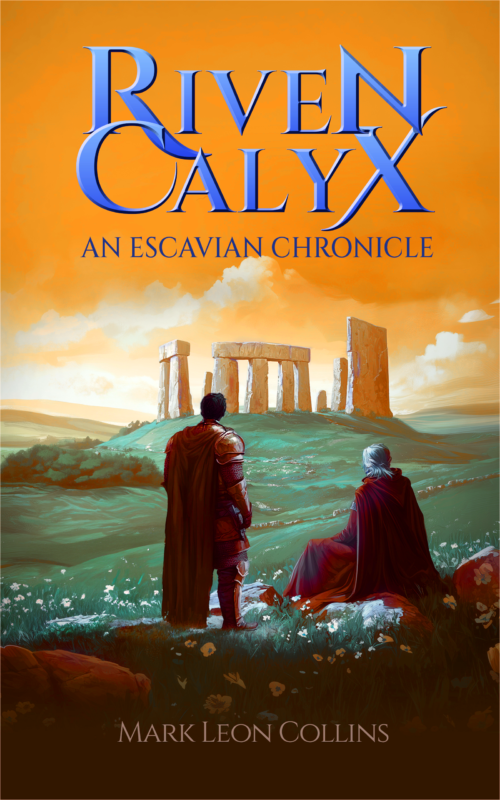
Riven Calyx details the rise of a knight haunted by the children he was forced to kill. He is commissioned by the equally haunted king to find a wizard to remove a curse affecting them both and the area just conquered. It should appeal to young adults and all fantasy fans.
Nathan says:
While there’s nothing technically wrong with anything on this cover… it’s not terribly dynamic or exciting, is it? For a book with “haunted” and “forced to kill” and “curse” and “conquered” in the description, the cover just seems like two people on a springtime picnic, enjoying the ruins.
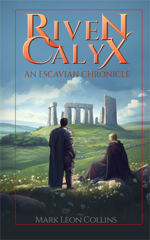
A more dynamic scene is definitely the best course, but even playing with the color scheme of your current artwork boosts it:

(This is only an “open Photoshop and grab a filter for an example” version. It is not the best possible example.)
The other advice I have, if you’re still planning on using the current artwork, is to decrease the dead space. Remember, 99% of readers will first encounter your cover as a thumbnail; thus, make the important elements — including the type — understandable at that size.
Other comments?


Just a couple of quick comments:
• I agree with Nathan about the cropping. Enlarging the image will help.
• Author name should be larger.
• Move the subtitle so it’s not sitting on the top of the cloud.
• Tighten up the kerning between the L and the X.
• Not crazy about Nathan’s orange sky, but I agree that something needs to be done to make it look more “conquered.”
Thanks Nathan and Don, your ctiques are very helpful. I’ll get back to my artist. I’m glad the cover concept is fine as a foundation. All the best.
I knew that title sounded familiar: the last time you submitted this to us was seven years ago, but I haven’t forgotten its rather ornate medieval-sounding name. So basically, you’re looking to update from the cover you’ve got on your novel right now? Understandable, and this is not a bad first draft as these things go, but our esteemed host is right: this is an awfully generic cover for what your pitch suggests is a rather dark and ponderous story about a tormented soul.
For best results, I recommend bringing your story’s tormented protagonist to the front and center of your cover image. Instead of what does indeed look like a picnic in front of the ruins of Stonehenge, how about a shot of him kneeling in prayer in a church? If that kind of setting is a little too on-the-nose for him, any shot of your tormented protagonist in any kind of setting the least bit relevant to the story (e.g. standing before the King to receive his quest, or talking to that wizard he’s been tasked with finding) with his head bowed as if all the weight of the world were resting on his shoulders should suffice.
As for the lettering of the titles and byline? There’s nothing terribly wrong with any of them, but I do have some minor gripes: the title letters shouldn’t overlap so much, and while the main title is legible in the thumbnail (which is the first glimpse of your cover your prospective readers will see, nothing else is. I recommend expanding all captions (especially your byline; don’t hide it like you’re somehow ashamed of your work) to fill the cover as much as you can without covering up anything important in the cover image or putting them in danger of being cut off during physical printings.
Long story short: that’s a nice cover image you’ve got there, but nice isn’t going to be enough; for selling your novel, you need nothing less an awesome cover.