The author says:
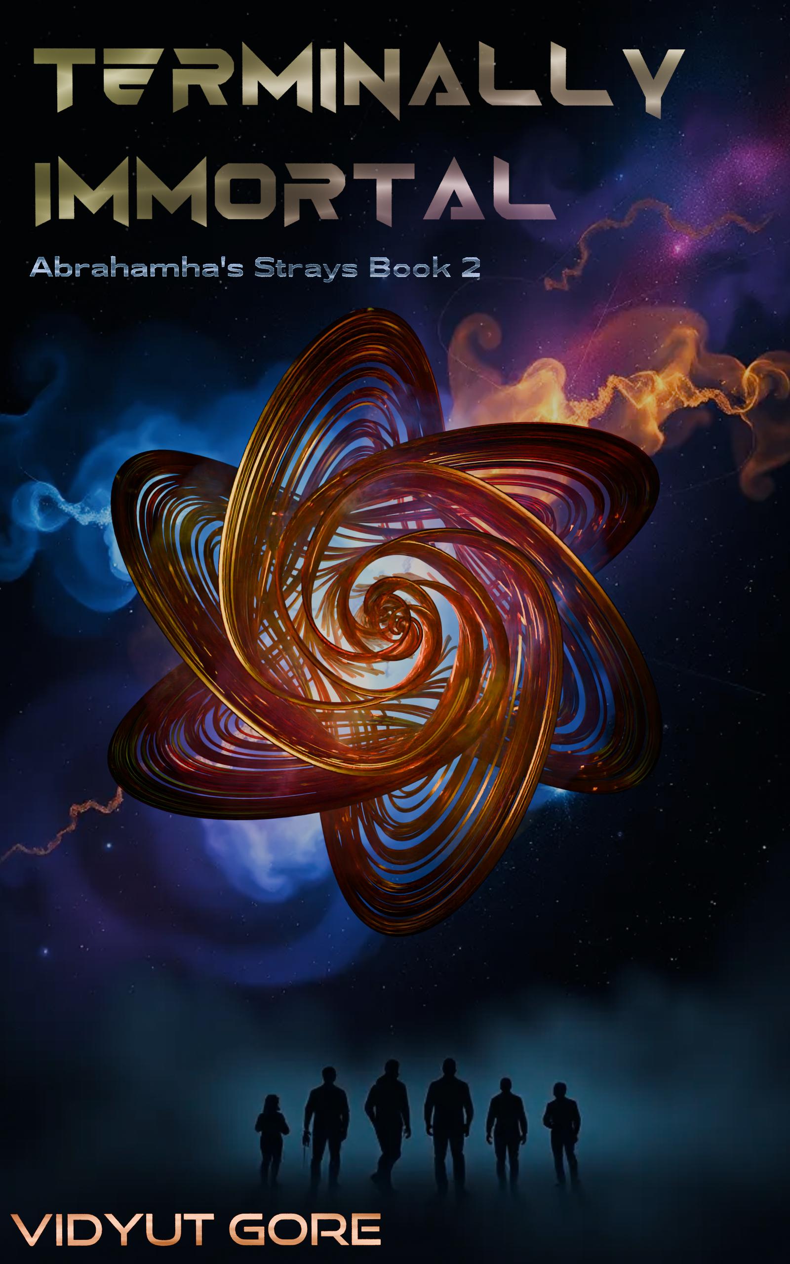
Book 2 of the Abrahamha’s Strays series: Terminally Human. Sci-fi set in the 25th century. Large cast. Symbiotic microorganisms in humans grant them longevity and rapid healing (the thingy in the center is supposed to represent how a few can perceive them). A few have extraordinary powers, that come with considerable limitations. The first book had solved a mystery and rescued an ancient hero. This book is a quest for her original attacker.
Nathan says:
I haven’t looked up Book 1 to see how you’ve maintained the branding, because even if Book 2 follows Book 1 visually, it’s still got a major problem:
I CAN’T SEE ANYTHING.
Remember, most readers are going to see your cover first at thumbnail size, with other books’ thumbnails on either side of it. And what do I learn about your book from the thumbnail? Nothing. I can’t read the title, I can’t recognize any image. As a reader, I might not even register that your book cover is there, because of more intelligible and attractive covers to the left and right.
Even at full size, the reflective tricks on the title only add another half-second to my comprehension, which is a half-second you can’t afford. The “thingy” doesn’t stand out from the background, and the one intelligible part of the image — the human silhouettes at the bottom — blend into their background.
You need to start over with a single question in mind: “What can I convey to my target audience in the limited time and real estate of the thumbnail that will get them to stop and find out more?”
Other comments?
There are a few issues. The first is that the central image—whatever that is—overwhelms the cover. So much so that you have crowded the title into the top corner and the figures and your name into the bottom margin. This just leaves an enormous image that conveys nothing special to the potential reader…other than a generic sense of “science fiction.” To make the title worse, the color and shading camouflage it against the background. The title needs to be much larger and more easily readable. I’d enlarge those figures so that they span the width of the cover and overlap the whirly thing. And then make your name larger and further up into the cover.
I think what might be getting in the way here is objectivity. The design in the middle has significance to you because you know what it represents. The potential reader won’t have that advantage.
My first reaction was cliche, and wondered if it was a poster for a film. I don’t understand what the gyroscope looking things is portraying. Otherwise as a simple observation is that my gut instinct is wondering how these immortals are going to die – which may be a good or bad bewilderment depending on what you as the writer is trying to convey.
Typography treatment is one of the most common problems with covers.
In this case it needs to be bigger, brighter, and centered. Try placing author name between the main object and the figures of humans instead of squeezing it in the corner. I don’t mind too much over the focal point object because it looks sci-fi, but hopefully the story will reveal its purpose.
I actually improved the concept further. But I don’t know how to share it.
Book 1 has a different cover currently (it also doesn’t have series name) – I’ll be updating it when I publish this book and I’m hoping both are then similar. I can share both covers to update the post, but I don’t know how.
Just comment with a link to the new cover (on Imgur or the like) and I’ll edit it to show up in the comment itself.
Thanks.
https://imgur.com/a/1ABWPRQ
Hmm… For some reason, the image aren’t showing when I edit your comment.
No matter. Both covers can be seen at your link.
I viewed the revised cover and it’s much better. The title and author name is lots easier to read. There’s been a lot of comments about the illustration. Unlike some other replies, I think it’s ok to have an unrecognizable object. After all, it’s in the future, so today’s human wouldn’t know what it was anyway. I interpreted it as a futuristic space station. There’s nothing wrong with inviting curiousity. What I like about it is you have a main focal point. I’ve seen so many covers that make you wander all over the place through a jumpy composition. Nice job. I’d say it’s ready to go.
It’s more readable, but I still think that the few details visible from the thumbnail still don’t hook the reader. Even reversing the emphasis of the silhouettes and the thingy (i.e., making the silhouettes fill the screen with the thingy subordinate to them) would be am improvement — viewers would at least have something they recognize.
Thanks. Reading all comments. Will see what I can do and update.
Absent any context, my first guess about that swirly thing at the center of the cover would be that it was some kind of corporate logo for some fictional corporation in the story. Within the context—well, there’s the main problem right there: none of your prospective readers have that context yet, do they? That’s why we always tell cover designers not to try to engage in any kind of “representation” or symbolism or other kinds of visual abstraction that have no meaning outside the story: people scrolling through the search engine at Amazon or Barnes & Noble or Smashwords or whatever aren’t going to be interested in stuff that doesn’t mean anything to them yet.
Sure, that swirly thing is pretty and all, but how’s it going to interest anybody in clicking on the link to your sales page? The short answer to that rhetorical question, of course, is that it won’t. No casual browser’s attention is going to be snagged long enough for you to pitch that prospective reader any further potentially intriguing information that might get people to buy your book.
Now if I’m reading your pitch right, you’re saying what that six-pointed swirly thing is supposed to mean is that a grand total of six people (or six percent, or six per million or billion?) in the world “perceive” those healing symbiotic microorganisms everyone’s got in ways that no one else can. Whatever is supposed to be so special about that perception, is that number (or percentage, or whatever it’s supposed to be) really so vital to your story that you feel it absolutely has to be the main focus of your cover? I mean, even if this is basically a novel-length superhero team-up story now, who in or out of the story would be expected to care about how many members the team has?
If anything, I’d expect what people would find intriguing about the rare few people who “perceive” these Wolverine-style-healing-factor-granting microorganisms some way everyone else can’t is what kind of powers this unusual perception grants them. The only time their number would be of any interest would be if the group needed a branding logo for publicity’s sake, e.g. for their team uniforms or their club rings or on a banner they carry into battle or a sign out in front of their sponsor’s corporate headquarters or the like. If that’s what your swirly symbol thing is supposed to be—their team logo—then yes, you should indeed show that logo on your cover, but not in abstract isolation like you’ve got it now; show it on at least one of the actual immediately recognizable objects where these people typically display it (e.g. the old “Clark Kent opens his shirt” closeup shot from Superman stories—cliched as it is—has the advantage of being immediately meaningful and recognizable to just about everybody regardless of whether or not they recognize the logo you slap on the uniform underneath).
Otherwise, if your swirly symbol is not something anybody uses in-story, ditch it for something else immediately recognizable at thumbnail size that will actually grab prospective readers’ attention. If the characters don’t wear garish costumes or anything like that (and indeed, if any kind of superpowers actually existed, I suspect any more introverted or less sociable people who had them would prefer to avoid advertising their abilities), you could nevertheless still show them using their powers in some highly visible way. What’s important for getting prospective readers’ attention is that you show them something immediately recognizable to everybody so they’ll understand what they’re seeing and pairing that with something unique to your story so they’ll be intrigued.