The author says:
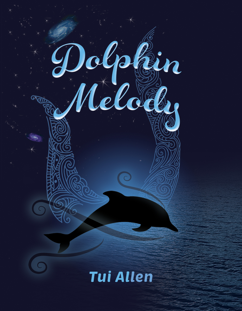
In the vast depths of the oceans, Hinemoana, the Māori Goddess of the sea, watches over all marine life, narrating the poignant tale of Melody, a dolphin born in the Bay of Islands, New Zealand. Melody’s life, marked by tragedy and music, turns dark after the loss of her mother and her baby to human hands. Haunted by a freezing spectre of hatred, she struggles to find peace and a voice to communicate with mankind.
Onshore, the artist Manaia faces her own battles, mirroring Melody’s pain and loss. As Melody seeks solace through astral journeys and divine promises, her path intertwines with Manaia’s, leading to an extraordinary alliance with Manaia’s husband, Rōreka. Through acts of sacrifice, love, and interspecies communication, Melody finds hope and healing.
A journey of sorrow, redemption, and the powerful bond between humans and dolphins unfolds, revealing the potential for unity and understanding between worlds.
Nathan says:
Conceptually, if the “hook” of the novel is the interaction and relationship between human and dolphin, make that visible on the cover (by which I mean, use a human).
Technically, I have two comments about the current cover:
- I understand that the ocean depths are dark. However, giving more bright spots for contrast will help this cover be visible.
- There’s a lot of unused space. Nothing would be lost if you trimmed the live area roughly like this:
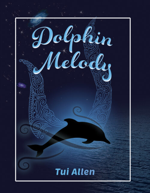 (It may seem that I have a problem with open space. Not so; I have a problem with open space that doesn’t add anything to the whole.)
Other comments?
I like the colors and the image. It may appeal to those who like stories about the sea. Here’s suggestions from a design standpoint: Delete the white border. It doesn’t add anything and may create a centering issue when printed. Both title and author name needs to be larger. The title typography has a mid-century feeling to me. You didn’t specifically mention the genre, but from the narrative it sounds like fantasy/mytholgical. You may want to experiment with fonts that look more Romanesque.
I think the border you refer to is Nathan showing where the cover would be cropped.
Not much I can add to Nathan’s suggestions.
I tend to agree. I’d take out the pattern and put in the protagonist’s face. I think the contrasts are ok, but on a thumbnail, Nathan is probably correct.
you need something like this
https://imgur.com/a/OmlABjH
an image with contrast so the eye knows where to look
You can have this if you want.
Wow! Thank-you all of you! I’m super grateful and will give all this some thought. Nathan’s comments about the darkness are bang on. I have a proof copy in my hands now and a lot of the detail is lost through lack of contrast. The whole image is way too dark. My stars were too transparent and were lost altogether. As a design newbie, I had no idea until I saw it in print. So I’ve already ramped up the contrast and lightened the image.
As for the wasted space, I’ll also play with that and see how it goes. Thank-you Nathan.
Shelley’s image is spectacular and very tempting. Is it AI generated?
Mark’s suggestion about removing the patterns is understandable except my first market is likely to be local here in Aotearoa and these patterns suggest an ethnic angle, of the Maori human culture of this setting and my Maori Sea Goddess narrator. It might mean less to those unaccustomed to our local culture, but as my local market is likely where this story will begin its journey, I’d like to hang with them . . . . but as I said, I’m considering everything here before making final decisions.