The author says:
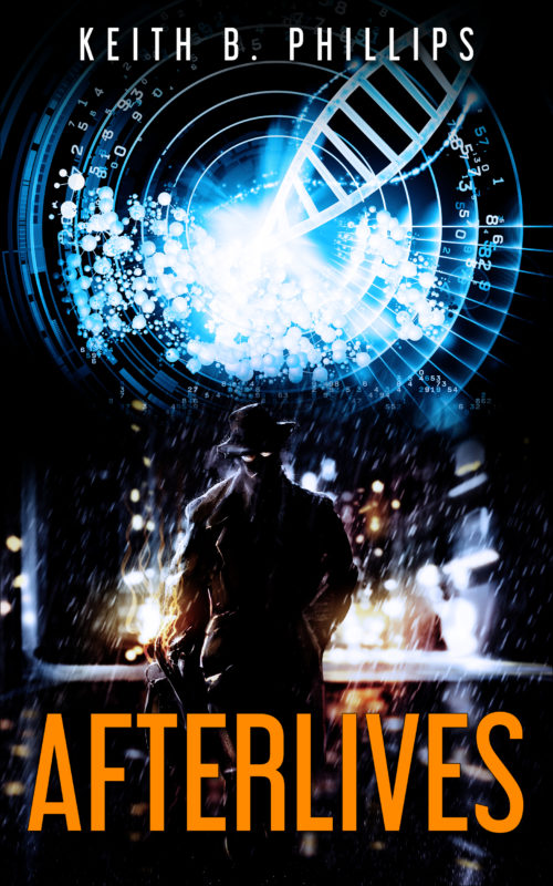
Private detective and military veteran, Martin Coswell never never expected any special treatment from anyone. But when he awoke at Medicore Nanotech five years after dying of brain cancer, he got a second life to live. A life soon to be turned completely upside down by an AI gone rogue, and a daughter with a missing father.
Nathan says:
A good combination of “thriller” and “sci-fi” imagery. However, the human silhouette gets lost because he’s against the darker part of the background. I would exchange the DNA and rainy street images so that there’s something bright behind the silhouette’s head.
Any other comments?


I like this cover, too. But the eyes don’t look like they’re in the right place. Those are eyes on the man’s face, correct?
I think they are just some lighting spots on his face, cheek and nose. I don’t think those are eyes.
Regarding Nathan’s suggestion, swapping the DNA and street images (assuming the man and the street aren’t one image) might look odd since the figure of a man standing in a dark and gritty street is such a strong trope. Could the DNA image simply be lowered to the same effect?
The title font and color is confusing me somehow. It is visible and legible at both full and thumbnail, the color doesn’t clash, and the font doesn’t seem bad. Despite that, it somehow seems off to me, like my eye is being forced away from it. Maybe the DNA image is just to much of a focal draw, overwhelming the title along with the man. Maybe it’s just me, I’m not sure.
They’re glasses–the light spots on his face. If you zoom in, and notice the ciggy, you can then “see” that those are lenses. I concur that they’re a bit distracting.
Kristopher, I think the title is playing with your brain because it’s not a word that’s often used. Afterlife, sure, but Afterlives? Not hardly, don’tcha know. 😉
Mostly, I like this cover. It’s a nice play of light and dark, contrast, etc. I’ll defer to you designy types, though, about the DNA symbol and the man. (I do think that the lenses are a bit problematic.)
Title seems perfectly fine to me – if it is by technology, perhaps you will be revived many times. Or even many copies of you.
I didn’t say it wasn’t. I was responding to Kristopher’s comment about the title font & color “…confusing [him] somehow.” That’s all. The title doesn’t faze me.
Yeah, it’s just some quirk I’m trying to figure out on my end. I only mentioned it in case it wasn’t specific to me, thereby indicating an actual problem.
Maybe a different font for the title?
Not bad! I think if you slide all that bright glow-y science-y stuff in the background down just enough to outline the silhouette’s head, that should do the trick. Once you’ve done that, the cover should be good to go.
I dunno.
I think the cover does convey something of the sense of the book…but I think it does so a little haphazardly.
I certainly agree with the others about the glowing “eyes.” Those were the first things I saw and I immediately jumped to the conclusion that the book was about some sort of dark science fiction anti-hero—in fact, the first thing I thought of was “Darkman.” It was not until I read the blurb that I found out I was completely wrong. You don’t want your cover to mislead potential readers like that.
The bright, circular glowing graphic at the top half and the figure in the lower half seem to be two separate, unrelated elements. The upper shape is also especially uninformative. Other than the suggestion of DNA, it really says nothing. It’s just there. You need to tie these two elements together better, probably by making the figure overlap the circular shape, by lowering the latter and raising the former. This would also make the most important parts of the cover closer to the center of the cover, where the eye naturally wants to go.
I tried removing the lenses and the cig, and it does look better, even in thumbnail. Looking closeup, especially the cig is really odd looking. I would also spruce up the title a bit, different font, or distress or texture it a little. Other than that, what Nathan said of the outline, and you’d have a really fine cover.