The author says:
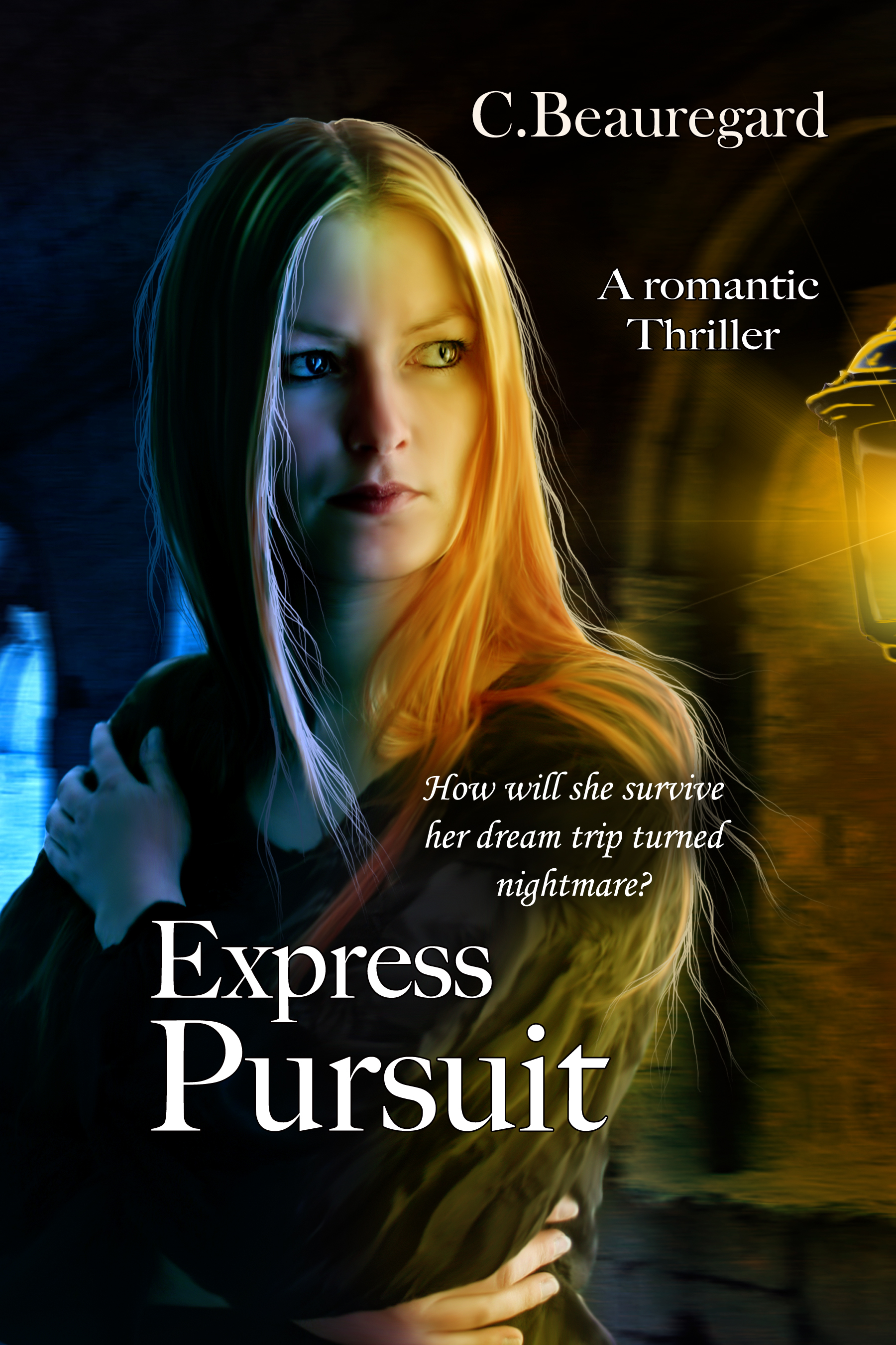
This for a romantic thriller or romantic suspense. While vacationing on a train journey across Europe, a feisty ATC is forced to work with a tenacious FBI agent to prevent a series of deadly terrorist explosions she is triggering against her will.
Nathan says:
It’s a very well done illustration, but it doesn’t seem right for this book. I’m not sure what an “ATC” is (air traffic controller, maybe?), but with FBI agents and bombs involved, I’d expect to see a gun or other sign of action and violence. This gives more of the impression of a modern “gothic” novel — dramatic and possibly perilous, but the heroin is without defense.
The other problem with the illustration is that it doesn’t allow clear areas for text, meaning that the title and byline (and subtitle and tagline) all have to be squeezed into odd spaces.
(Of the utterly boring character of the font used for all text, we shall not speak).
Other comments?