The author says:
Genre: Cyberpunk, Sci-fi.
Comparable book: Series-Neuromancer,
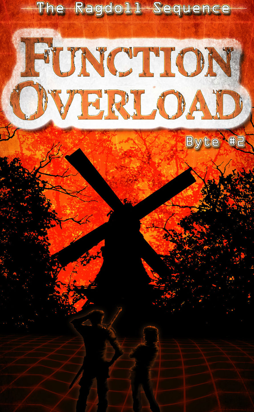
This book-LitRPGs books Publishable, but looking for feedback on the characters. As everything is pretty much silhouettes I worry the characters blend in too much. I’ve tried a couple variations and this is the best of the lot. I’ve tried a gradient from orange to black, but it feels like they pop too much. Or, is this even the right direction with characters?
Elevator pitch: In the second novella, a night of playing a VRMMORPG turns dark when one of Ragan’s friends doesn’t wake up after being captured by a raid boss. Using her skills as computer security cracker she will have to figure out what is trapping people in the game, and for what reason before time runs out.

Nathan says:
Your intuition is right: The characters blend too much.
I think the fix on that, though, needs to go back further into the design. You’ve got way to much unused space (which is not the same as functional empty space, i.e., a conscious decision to use a blank spot as a design element). Look how much everything on the cover is improved by cropping:
(I know, I cropped off the byline. I’m not on my home computer right now, so I can’t modify the image beyond a few basics.)
Once you do that, EVERYTHING becomes clearer. When you put the byline across the characters’ legs, you can then increase the intensity of the glow around the silhouettes, and it won’t look out of place.
Also: Have you considered rendering the grid on the bottom in green?
Other comments?
For comparison here is the cover for the first one: https://imgur.com/a/IzOmCmE
The characters do blend in an awful lot. I can’t see them or the grid lines at all in thumbnail. Could the lines be wider? (Also, I find the phrasing in the elevator pitch a little awkward. Is there any reason not to use “Why” instead of “for what reason”? Why certainly sounds smoother.)
I could make the lines a bit wider. I’ll give it a try and see what it looks like.
The elevator pitch was just top of the head, the book is in editing and I’ll be working on the back copy stuff when that’s done. But thanks for the feedback!
I love The red/yellow fire-ish background!
I also like the fiery orange colors. I also agree with brightening the character back glow, as well as cropping. My issue is with your 3d grid lines. They are used incorrectly. When creating a 3d image, you use dots in three dimensional space (vertices). Two vertices connected together in straight lines are edges. Three or four vertices connected in a triangle or rectangle form a face. When you create a terrain using a 3d program, the surface is created by a series of interconnecting faces. Some programs use 3 sided faces, and others 4. The ones that use four, technically really use 3, with an unseen edge connecting 2 of the 4 opposing vertices like a fold in a piece of paper. If you look at the image below, you will see you have edges bending without a vertice. (the white line shows an example of where you have a bend in the edges, without any vertices.) To be realistic in your image, you have to form your terrain by moving vertices, edges, and faces in differing places along the z-axis (up and down). Edges MUST be a straight line between two vertices.
https://i.imgur.com/PXCJB8e.png
Some programs make exceptions for circles or spheres, but that wouldn’t apply to you. Your best bet is to use an actual 3d program and utilize the terrain in wire-frame mode to acquire the proper look. If need be, you can grab it in a screen capture.
Yes, I know most people wouldn’t notice such things, but I’m sure a higher percentage of your target audience will.
Ughh. Forgive the typo on my image.
Thanks for the heads up, I did notice that after I sent the image… of course, lol. I was considering doing the grids it in blender3d, but decided to stick with Photoshop as I had trouble getting it to work color wise. The graph is something I will be fixing, because that bent line has been bugging me since I noticed. I appreciate you taking the time to inform me, and other of the mistake and why it’s wrong!
There’s some extremely strong stuff about this cover. You palette choice is strong, firmly signally the adventure/thriller/SF tone. I like your approach to the title lock-up. The treatment (alongside the same approach for the first book).
What is letting the cover down as you say lies within the imagery. But it’s not just that the human figures can’t be seen, it’s that what can be seen (especially at thumbnail) is doing nothing to communicate your genre/world and is even kind of undermining it.
Because while I presume a windmill is an important plot element or setting in the book, as an image is does not scream cyberpunk SF! Silhouetted alongside the trees it screams ‘horror’. And horror might have a place in your book, one worth referencing visually, but not as the big lead image. You need visuals that signal the VRMMORPG bit much more clearly.
You have something of a classic novice cover designer issue here in that you’ve gathered several images together of things which are important in your book, and photoshopped them together. And that’s always going to look comparatively weak. Partly simply because most people are not professional-level at making Photoshop montage illustrations. Partly because most people don’t have the trained eye for selecting imagery. Partly because even if well-executed you get quite outdated visuals.
The idea of a book cover as ‘title at top, illustration in middle, by-line at bottom’ is not really how book covers tend to look now. More often they are dominated by big title typography placed centre stage and more abstracted graphic/illustrated elements interacting. It varies from genre to genre, but foray and SF it’s definitely what’s going on.
And the lucky thing is, this approach is far easier to aspire to as a novice designer. It takes the pressure of having to have bespoke illustrations.
Look at Ready Player One’s cover. https://amazingstoriesmag.com/wp-content/uploads/2017/01/ready-player-one-book-cover-200×300.jpg.
Or the lovely covers for Philip Reeve’s Railhead series https://images-na.ssl-images-amazon.com/images/I/51cJ05pyLVL.jpg
https://images-na.ssl-images-amazon.com/images/I/51sEK2Rg6cL.jpg
https://images-na.ssl-images-amazon.com/images/I/51RrDfIiHjL.jpg
Here’s some more:
https://images-na.ssl-images-amazon.com/images/I/71I11zhTsFL.jpg
https://images-na.ssl-images-amazon.com/images/I/41fBH4kAfGL.jpg
Sure, all of these examples utilise illustration. But if you actually look closely you’ll see how comparatively generic that illustration often is – nothing you couldn’t get from Shutterstock.
https://www.shutterstock.com/image-illustration/scifi-concept-traveler-take-picture-abstract-653554594?src=0qVe2xTEXquhEvWP786_iQ-1-58
https://www.shutterstock.com/image-illustration/illustration-sisters-brothers-who-joined-resistance-298074050?src=DU0FNYQvcqOPvTkjXPcR9Q-2-59
The Reeve covers use one spot illustration of the character/s and literally the rest of the imagery is stock.
What makes these work is that the designers have not got these stock images and tried to combine them into a cohesive illustration. They let the title type take the weight and use these illustrative bits as flourishes.
So I think you’ll get a far stronger cover from leaning into the type elements and in term of illustration carefully selecting a background and maybe a detail or two that really communicate your world and maybe main character.
Thank you for the great write up. I do agree. I had created the basis for this cover a few years ago when I first started planning the series, and I think I got kind of stuck on it. I’ve been considering working on a re-brand of the series, and I think you nailed where I’m stuck. I’m still trying to show too much that doesn’t matter to the prospective reader. While I really like the look of both covers, I think you may be on point.
I’ve had better luck with using stock images with my other covers, so it may be best to start there if I start from the beginning again. I do like the color schemes, which I think can still work.
Thank you again for taking the time to comment, you’ve given me lots to think about and that’s what I was hoping for!
Excellent, I’m so glad to help!
You’ve got it exactly: ‘trying to show too much that doesn’t matter to the prospective reader’. It’s the most common misstep.
But you’ve got some really good instincts on display too, so I think you’re off to a great start.
Looking forward to seeing further versions here!
(Also congratulations for dealing with the liberal scattering of bizarre typos in my first post, it was past midnight and my copy-editing brain had apparently shut down already)
I learned two important lessons as my graphics experience progressed: Keep it simple but striking, and make a series look like a series.
Might I suggest losing the grid at the bottom and having the two people in partial silhouette rather than full with the aura?
I can hardly do better than second Kata’s critique.
One thing that is often a very difficult hurdle for authors attempting to create their own covers to overcome is the problem of objectivity. It is much too easy to fall into the trap of including images that are meaningful or significant…but only to someone who is already familiar with the book. This is, of course, putting the cart before the horse. A reader should not have to read the book in order to understand the cover. This doesn’t mean that a cover cannot intrigue a potential reader…it just should not A. puzzle them or B. mislead them.
Let me give you my favorite example of this. I was once shown a cover ostensibly for a high fantasy adventure in the mode of Lord of the Rings. But the cover image was of a rustic stone bridge over a lovely little stream in the midst of a woods. It was all very picturesque and would make a wonderful cover for a travel guide to rural England but, I asked, what in the world did it have to do with the book? “Well,” the author replied, “the main character is a troll and that’s the bridge he lives under.”
Your instincts are sound; the reason the characters sink into the dark background without a trace in the thumbnail is that while the covers on the cover are quite well-saturated, the cover in general is much too dark, especially on my monitor. If you don’t look at it from a certain angle, you can barely see the character silhouettes even in the fuller-sized version. Widening the lines is not a bad idea, but a nice strong dose of gamma correction could work wonders for the overall image’s clarity and visibility at any size. (Here’s my one-minute revision doing just that which took longer to link in this message than it did to revise.)
While that wire frame sky and landscaping do clarify the setting to be in a computer simulation (once you can see them, anyway), that does strike me as a little old school. I mean, orange wire frame anything makes me think of some of the really primitive computer systems we had back in the early 1980s when the bizarre aesthetics of the movie Tron were about as sophisticated as computer graphics could get. I don’t suppose you might go with something at least a little more up-to-date? Even something as blocky and cartoonish as old World of Warcraft graphics would look a bit more futuristic at this point.
I do want to add that I think Nathan’s suggestion, about making the gridlines green–or perhaps a superbright yellow?–is super. I’d definitely experiment with that.
I know you’ll all be shocked to hear, I haven’t a single thing to say about the typography. Well, okay, one eeny-weeny thing. I love the titling font; love the wee series name font; I’m underwhelmed by the byline font. I would consider just sucking it in and using a nice, simple sans serif for the byline. Too many display fonts can/will indeed overwhelm the cover, so, given that you have two that are great, and one that’s very very strong–use a nice, simple, compressed-form sans serif–perhaps Impact?–for the byline.
Just watch the kerning on “Ragdoll”!
Yeah, but…that’s kinda picayune, so..
I have a question…
Why aren’t these “The Ragdoll Sequence 1″ and The Ragdoll Sequence 2” ? Maybe with the volume numbers nice and big, possibly behind the subtitle.
Under the title they’re Byte #1 and Byte #2 because I’m a dork and they’re novellas. 🙂 I think I’ll be changing that though.
An idea…
https://i.imgur.com/36IIfZ2.jpg