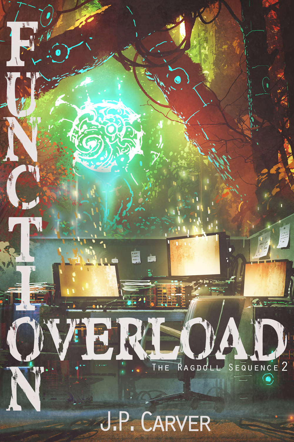
Rewriting Singularity

The author says:

All sitcom writer Jacob Grey wanted was story credit. Instead his partner betrays him above and below the covers: He steals Jake’s pilot, sells it to ABC, and sleeps with their bimbo agent. That’s when Jake leaves and ends up at a quirky Green Bay bed and breakfast. Nothing at the bed and breakfast is normal. Jake’s confounded by mysterious bangs and clangs inside the walls, and how despite writer’s block, his new sitcom writes itself while he sleeps. He’s not even sure if the owners are human. But he is sure there’s something about one of the owners. Hector Lodge, the man Jake calls Mr. Mumbles, is one big secret-a secret Jake wants to know better. When Jake sneaks into a hidden passageway between the walls to learn more about Mr. Mumbles, he finds more than a bedroom. A music box plays just for him with a journal tucked inside that he’s drawn to read. A story unfolds that binds two strangers’ pasts with his present. After Mr. Mumbles confronts Jake about his snooping, he confides in Jake. Yes, the house is haunted, and yes, the journals could answer why. But when Jake hires two private investigators to uncover information about the journal’s author, Jake also has them secretly look into Hector’s past. What they discover unravels the family’s hidden history and links them to the man who haunts them.

REWRITING SINGULARITY (62,680 words) is an adult fiction with multi-genre, magical realism twist and gay protagonist with Walter Mitty’s imagination.

Nathan says:

While I like the idea of showing a manuscript being redrafted as the cover and title, I don’t know that it works here.  “Rewriting Singularity” is such a counter-intuitive phrase to begin with, and then having one of the words be crossed out confuses the reader as to what the title actually is. Is it Rewriting Singularity, or just Singularity because “Rewriting” is crossed out?  If you want to use the same concept, what I would do is have two words in a typewriter font crossed out and two new words written in, and then in another ink color have THOSE words crossed out, and your actual title beneath them. (Although I still question whether the title you’ve chosen is a good choice; it doesn’t convey to the reader anything about the book.)

It’s also a good idea to have some kind of border or edge treatment on a cover with a white background, as most book and ebook vendor sites also have a white background, and you want a visual cue of where the cover ends.

Your description doesn’t actually say the word “comedy,” but I get a comic vibe from your synopsis, so my next comments will be informed by that assumption. If I’m reading it wrong, mea culpa.

Comedy is hard to convey on a cover without going over the top… so go over the top.  Ham it up.  I usually tell writers not to use “by” in their byline unless they need to describe the book — “A Novel by,” “An Adventure of the Far Future by,” etc.  In this case, the idea that popped into my head was “A Paranormal Gay Romance With Ninjas* by”… and then at the bottom, “*contains no ninjas.”

But like I said, if comedy isn’t actually a major element, that won’t help at all.

Other comments?

Land of Blades

The author says:

I recently published this book on KDP. It’s a fantasy novel in which the three main characters each have their own story lines. There’s a soldier, a Witch, and an assassin. Slowly, the three stories converge, which is why I wanted to include the three images (each is loosely related to each of the three characters).

Nathan says:

I think the idea of a triptych cover could work, but you need to make sure that each of the images is instantly identifiable, even trimmed down, even in thumbnail.  Looking at at the thumbnail here, you can see that the eye is the only image that can immediately be recognized as what it is, maybe.

However, you’re making your work harder for yourself by giving even less real estate for the triptych images to occupy.  The landscape serves little purpose at the bottom, and the accompanying sky serves even less purpose at the top. It’s just wasted space.

Your small title (and teeny byline) become nigh-on invisible against that background, both because of the thin letters against an image with texture, and because of the lack of value contrast (light/dark) with the image behind the type.

It’s a cover that makes the potential reader work to get anything out of it, and since said potential reader will likely see this with other book covers to the left and right, you can’t afford not to engage the reader as quickly and as clearly as you can.

Other comments?

Shadowsoul: Katera Rising

The author says:

Claire has lived most of her life enslaved by a dark mage and his monstrous creatures. As a special skill slave, Claire is frequently put into life or death situations with only her wit to keep her alive. In secret, she is given a mystical necklace with unusual properties, a necklace that is one of six and together it is said they have the power to free her people. But first, she has to escape her prison. Claire’s journey begins before she even knows it’s started and her path is flanked by dangers and mysteries. She will discover things about herself and her world that she would never have believed possible. A mysterious light, A fight for freedom, And a journey to change her world.

Nathan says:

The description makes clear that it’s fantasy, but doesn’t really tell us about the setting (the fact that the name “Claire” is in modern usage compounds the problem); I can only assume from elements in the image that it’s a vaguely pre-modern second-world fantasy setting.

First up, I have some complaints with the image; it’s fairly well done, but that right arm does a lot of damage; it seems out of proportion to the rest of the female model (to the point of seeming male), the forearm has obviously been painted in Photoshop, and it almost completely hides the sword, which is the only element which would say “fantasy” on first glance.  Given that it looks like the right arm was added to the image after the fact, I’d love to see how the image looks with the arm removed.

I think you’ve also got a lot of margin going to waste; the black empty space seems not so much an intentional design choice as simply an unwillingness to have any more overlap than necessary. You could easily cut the illustration down this much:

…and still be able to put the title and subtitle across the top and the byline across the bottom without obscuring any central detail.  We don’t really need to see her hands clearly to know they’re there, after all.

And I don’t love that font; it seems to take up lots of space without giving a good return in impact, and seems like the kind of font that would be chosen by convenience (or desperation) than by positive appeal.

Other comments?

Express Pursuit

The author says:

This for a romantic thriller or romantic suspense. While vacationing on a train journey across Europe, a feisty ATC is forced to work with a tenacious FBI agent to prevent a series of deadly terrorist explosions she is triggering against her will.

Nathan says:

It’s a very well done illustration, but it doesn’t seem right for this book.  I’m not sure what an “ATC” is (air traffic controller, maybe?), but with FBI agents and bombs involved, I’d expect to see a gun or other sign of action and violence.  This gives more of the impression of a modern “gothic” novel — dramatic and possibly perilous, but the heroin is without defense.

The other problem with the illustration is that it doesn’t allow clear areas for text, meaning that the title and byline (and subtitle and tagline) all have to be squeezed into odd spaces.

(Of the utterly boring character of the font used for all text, we shall not speak).

Other comments?

Brutal Adaptation [resubmit]

The author says:

Local TV news reporter deals with a worldwide plague of antibiotic resistant bacteria, a conspiracy to cover up a new skin disorder in children, and his old high school nemesis forcing himself back into his life.

This is my newest proof-of-concept for this book. I took the advice of others and tried to mimic books from the Medical Thriller genre’. Keeping the background a solid white, however, just looked too sterile, so I added a grainy texture to it. And sorry to all those who preferred the round bacteria over the pill shaped ones, but google-searching images of specific antibiotic resistant germs displayed more of this style then the others. Besides, I believe the round ones look more stationary and docile while the long ones look active and aggressive.

[original submission and comments here]

Nathan says:

It… looks like a cross between a pickle, a tampon, and a sperm.

I think you’re moving in the right direction, but it needs a lot more refinement.

  • I don’t know why, but it seems that a taller font (usually sans serif, but not always) works for the medical thriller genre.
  • With the, um, ease with which the image of the germ could be misinterpreted, a visual cue that we’re looking at something microscopic would help a lot. Googling “view through a microscope” shows me this:

I think showing the blurry circle of the microscope is the main visual cue missing.

Put that together with your revised image, and here’s a five-minute redo:

I’m not happy with how the microscope effect turned out — I’d want to refine it to make it more immediately recognizable as such — and the font is the first tall one I came across, but hey, five minutes.

Other comments?