The author says:
Local TV news reporter deals with a worldwide plague of antibiotic resistant bacteria, a conspiracy to cover up a new skin disorder in children, and his old high school nemesis forcing himself back into his life.
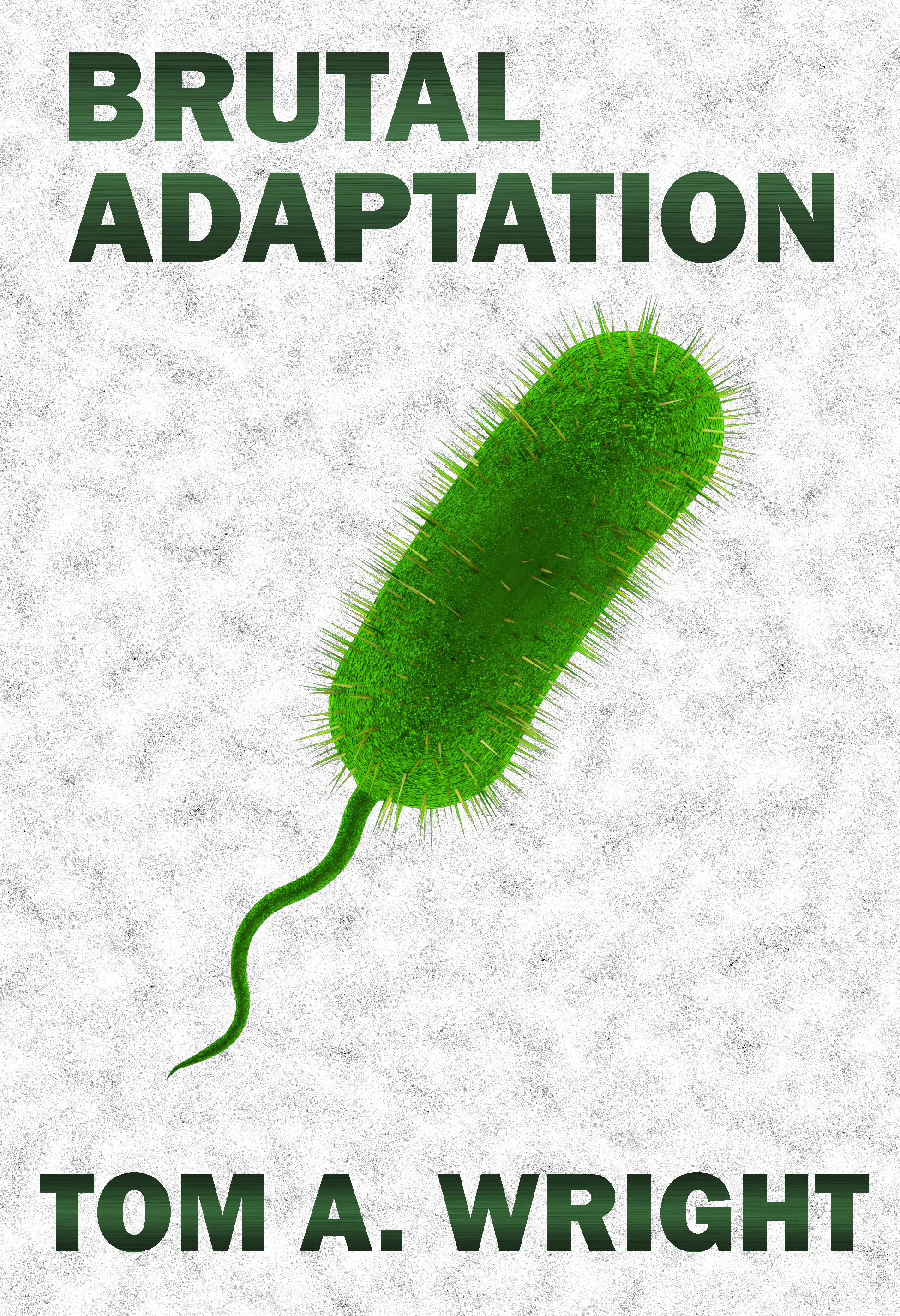
This is my newest proof-of-concept for this book. I took the advice of others and tried to mimic books from the Medical Thriller genre’. Keeping the background a solid white, however, just looked too sterile, so I added a grainy texture to it. And sorry to all those who preferred the round bacteria over the pill shaped ones, but google-searching images of specific antibiotic resistant germs displayed more of this style then the others. Besides, I believe the round ones look more stationary and docile while the long ones look active and aggressive.
[original submission and comments here]
Nathan says:
It… looks like a cross between a pickle, a tampon, and a sperm.
I think you’re moving in the right direction, but it needs a lot more refinement.
- I don’t know why, but it seems that a taller font (usually sans serif, but not always) works for the medical thriller genre.
- With the, um, ease with which the image of the germ could be misinterpreted, a visual cue that we’re looking at something microscopic would help a lot. Googling “view through a microscope” shows me this:
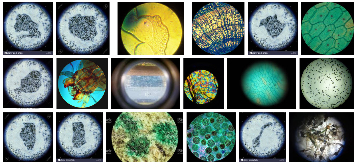
I think showing the blurry circle of the microscope is the main visual cue missing.
Put that together with your revised image, and here’s a five-minute redo:
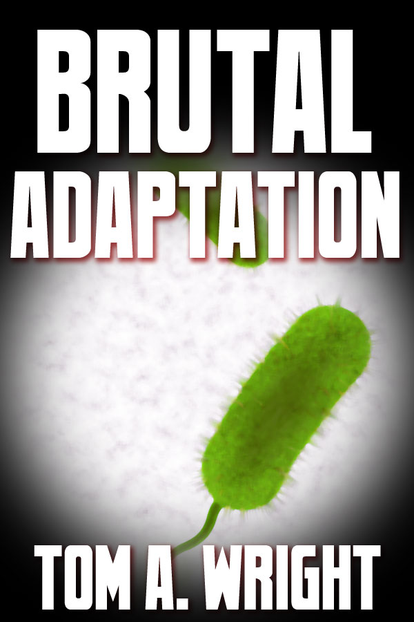
I’m not happy with how the microscope effect turned out — I’d want to refine it to make it more immediately recognizable as such — and the font is the first tall one I came across, but hey, five minutes.
Other comments?
I think that the main thing that works against this is the assumption that anyone would immediately recognize the image for what it is.
Even Nathan’s suggestion probably isn’t sufficient.
And there is the additional problem that a mere photo of a microorganism isn’t really enough to convey a sense of what your book is about, its themes or subject. Once again, I suggest applying this test: Imagine the title in a language you don’t understand. Would you be able to tell what the book was about from the image alone? Would you even be sure it is fiction?
Maybe the addition of another graphic ,like a dna strand, morphing from the normal strand into something different would help? The trick is to pick two easily identifiable objects to morph together, Something a reader will recognize at a glance so the change will be apparent to them. Maybe a simple human outline with a tail or something? I get there is likely no humans with tails in the book, but it would get the message across that humans are changing. (I’m picturing the additional graphic as a shadow behind the close up of the cell, like a background.) Maybe a graphic of a brain would work, the kind where areas are lit to show activity. if you put a brightly lit one as your background or one lit oddly, that might work.
sort of like this:
https://imgur.com/a/dmW9MiT
I tried it the opposite way but the cell graphic obscured the brain too much.
I’m not sold on the brain though as it doesn’t convey the whole skin disorder thing well. Maybe a rashy child’s arm/leg/hand/ etc would work.
I like the way you did the title. Tiverton?
I like what you did. The brain one wouldn’t work for my story, but the hand one might have. However, you inspired a different idea. (As well as B.L.’s own book cover submission.) My 15 minute proof of concept image is linked below. This seems a more appropriate way for me to go. Please, everyone, let me know if this idea works.
https://i.imgur.com/hOndD5W.png
https://i.imgur.com/loFjITT.jpg
Brother 1816. (which I got free in a great giveaway. It came with the web font too.)I just enlarged the first letters and the last one and fussed with the vertical spacing then clipped the layer mask to it to give it the ‘cells’
Lots of font sites have giveaways so it’s worth signing up to their newsletters to score some great stuff.
I added another image, a child’s hand with a rash and added some scaly skin to it, but any effect you wished could be added.(did it quick with no blending so it’s a bit crude but you get the idea) I was thinking a taloned nail would be cool but I’m unsure what the adaptation is so am just guessing.
Figured my post under S M Savoy’s firs post might get missed, so below is a link I mentioned up there. New concept. Let me know what everyone thinks. Thanks.
https://i.imgur.com/hOndD5W.png
That’s not bad, but a little too ‘clean’ for a ‘brutal adaptation’. If you used a background like mine and added some kind of edge (not unlike my petri dish graphic) this could be very eye catching. Just don’t place the fetus inside a set of nuclear rings. LOL (The red BG and petri dish are free to use images as long as you credit the creators)
Something like this:
https://i.imgur.com/UVlhiWM.jpg
Love that idea!! This is exactly why this site is so awesome!! It gives you ideas and perspectives that you hadn’t considered that can really spark your creativity. If the child will have visible mutations you could add a hint of that, scales, tails, elongated limbs, whatever it is. Or if it’s a mind thing, maybe enlarge the head a bit. Or if this kills the children maybe make part of the child green and black or malformed like it was dying. Nothing massive, something that just makes the reader ponder.
I loved the idea of adding some texture to the background too. Maybe play with the other elements of the story there. Like you could have a love letter in the background (maybe a ripped up one to fit your premise) or lab papers. Not that having more medical stuff wouldn’t rock too.
I don’t hate the font but its sort of boring. Maybe try making a few letters bigger. It might look cool to enlarge the L in brutal to intersect adaptation but that sort of thing you need to play with. It might look cool to keep Brutal in that hard font and put adaptation in a font with sharp or jagged ends, something with a hard serif. I’d also maybe change the effect to look more like blood platelets floating randomly in the letters. Or it might look good to have the letters change color drastically at the end of adaptation or even change fonts mid word for a brutal adaptation thing( I’m picturing a font that has stuff protruding from it as if it were adapting)(you can get that effect by layering the leaves, thorns, or whatever your having protrude over white/black text then using the trace tool and making a new layer that you color whatever you want). But those sorts of things need to be tried and played with. Sometimes the ideas don’t translate well at all. If you need help getting your ideas to translate, drop me a note and I can help you get your vision on paper.
Oh, I forgot to say, check wiki commons for the fetus picture. I bet they have a free one you could use. Adding the ‘womb’ around it like in your sample would be really simple
How about this?
https://i.imgur.com/JELapd8.jpg
Or this
https://i.imgur.com/gQerMqi.jpg
Love the needle!
I was trying different ways to integrate it into the title horizontally, then looked for ways to fit in the letters and came on the idea of the tube being the I, then from there I sized it to also be injecting (or extracting) the petri dish, then realized the grip would fit nicely into the A, so I borrowed your idea.
I like the creativity–but at thumbnail size, it hampers readability.
The original submission with the single object is not intuitive at all. I do like the microscope effect and the addition of a second germ. I’d probably move it out from under the text, but seems like a good way to go. Maybe also mute the green, it seems too cheerful – perhaps more brown to suggest dirty germs rather than yummy green vegetables.
All of the suggested remakes are great aesthetically, but I think they still miss the target. The cover image needs to be more explicit in getting across the theme, subject and nature of the book. The bare image of a bacillus or fetus does not do this. The addition of the syringe helps, but it is probably too subtle, being integrated into the the title. If would probably work better if it were part of the image of the fetus, since this might suggest a threat of some kind, or danger. Adding a DNA strand wrapped around the fetus might add toward conveying the idea of the book.
I’m not sure stabbing a fetus with a needle will entice readers. I have a fetus on the Relative Age cover but I stayed well away from depicting the reality of its fate in the story.
Wrapping a fetus with a DNA strand is also tricky and best left to a professional artist.
I wasn’t thinking of showing it being stabbed!
I was just having some fun
After many covers I’ve come to the conclusion texture is preferable over detail. Eye-catching colors and textures but with a clear focal point. Don’t contradict the story, but don’t try to recreate it visually, either. For us DIYers, the more detail we attempt to include, the more amateurish our covers end up appearing. I tried the fetus wrapped in a double helix and it looks terrible.
Here is a variant on my last one, with the DNA sequence over the entire background.
https://i.imgur.com/ssVM1tz.jpg
I’ve decided to use the fetus, but having it reflect the skin disorder. The link below shows my efforts in showing this. Please comment and leave suggestions.
https://i.imgur.com/FOcYPje.png
FYI, I think I may try to incorporate a DNA strand somehow. Still thinking about how to best do that.
Double Helix and new fetus
https://i.imgur.com/aSEaaXK.jpg
Now it just looks like some sort of coloration. At thumbnail size, it’s not going to convey the idea at all, I’m sorry to say.
I’m still struggling with what can be done, to convey–at a glance–the story/tone/theme of the book. The fetus image is always risky, for myriad reasons. But, if you’re going to use it, then definitely do something that clearly conveys to the reader that the fetus is being altered, somehow.
I agree.
The problem that I mentioned earlier remains: there is nothing to suggest what this book is about. The mere depiction of a fetus or bacillus is not remotely enough. There needs to be an additional element that clearly conveys the nature, theme or idea of the book. And one that does not require any prior knowledge of the story…which is the main problem with the skin texture.
Try fading it a bit more and randomizing the patchiness, leaving some larger areas and some relatively clear areas. it looks a bit to uniform right now. I would maybe try making the areas around the stomach and butt darker splotches than the head as if the disease is progressing. I’d also opt for a vein pattern as opposed to the flecks or maybe veiny and flecks. adding some ‘mood’ light to the embryonic sack would be cool too just darkening it a bit on the edges so it doesn’t look healthy pink. (A simple way to do that is duplicate the layer then use the color adjuster on it to make it darker. then use a layer mask on that layer to fade it out in spots with a soft brush set to a big size atop the first one.)
(You could also get some free pictures of skin rashes and disorders and then fade them into the fetus. If you use a layer mask and soft brush on the edge to of the picture so you have no harsh lines and then fade it, that should work nicely.)
I made a baby! Sort of…
https://i.imgur.com/poH1Ao3.png
More like this. Just subtle touches, not all over coloring. I used a flipper from a turtle on the foot but anything could be used. (I also spent no time blending or fitting it but just plopped it on to use as an example.) I’m not sure of the feel of the mutation he is going for but it needs to be integrated so it looks as if it’s forming naturally. But the human baby beneath needs to remain clear.There’s some nicely icky pictures of skin diseases that could be used or actual claws/ paws/ or deformed limbs/ etc could be morphed onto the fetus.
And I forgot the link…lol
https://imgur.com/a/3nxNe1s
Not bad at all. If that was combined with parts of mine I think it would be quite effective.
Getting there, for sure!
I think I might try getting the fetus to fill a little more of the space and make the disease/condition much more apparent.
Definitely improving compared to the tickle pickle
…aka The Torture Tampon.
I agree with that completely! I eagerly await Tom’s next iteration. He always has the funniest covers…lol
Wow; I take a couple days off and the comments section on here fills up! Well, you can see everyone here is offering all kinds of advice, so try some of it out at your leisure. As for me, I’ll say that if you’re going go with a picture of the nasty little bug causing the epidemic in the story, you should show a whole bunch of these little monsters under the microscope rather than just one; as others have noted, having just one makes it look like a green tampon with spikes and a flagellum.
Right??
I think we need to be careful here not to throw too much at authors in a scattergun way.
For myself I know I tend to leave long comments but I try to make sure my thoughts are in some kind of order within a single post so an author could go through and understand my line of thinking. I think multiple comments and mock-ups scattered through threads can probably be overwhelming so I try to reign it in!
Luckily S M Savoy seems to be keeping up with all the back and forth and getting the sense of the good advice!
That’s why the creators need to monitor and respond to the threads regularly to point out what they like and don’t like. They must provide a rudder to steer the direction of the suggestions. They (we) must also learn to let go of certain ideas and be open to new ideas. What we see in our mind usually doesn’t translate to the cover (like Art Deco type for a time travel novel)
Here is why I try to minimize my posts. This is directly from this site’s instructions on submitting:
5) Shut up. No, really, shut up. Remember that you won’t be standing next to every potential reader as they browse Amazon and make a snap judgment about your book based on your cover; the work has to stand for itself, without you defending your design choices. The only exception is if you phrase it in the form of a question: “You said the cover was boring; can you be more specific?” or “I was trying to go for a certain vibe; can you suggest some way to accomplish that?”
Honestly, I value my ability to post covers and get honest opinions too much to risk being locked out for being argumentative. It is just far too easy to type in a response to someone’s post and have it come across far harsher than you originally intended. As an example, B L, you keep posting image suggestions that utilize petri dishes. I can write several paragraphs on why, in my humble opinion, that element does not work for a cover in general, not to mention for the book itself. That could easily be construed as hostile. Or, I could just say I don’t want to use it on my cover. Although that may work for some, other people could get mad, wondering why the submitter is even asking for opinions if they are just going to be ignored. Seriously, I’ve gone back quite a ways to view posts prior to submitting mine, and I have seen comments making similar accusations toward the submitter. (For the record, I used the petri dish approach as the book’s first cover. The book didn’t sell utilizing it.) So, if someone wants to ask me specific questions, I’m more that happy to answer. If I have a specific question related to my submission, I’ll ask. If I decide to take a different approach to a cover, like this one, I will post a test image and ask for input, like I did here, or will resubmit a new version completely. Other than that, I choose to try to play it cautious and safe in minimizing posts. I’m sure other people do likewise.
There’s a difference between “you’re a poo-poo head who couldn’t design a rock” and “I like that element but feel it doesn’t work for this cover.”
I kept using the dish because you never dismissed it as a design element. Even if you’re worried about bending the rules, it’s not as if you can’t let me know privately.
This thread must be setting some kind of record for comments…lol
But I think if you’ve posted a mock up that got no reply you can safely assume it wasn’t matching the vision of the poster. They have no obligation to comment or care about our opinions. I also think most people hate the whole chore of cover design, while we enjoy the artistic process, they just want it over with. They dont want to chat about concepts. Some probably worry that using an idea from a mockup will mean they need to pay the artist or that it’s a conflict of some kind. And while I can’t speak for anyone else who posts mockup ideas, for mine they’re free to use modify or ignore any part of mine.
If I post more than 1 version unprompted its just to get a concept clear for myself. To me, it’s easier to make the picture than ecplain what I mean.
If you want a good spot to talk over design, try the cover design studio at Scribophile.com
I honestly don’t know when helping simply to be nice became a bad thing.
Whoever said it is a bad thing? I certainly didn’t. I love hearing people’s thoughts, and seeing their 5-minute image posts. Even though I haven’t said so, I’ve actually used many people’s ideas, then tweaked them to fit my needs. I’m sure that’s true with most other submitters. And just because something suggested or posted wasn’t used, it certainly was still appreciated (at least by me.)
I didn’t mean to imply it was. It’s super nice to spend your time and talent trying to help someone!!!
It is also fun to do so, when you have the time and an interesting idea. Look forward to a submission in which I have something suitable to offer.