The author says:
Local TV news reporter deals with a worldwide plague of antibiotic resistant bacteria, a conspiracy to cover up a new skin disorder in children, and his old high school nemesis forcing himself back into his life.
Although Brutal Adaptation could be considered a modern medical mystery, the science fiction elements of the story are too strong not to consider it sci-fi. It utilizes an around the corner type of science that was used often by Michael Crichton, without the embedded action sequences.
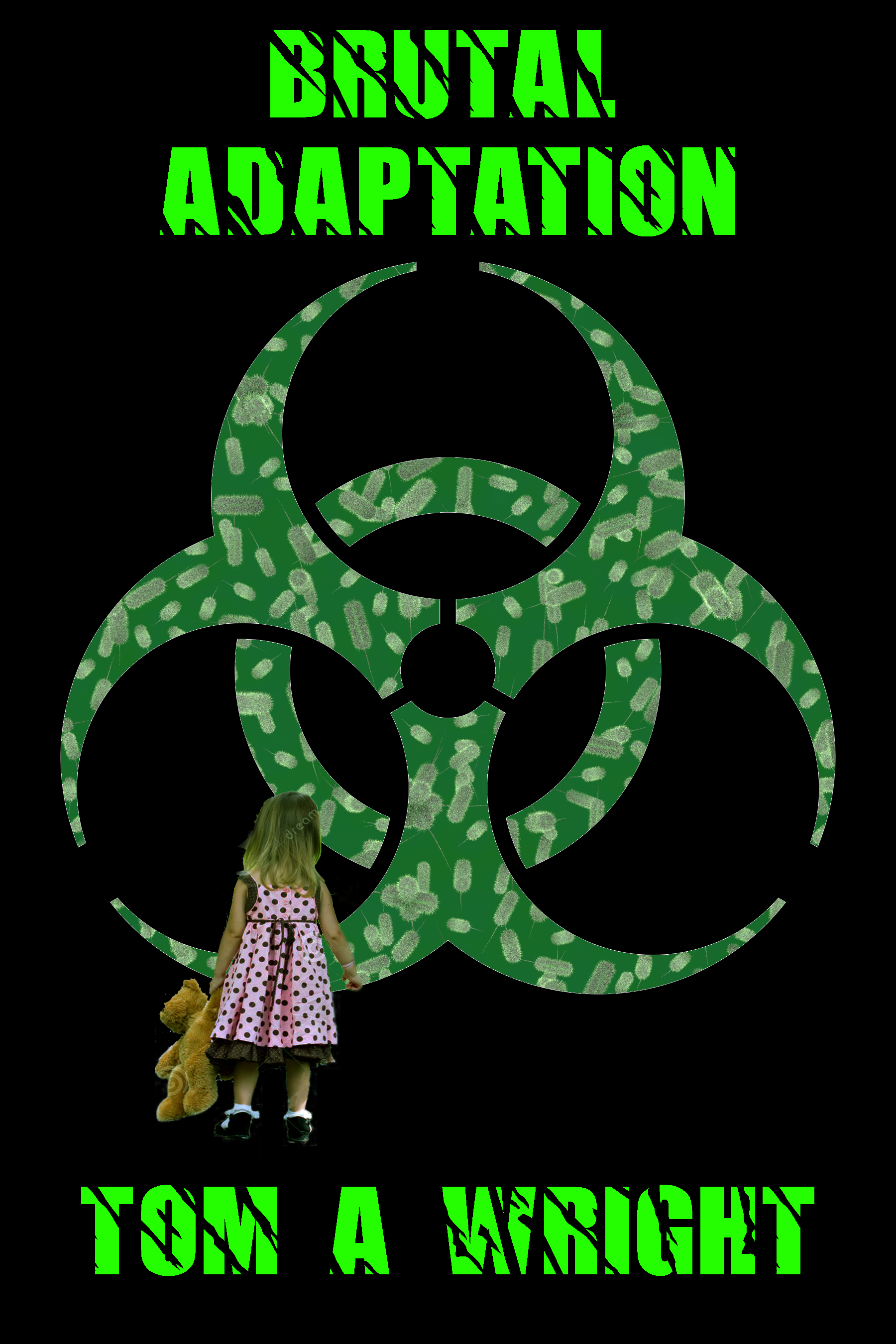
This is a test of concept for a replacement cover for my existing novel. One thing I am concerned about is that the font on this image may make it appear to be a horror story, which it is not.
Nathan says:
Whenever anyone introduces a cover as a replacement for their current cover, I like to seek out the current cover for comparison:

So yes, the new cover concept is an improvement.
I think the new font has other demerits before you get to the question of it looking too much like a horror novel; it’s also nigh unreadable, and even worse at thumbnail size.
And if looking too much like a horror novel is your concern, then definitely DON’T include a little girl and her teddy bear — anywhere other than a children’s picture book, that just screams “horror novel” to me.
I’m also not a fan of the biohazard symbol, if only because it’s so overused these days (and half the time, you see it on the cover of a zombie apocalypse novel — yet another false flag for horror novels).
You mentioned Michael Crichton as an author with comparable appeal. Obviously, it’s a problem taking cues from the covers of Michael Crichton novels, because the most important element on those covers is the big name “MICHAEL CRICHTON,” but let’s take a look at the “medical thriller” category, where you’d find such novels as The Andromeda Strain:

Here’s what I’m seeing: strong and clear type that dominate the “real estate” of the cover, and a single central image. A lot of reds, which seems to correlate with how “medical” the book is.
So: Find a simple image that says “contagion” or “infection” — a broken test tube seems to fit the bill. Either a dark red background if it’s a very “medical” story or, if your story concentrates more on the conspiracy as it sound like it might from the description, some other dark color. Clear, untextured type above and below the test tube, and Bob’s yer uncle.
Other comments?
I agree that the font is unreadable. I thought the title was “Digital Deception” at first glance. The black and neon green color scheme works. What if you used a similarly colored photo of bacteria? In a circle, maybe, as if shot through a microscope? The stuff in your biohazard symbol might work, if it was more neon… or something that looked more bacteria-ish and not quite so pill-form.
Just a little FYI note on the bacteria. I Google Image searched for antibiotic-resistant strains of bacteria (by scientific names) and this displayed more images of pill-shaped ones than the circular. Based on that, I chose to create the pill-shaped bacteria for my proof of concept test.
It’s far too elemental. Each piece is too separate from the whole. Perhaps use bacteria as a full background with the symbol as a bolder foreground element, possibly with a glow just to enhance it.
Or something like this:
http://a.co/66phLAk
I also submit two examples of indie covers that are simple without being simple images pasted together:
http://a.co/g3W38HT
http://a.co/ilZhuuG
Or almost anything by Robin Cook
5 Minute Mockup
https://i.imgur.com/HqZAkt3.jpg
Alternate without the biohazard logo. Instead I blended a doll’s eye into the petri dish.
https://i.imgur.com/tVfWFSL.jpg
Brilliant! (Though perhaps if the eye were a little more open it might read more immediately as to what it is.)
This shows the eye better.
https://i.imgur.com/aMIKMdW.jpg
I don’t usually comment here, but as someone who once pitched using a bio-hazard symbol to cover critics (https://covercritics.com/?p=911) I agree with Nathan. It’s way overused.
I ultimately went in a different direction and haven’t ever regretted it (thanks to the feedback I got here). I’d urge you to consider doing the same.
Hint: decorative typefaces should be used with caution and discretion. The first rule is that a book title be easily readable.
…and one in red…
https://i.imgur.com/fKqUkjG.jpg
Bio in red, just for comparison
https://i.imgur.com/fxwyCEd.jpg
and one with a girl…
https://i.imgur.com/snzZihu.jpg
The real problem as I see it is that you’re basically doing a non-action story in a genre suited mainly to action stories: most movies about viral outbreaks are (of course) zombie movies like 28 Days Later (which is largely to blame for the overuse of that bio-hazard symbol) and even those that aren’t, such as No Blade of Grass (in which a virus destroys most of the world’s food supplies) are usually Mad Max ripoffs in which survivors engage in violent struggles with each other over the dwindling resources. If this is more a story about the medical research going on at a laboratory or the political squabbling going on in the halls of government during the outbreak than about the common people rioting in the streets, then it needs to be presented more in the style of a clinical investigation story like The Andromeda Strain or a “chatty” political drama like Fail Safe. You’ll want to steer clear of the more vaguely military-themed symbols common to action movies such as anything involving stenciling; which includes that bio-hazard symbol, incidentally.
So the symbol’s going to have to go; what about the little girl? Unfortunately, due in no small part to horror movies like David Cronenberg’s The Brood, showing little children with stuffed toys on the cover in any context whatsoever is pretty much out of the question: their mere presence hints at threatened innocence, and hence at the horror genre you’re trying to avoid. Therefore, sad to say, you’re going to have to remove the kid and her teddy bear from your cover as well.
What to put in their place? In medical dramas dealing with epidemics, even when the story is mostly about all the arguing over what to do about the disease, any kind of equipment used in quarantines generally serves as a good visual shorthand for the central conflict. Take a look at the third act in the movie E.T. in which the government quarantines the protagonist family’s home, and you’ll have a pretty good idea of what kind of equipment that is: bio-hazard suits, breathing masks and hoses, medical gloves and sterile containers, and miles of transparent/translucent plastic draped over everything.
Basically, you could get a lot of mileage out of a simple shot of some medical gloves, or the head-covering of a bio-hazard suit, or a sterile container with some used swabs in it. If you’re looking to make this a “News at Eleven!” kind of investigative drama as well, you could also throw a reporter’s microphone or a press pass or the like into the shot. As long as everything’s at least somewhat relevant to the story, a simple montage of objects like that should clue your target audience to this being both a medical and investigative reporting drama.
Concerning fonts, legibility in the thumbnail should be your top priority, but I can see why you might want to use distressed lettering for the title and byline of this kind of drama. Generally, I recommend against using pre-distressed fonts, however: as with this example, the uniform appearance of every repeated letter betrays how artificial and prefabricated the distressing is. A better way to get distressed lettering is to use some kind of clean-cut simple font when typing out the title and byline, and then apply the intended distress effect(s) to them before placing them on the cover.
As our esteemed host says, this cover is an improvement over your current one, but it’s still a long way from where you’re trying to go. About the only parts that don’t need improvement are the color scheme and the layout. The irony of telling you that you’ve got a decent cover here and all you need to do to make it work is change almost everything on it has not escaped me, but that’s basically my assessment.
Like Nathan says, closer but still not quite the bunny.
Also like he says, check out those other covers in or near your genre. Notice the kinds of fonts that are getting used and how – simple, tall, blocky fonts. It’s one of those pretty immoveable objects of the thriller genre.
And the colour scheme. Red (coupled with white) do indeed often indicate a medical thriller. Green can also work, but you probably want it paired with white. Green and black says Halloween, green and white says pharmaceuticals.
On which note – almost all the covers have a simple pallete of twocolours, a dominating one and a highlight. This is essential for making things pop and also often for readability at thumbnail size.
So you’ve got some the right idea in keeping the palette limited you just haven’t got quite the right colours yet.
As for the imagery, a bio-hazard symbol isn’t a bad choice, it’s striking and instantly recognisable and communicative. But for that reason, like Bruce says, it’s really overused. You need your book to signal what kind of genre it is clearly, but you also need it to stand out a little. And another bi-hazard cover is going to look too generic and to be attention grabbing.
A bit of time spent in a stock site popping in different search terms can turn up much more unusual images to play with.
https://www.shutterstock.com/image-illustration/superbug-danger-concept-killer-bacteria-shaped-290695925?src=MTeXENz78f00wa9HR9M7ZQ-1-68
https://www.shutterstock.com/image-photo/gray-bacteria-viruses-various-shapes-against-749203273?src=S52ZVKg-8BFz3WULijVxfg-1-7
Here’s some sinister hospital corridors, one which leans on the straightforward thriller side…
https://www.shutterstock.com/image-illustration/scary-hospital-corridor-132587138?src=5W0g5YIism5v1JB1m3UY3Q-1-0
And a couple with more creative imagery that could be used to signal the paranormal/science fiction side, as well as the evocative point of children being at risk in this plot.
https://www.shutterstock.com/image-illustration/scary-hosptial-corridor-yurei-ghost-appear-132585575?src=5W0g5YIism5v1JB1m3UY3Q-1-7
https://www.shutterstock.com/image-illustration/scary-hospital-corridor-yurei-ghost-appear-132584939?src=5W0g5YIism5v1JB1m3UY3Q-1-33
One of the important things when looking for imagery is to keep an open mind and think about how imagery can be repurposed. For example, those last two images are intended as illustrating a specific piece of ghost folklore. But used cleverly, they could become equally evocative images of a quite different story and genre – yours.
All cool graphics that could be implemented to make great covers. I love how you’re thinking outside the box.
An observation from an author’s point of view. The comments often end up including a variety of ideas about what a particular cover should convey, many of which contradict one another. One critic says “Don’t try to depict the actual story” while another says “Tell the potential reader exactly what the book is about.” That combined with the sheer number of suggestions can easily reach the point of being overwhelming.
I try to create mock-ups based on the original covers because I believe the authors have an idea about what they want yet aren’t sure how to realize that idea or are limited by their budget, skill, or software. I’ve been there myself and found the most helpful inspiration came from looking at published or pre-made covers or by creating different versions myself. A cover’s job is to make the potential reader read the blurb to see if they want to read the book. Regardless of the cover content, if it achieves that goal it’s a good cover.
I believe everyone attempting to create their own cover or seeking feedback on a cover they purchased can find value here.
Two more ideas…
https://i.imgur.com/WZEftA0.jpg
https://i.imgur.com/7gkf68d.jpg