The author says:
Medieval Fantasy/Sword & Sorcery, new adult/adult novel.
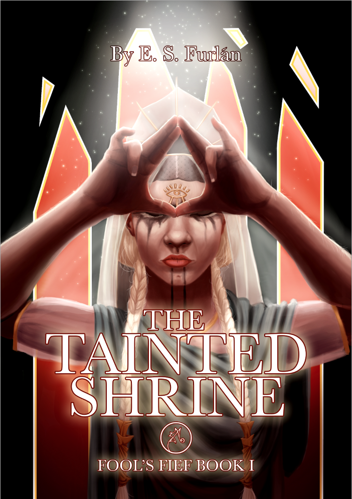
“Ilas is not the gentle goddess the invaders believe her to be, you know. There will come a time when her sword is all that stands between humanity and ruin.” Kanika, the scorned Seer, must reclaim her identity from the invaders’ Crown Prince Atham. Though her people may never forgive her, she must redeem herself through fire and blood if necessary and take back the land the Seers have called home for centuries. However, Prince Atham’s position is not as secure as Kanika would like. Prince Meto and Princess Elsephere both have designs on the throne, which would spell the end of any hope of justice for the subjugated Seers of Argorien. THE TAINTED SHRINE follows the fight for control of the conquered city of Argorien, the revolution that creates more problems than it solves, and the unnatural creatures threatening to consume the Fierce Lands in chaos.
I am both the artist and the author.
Nathan says:
Nicely done artwork, although the biceps could use some refinement.
However, the whole definitely doesn’t say “Medieval Fantasy/Sword & Sorcery” to me. The only element that even indicates at historical Europe are the girl’s blonde braids, which aren’t visible until one spends time examining the image. My guess at first glance would have been either non-European mythology, or science fiction incorporating non-European mythology.
However, a lot of that “Medieval Fantasy/Sword & Sorcery” vibe can be added by switching out the typefaces and perhaps adding some ornamentation or scrollwork around the borders. Even just replacing the garden-variety Roman-ish font with a simple uncial would do wonders. (Our resident font expert will be along presently with suggestions, no doubt.)
Also, the glow around the white letters makes the print harder to read. I would suggest a dark glow or simple drop shadow to separate the type from the image.
And finally, the “by” in the byline is unnecessary. When people see a title and a name on a book cover, they know that the name is that of the author. The only time you need “by” is when you need to describe the book: “A Historical Drama by,” “A New SERIES TITLE Novel by,” etc.
Other comments?