The author says:
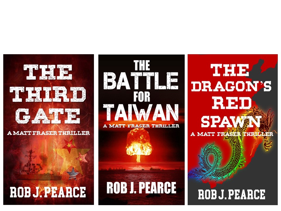
My cover for The Third Gate is ready to resubmit. The cover for the second in the series, The Battle for Taiwan is finished. The third book in the series is being edited and all books will go to amazon within one month. Because they are a series and the guys have not seen the third book cover or description, may I send a compilation of the covers and a description and ask for comments?
Nathan says:
The first book is the linchpin for your branding, so it’s a good thing that it’s the best of the three.
The typeface changes in The Battle For Taiwan are a definite mistake. You should keep both the typeface and positioning (obviously, with more words, the title won’t fit exactly, but the subtitle and byline can be exactly where they are in the first cover).I would go further in extending the look from the first cover to the second by adding a texture — maybe some culturally Taiwanese pattern? — to the dark areas at the borders and behind the title.
For the third cover, the length of “Dragon’s” is obviously the hurdle in matching the title type to the first cover, but with a little more tweaking of the spacing between letters (called “kerning”) you can get it a little bigger. Don’t let “Dragon’s” be the smallest word in the title — it calls attention to the space constraints. For the image, bring the dragon down so that his head is visible even if that means cutting off the tail, make the area behind the title darker, and add a matching texture.
Other comments?