The author says:
An enslaved Seer in a fantasy land must avoid death at the hands of her future in-laws and escape her abusive would-be groom, to the backdrop of civil unrest, wide-scale oppression of her fellow Seers and magickal assassination attempts.
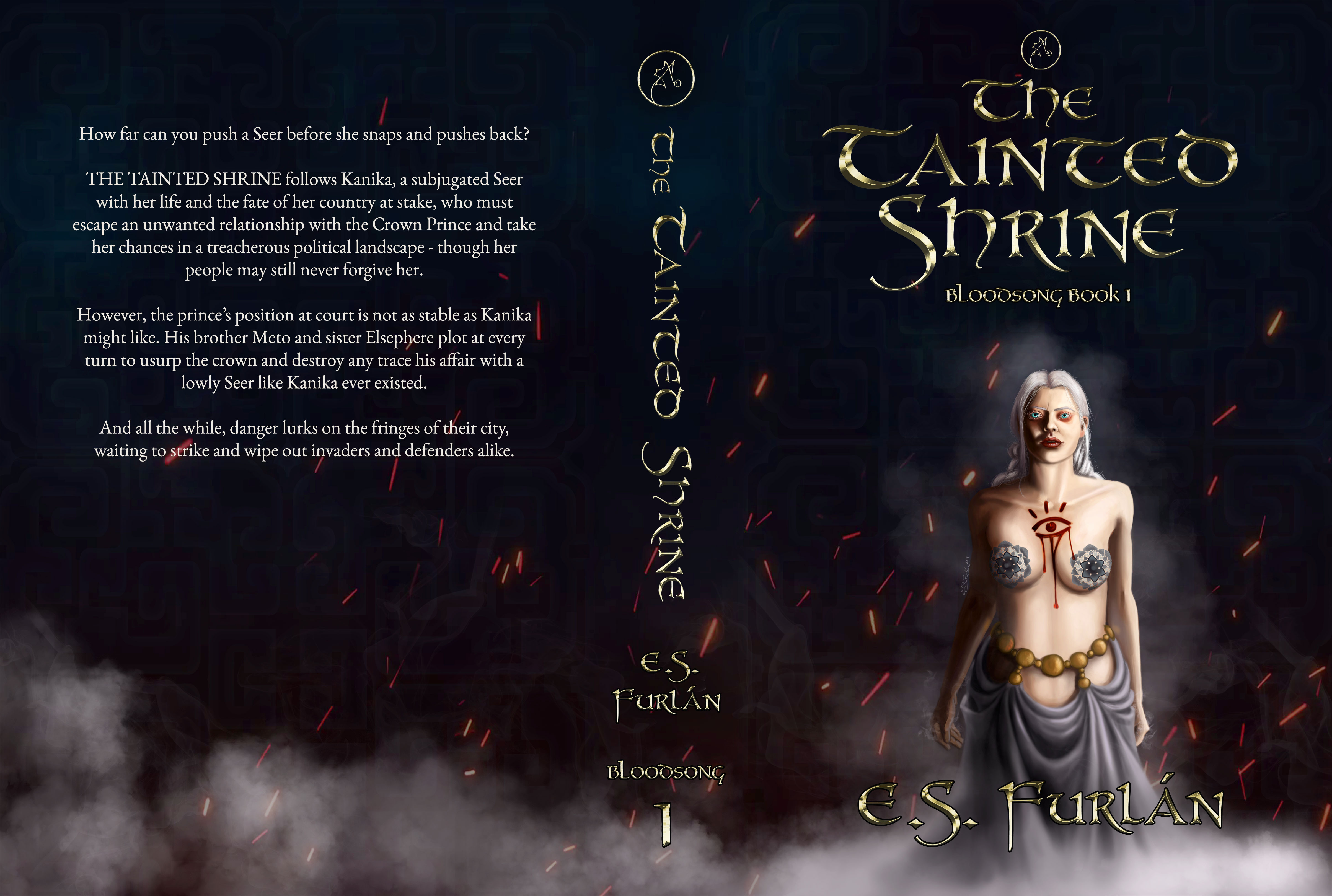
This is a hard copy cover illustration.
The blurb reads: “How far can you push a Seer before she snaps and pushes back? THE TAINTED SHRINE follows Kanika, a subjugated Seer with her life and the fate of her country at stake, who must escape an unwanted relationship with the Crown Prince and take her chances in a treacherous political landscape – though her people may still never forgive her. However, the prince’s position at court is not as stable as Kanika might like. His brother Meto and sister Elsephere plot at every turn to usurp the crown and destroy any trace his affair with a lowly Seer like Kanika ever existed. And all the while, danger lurks on the fringes of their city, waiting to strike and wipe out invaders and defenders alike.”
The genre is medieval epic fantasy with real-world parallels to domestic abuse, colonialism and mob mentality. There is a moderate focus on the fantasy religions and a fair amount of political intrigue, as well as moderate gore and dark themes. Target audience is new adult/adult, primarily women between the ages of 18 and 35, who are interested in medieval fantasy, political intrigue, spirit-based magic systems and feminism. Would appeal to readers of Ursula K. le Guinn, Robin Hobb and George R. R. Martin.
I submitted a completely different previous cover concept for this novel several months ago. I am both the book’s author and the cover illustrator. Thank you for taking another look at my book cover.
[original submission and comments here]
Nathan says:
This version works much better in thumbnail than the last — there’s instant comprehension both of the image subject and the genre. I do think the type needs to be a little clearer in thumbnail; make it either bolder or larger.
At full size, I think the art needs more refinement. The figure’s belly is just a flat waxy area, and both her eyes and her boobs are off-kilter. You could also add some texture to the fabric she’s wearing for contrast.
Other comments?
I’d rather see an image that’s photographic.
Not necessarily a closeup, but here’s my super quick mockup:
https://www.dropbox.com/s/akr17buym1gxn90/Fantasy_woman.png?dl=0
Ooooh, Tracy! That is VERY nice! Very tasty, and would appeal to me as a reader in this particular genre.
High compliment, Hitch! I blush.
So this cover’s got a bit more ooh-la-la than the last one… All right, assuming the sales sites will consider those weird tattoos on her breasts to be sufficient censors, the image at full size still needs some refinement. Even in thumbnail, the gal’s eyes look awfully creepy; up close, they look downright bizarre and threatening at the same time.
Her face is awfully broad, to the point that she seems to be sporting a man-jaw, and everything about her above the neck just looks awfully severe. Below the neck, one of those breasts is clearly hanging quite a bit lower than the other; people on the whole tend to prefer symmetry, you know? While I might believe that ornamentation around her midriff happens to be perfectly positioned to cover her belly button, covering that up just makes the rest of her bared midriff look awfully weird.
So yes, (arguably) sex sells, but your protagonist is a little too deep into the uncanny valley to be what most of your readership is likely to consider sexy. I recommend narrowing and softening that face, evening up those breasts, and letting that ornamentation hang low enough for the belly button to show. Your title and byline could also stand to be a few points bigger to ensure legibility at any size.
I will disagree with the above commenter about whether her face and jaw is too broad, partly because her head is tilted slightly upward, which visually broadens the jawline, and partly because the wide forehead and slim jaw look is heavily influenced by modern fashions. Her face is well within the range of normal human women’s faces. (source: years of figure drawing a range of humans, an MA in anthropology, and my own broad face that nobody’s ever had trouble distinguishing from a man’s.)
I agree with our host that the painting could use refinement. The main lighting source is white, which is pretty boring, and there’s not a lot of secondary or bounce light, which is flattening out her figure and hiding half of it
The light is also full of subtle inconsistencies that don’t quite add up.
I did a…well, you can’t call it a paintover because I’m stuck without my tablet at the moment and had to do all this with a trackball, so forgive inconsistencies.
https://i.imgur.com/xi5sxQw.jpg
Left half is the original, with arrows pointing out which direction the light is coming from on various parts of the figure, and some notes about the lighting.
I’ve also got a (trackball-made) doodle of an eye that shows how light reflects within it: the highlight is where light enters the eye, and it flows around the iris so that the lightest part of the iris is opposite where the light enters. Which is totally non-intuitive! Also, her eyes look dead in the original because there’s no highlight over the pupil. The cornea covers the pupil as well as the iris, so it’ll reflect on top of the pupil also.
If your intention was to show that she has been mentally taken over, then skipping the pupil reflection is good! If you watch anime or Western cartoons, you’ll notice that the animators remove reflections from eyes to signify that the mind behind the eyes isn’t working. So if that’s the case, I might experiment with pushing that and making her eyes flatter.
On the right side of the image I linked is a quick re-do to illustrate bumping up the lighting (which I didn’t get perfect by any means!) and a few anatomy/shadow things.
I used Photoshop’s Liqufy to bump up the size of her smaller breast a bit so it wasn’t as attention-pulling, and pushed in the area right above that breast so it echoes the shape of the other breast.
I faded out her collarbones and neck tendons a bit, because the harsh lines were pulling attention away from the bloody eye.
I redid the shadows on her face a bit–the shadow cast by the nose and the shadow cast by the chin onto the neck should be at the same angle. You can see from the arrows I put on her face on the left where the shadows were telling different stories about the location of the light.
As a general rule: cast shadows like the one from her nose onto her face, should have hard edges and form shadows, like where her cheek curves away from the light, should be softer.
I threw two color filters on top of the picture to zhuzh it up a bit: there’s a purply one for the light and a red-orange one for the shadows. I picked a cool tone for the light because it tends to lend an unearthly feel (check out the Throne of Glass book series covers to see an extreme example of cool lighting on a single figure contrasted with warm backgrounds), and the red-orange because of the sparks and because it’s opposite purple on the color wheel. In places that the filters overlap where I didn’t fully erase away one or the other, you accidentally end up with green or yellow–I think the green actually works on her hand, but not on her face. 🙂
The color filters took some red out of her eye makeup, lips, and the bloody eye on her chest, but that’s an easy matter to fix.
I bumped up the mist behind the left side of the figure (our left) to silhouette her and pop her out from the background, added a red/orange bounce light in the shadows of her arm, torso, and cheek to push that farther and to make the shapes come out a bit more, and added some of that to the shadows on her clothing and belt.
Her hair, being white, would be very reflective, so I did the shadowed side in red-orange and the light side in purple. The yellow-green highlight on top is unintentional, and there would normally be more variants of shades in her hair but again: stuck with a trackball today.
If you think I’m totally full of it, that’s fine, but the one thing I would strongly urge you to consider is my next-to-final paragraph above about popping her out of the background–it’ll make the figure stronger on the cover instead of fading into the shadows.
And now for the cover itself! You’ve got a lovely striking figure here (once it’s refined a bit more), and at her size you’re losing all the detail in her apprehensive expression and tense stance.
I’d blow her up and give her almost the whole space of the cover, getting rid of the dead space around. (You could use the painting as-is on the back cover.) That has two advantages: 1) you can see her fear/apprehension more clearly and 2) it fits with modern trends for fantasy covers, which is to front-and-center the title. It is totally OK to slap text on top of artwork!
https://i.imgur.com/t3D3HYq.jpg
As is the way when you have two round objects with center dots next to each other, her breast designs are eyes staring out of the cover, less obvious when she’s smaller, more obvious at this size. I fixed that by simply slapping the title over them, but I’d recommend considering a drift of fabric over them to make the eyes less prominent, since I assume the bloody eye and her expression are more important to the story than her breasts. If you did that, you could push the title down a little bit.
https://i.imgur.com/uSqXdGD.jpg
Note: I am not recommending this font. It’s just the most fantasy-like I have on the the computer I’m on right now. (It also doesn’t have an accented A so I had to misspell your name. I apologize.)
That’s a major improvement! It still think this is fundamentally the wrong image for this book as per my comment below, but these changes have pulled it away from the issues with rendering and even with subject choice/presentation for the cover.
I definitely prefer the second version, though. I agree about the breasts being inappropriately eye-drawing on the original cover becuase they’re the only points of fine detail and also, well, breasts. But the title letters so exactly ating as a censor bar is almost comical 😀
True! I think if the book was intended to be for readers of eroticized fantasy like Carey’s Kushiel saga, it might be more appropriate, but that’s not apparent from the description.
Although I believe women are a large part of the Kushiel audience, and the figures on the covers, while mostly nude, are not especially eroticized. If the author wants to go in that direction, I’d suggest studying those covers for ideas.
TITS!
That’s what you’ve got here. This cover will appeal to people who like breasts. That’s all. She’s still not doing anything; there’s still nothing else identifiable that could tell us anything about the world or about what happens in the story. All it tells us is that there’s fanservice for straight dudes. Which is a problem if your audience is women, especially feminist women. Hell, it won’t even appeal to women who are into women, since they prefer stuff like this.
It’s all very mystifying because in the previous thread you shared this GREAT sketch. It’s dynamic! There’s movement! There’s an intriguing hooded figure! We get to see the world!
Pleasepleaseplease go back and finish that sketch and use it as your cover. Please?
(Inb4 the inevitable dude shows up to tell me that women TOTALLY like titty covers.)
I’d like to second Gwen’s recommendation that you perfect that originally-proposed sketch. 🙂
Holy cow! That sketch is incredible! If only a couple of details, such as the hand, were a little more defined it would work as a cover as is!
Fourth-ing this return to the GREAT sketch. Feels mysterious!
As a fellow sff author who self-illustrates (or self-photobashes) most her covers, I feel like we have a distinct advantage in that, if we are careful to signal the appropriate mood and genre cues, we can bypass the posing and background limitations of stock photos, and thus stand out from the crowd.
I even liked the last try submitted ( https://covercritics.com/?p=2230 )–it’s very dramatic compared to this current submission, which is very static–anytime you have a figure facing dead forward without any contrappasto or expression you’re going to get dull, calming horizontals. Like, 😐
Your cover should hint at the kinds of emotions the reader will feel while reading, and I think the aforelinked sketch is, well, mysterious!
In fact, I think the #1 thing for you to research is typography. In all three submissions, it seems like that was mentioned as your weakest spot. My advice (worth exactly what you paid for it): Pick a fantasy font that’s like, 10-25% less fancy than you’d like, and then a nice elegant and legible serif for name and (perhaps) series title.
Please please please resubmit I follow this page because I am a makeover junkie and I really wanna see where this ends up. 😉
I’d like to second Gwen’s recommendation that you perfect that originally-proposed sketch. 🙂
Regardless of whether or not her jawline is WELL within the human norm, the reality is, as it’s drawn now, it’s unattractive, coupled with the off-kilter eyes and the quite off-kilter breasts. Now, I’m a member of the clan, so I know quite well that in real life, breast are indeed not perfectly symmetrical–but these are unfortunately quite noticeably hinky. This is probably because the pasties used here are pointing in different directions; if they were made parallel to each other, both vertically and horizontally, (prob. needing to be made a bit larger–the pasties, not the breasts!), then they would be far less noticeably off-mark.
I personally don’t find the woman’s face attractive, jaw and eye issues aside. She does look…I don’t know. Crazed? Her posture appears as though she’s throwing her shoulders back to push her breasts forward, like young girls do when they’re first growing their girls. The crease down her abdominal area is also a bit weird.
I think that Tracy’s mockup is quite strong, in terms of an attractive cover. I think that pseudohumans and illustrated people are so, so hard to do…especially when you’re trying to appeal as widely as you can, to many different people, all with their own tastes. If it were me, I’d be sketching a face based on a current female movie star, to try to hit as many bases as I could.
Lastly, font: fonts are usually where I focus my attention; the choices here are quite difficult to read. I realize that you’re trying to convey the fantasy element; the medieval sense, some Celt thrown in there, but there are other fonts that would suit your book better, IMHO. If you’re going to stick with this, I’ll be happy to suggest some fonts, but if you’re going to rework it a bit more, I’d rather pull some choices then. Remember, theme matters, but readability matters MORE. 🙂
I had written a bunch of stuff about why this image wasn’t quite working (the angles on her face being off etc) but ultimately it felt superfluous to what I feel about this cover which is: it’s simply the wrong choice of image for your book.
It’s quite possible that an image of your main character is the way to go (see below for the fact I actually preferred your previous artwork) but the figure would need to be expressing something about her character or story.
This figure is not doing anything or wearing anything hugely fascinating (I mean the outfit would be notable on Balham High Street, but this is a fantasy cover and it’s kind of generically blandly sexy-fantasy-girl. There’s nothing about her that really suggests specific setting). Her pose and face is ambiguous in emotion. There’s nothing to interest a reader. Bluntly, the only thing that grabs you about her is the fact she has her boobs out.
And if this was in the fantasy/erotica kind of genre, then fine. But that is not what your books sounds like. This image feels male-gazey and titilating, and I don’t really see any of that in your blurb/description.
The image might be an accurate rendering of how the character appears in the book but presented without context on the front she doesn’t any of the characteristics or experiences you describe, be that enslavement, subjugation, inner strength, power, insight, yearning for freedom…
I have to say I preferred your previous cover a lot. The pose and composition were far superior. The girl was making an arcane gesture, which is immediately interesting and suggestive of magic and fantasy. and I loved the way her actual eyes were all-but covered but an eye symbol visible on her forehead. That immediately told us a lot more about some of the book’s/character’s important details than this image does. The new image has a big eye symbol, sure, but nothing about the composition emphasises it.
What the previous cover lacked was not in the central figure or composition, it was in how that central artwork needed better support from the other elements.
The other cover just needed a better background or framing to the figure that gives us a bit more world-hinting detail, a better title treatment (which you have created here) and a little refinement to the fine detail of the figure
The concept is great, but the art has some real problems, which I suspect have all been already mentioned by others. Overall, it simply looks unfinished.
The typography needs to be rethought especially. Decorative type faces are fine but legibility is always the foremost concern.
I only just now saw the original sketch! Yikes! It’s fantastic! With just a little refinement on a few small details, such as the hand, it’s pretty much good to go as it is—that is, as a drawing (with a few better decisions on the typography).