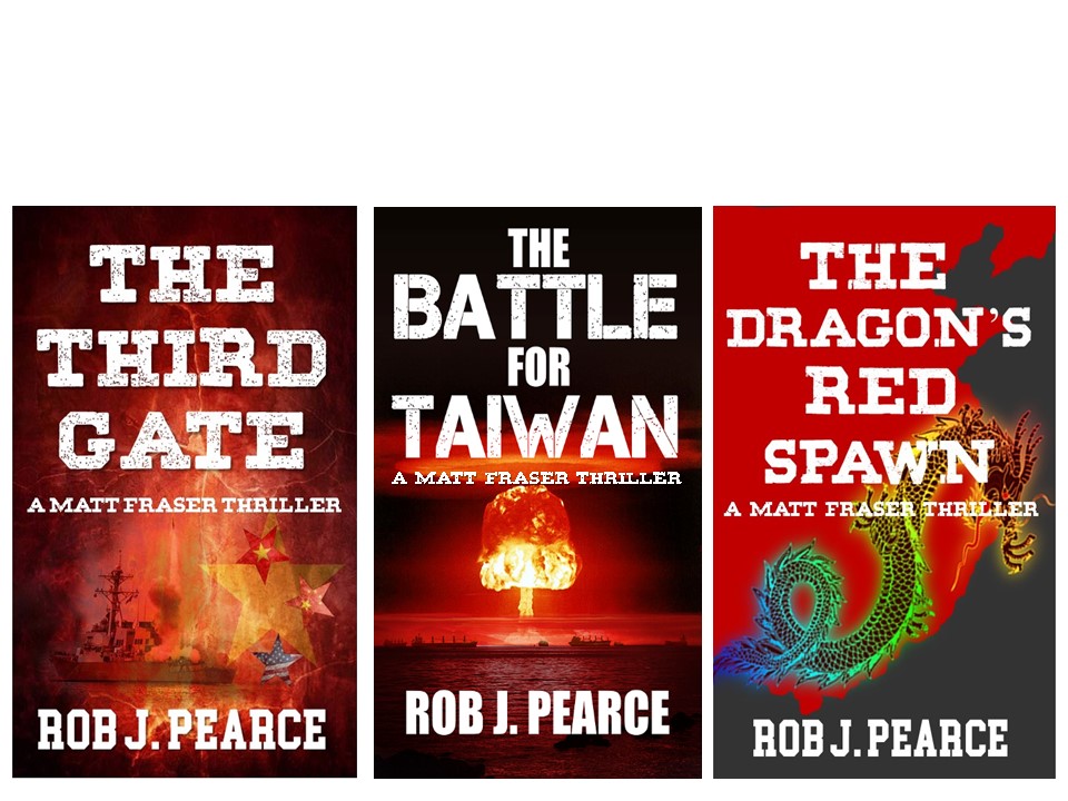
The author says:
My cover for The Third Gate is ready to resubmit. The cover for the second in the series, The Battle for Taiwan is finished. The third book in the series is being edited and all books will go to amazon within one month. Because they are a series and the guys have not seen the third book cover or description, may I send a compilation of the covers and a description and ask for comments?
Nathan says:
The first book is the linchpin for your branding, so it’s a good thing that it’s the best of the three.
The typeface changes in The Battle For Taiwan are a definite mistake. You should keep both the typeface and positioning (obviously, with more words, the title won’t fit exactly, but the subtitle and byline can be exactly where they are in the first cover).I would go further in extending the look from the first cover to the second by adding a texture — maybe some culturally Taiwanese pattern? — to the dark areas at the borders and behind the title.
For the third cover, the length of “Dragon’s” is obviously the hurdle in matching the title type to the first cover, but with a little more tweaking of the spacing between letters (called “kerning”) you can get it a little bigger. Don’t let “Dragon’s” be the smallest word in the title — it calls attention to the space constraints. For the image, bring the dragon down so that his head is visible even if that means cutting off the tail, make the area behind the title darker, and add a matching texture.
Other comments?
I assume you understand my example to be a mockup and was not intended to be finished artwork.
I like the typeface of the first book. I’d make ‘THE’ smaller and place it in the same spot on each cover, then scale the other words to fit the same width except ‘FOR’ and ‘RED’ which I’d make slightly smaller, perhaps the same as ‘THE’. I’d also place the series and byline in the same positions for each book for continuity.
I’m not crazy about the third book imagery. It doesn’t fit with the others and you’re covering the dragon’s head. Perhaps a different dragon which fits that space and rendered in fiery colors with a textured background to fit the series.
If you want to keep the country silhouette I’d suggest texturing it to show it’s a land mass (like a topo map).
I’d lose some of the overlay texture on the first cover, also. Highlight the ship and stars if those are significant.
Definitely heading in the right direction.
I can’t improve upon Nathan’s comments on the type throughout the series. I’ll just limit myself to a few words about the art. “Battle” is probably the best of the three in being the least ambiguous. “Dragon” has great use of color, but there are some issues with the design. It’s too bad that the head of the dragon falls behind the title and I had no idea what the random-looking black shape was until I looked closely. It’s always a little iffy to count on potential readers to recognize a map…and the problem was exacerbated by having the dragon obscure much of the outline.
The most problematic is “Gate.” The art is just a kind of blur, with everything swimming in a cloud with no significant contrast in color or value between any of the elements and the background.
I don’t know if this is a possible solution for the length of ‘Dragon’s’, but could the title be changed to ‘Red Spawn of the Dragon’? This would allow more emphasis on shorter words, red and spawn, that could easily be displayed in a larger size. The need to scale dragon down for length I think would be less problematic if it was the final significant word than the first.
Yes Kristopher the title can be changed. The Dragon’s Spawn is fine or any variance such as what you suggested.
I prefer the typeface on your first book but here are mockups to show how to tie them together better. The third book includes an antique map blended with the dragon, although it would need to be graded so it’s more visible.
https://i.imgur.com/pwvV1FQ.jpg
Thank you very much BL.
I though the first book cover was good except that the ship and stars may need to be a little easier to distinguish. I can’t do this because I am not a professional like you guys and my designer has left my city. I also like the second cover but dont know how to make the adjustment Nathan suggested.
The third cover is stricking, but I cannot make out the map behind the dragon.
I am definitely not a professional and barely scratch the surface of amateur graphic artist, but I’ve learned some basics. I know what it’s like to be limited and that’s why I’m willing to help.
S. is clearly more advanced and I like her concepts, but we are both willing to work with you to get what you want. Let us know.
Oh, Mine are only mockups so some of the imagery is not available or must be purchased. I found the map on Getty and the fiery dragon I borrowed from DeviantArt. If that’s what you want to do and can find replacements I can help. To be honest, I kinda like what S. did, keeping the main image grounded and having other elements as logos in the corner.
https://imgur.com/a/vS7RVAb
You can have them, I can tweak them to suit you better too if you like.
Very nice
I should’ve made the ship face front like the other two and the text needs fixing for the spacing, and the ship could use some more highlights… But all that could be fixed
WOW! Savoy you are a generous person. The third book is mostly about tracking down a final missing nuclear bomb which is a part of the Dragon’s spawn. Matt’s team chase the bomb to the Red Sea where the ship it is on gets trapped by British and American warships. Rather than lose all their money and effort the purchasers of the bomb detonate it in the Red Sea rather than their intended target of Tel Aviv. The bomb takes out a small port city with the perpetrators hoping the Arabs will attack israel again. There are no planes in the third book. I think the original first cover was good except for the lighting of the stars and ship.
To get the covers have a series feel they should have a sameness. It could be all warships, but that runs the risk of being too similar because ships look a lot alike to a layman. The pictures would need be very distinct. An option would be extreme cloesups of the ships, focusing on a weapons they’d carry, like the cannon, or copter. But maybe weapons would work or wrecks… Maybe a picture of the bomb itself for book three? Is it a missile?
Choosing the major graphic of each book is the time consuming part. If you’d like help melding them into a cover drop me a note. I’ll do it free but there would be lots of detail to talk about and I don’t think Nathan would like us spamming his forum over it so use my email. If you’d rather do it yourself and just want help getting an effect, I can help with that too.
But I can also mind my own business…lol
I get inspired by the art posted here and the ideas just lurk in my head until I put them on ‘paper’ so I post them because why waste the effort and I hope they inspire the poster too.
I am the same way but am far behind regarding skill and software. Still, I enjoy challenging myself while helping others.
Nice work either way.
Thank you S but I cant find your email. I would love to have your help, if you dont want to tell me your email here, my email is delphi7567@hotmail.com
I really look forward to hearing from you.
Rob