The author says:
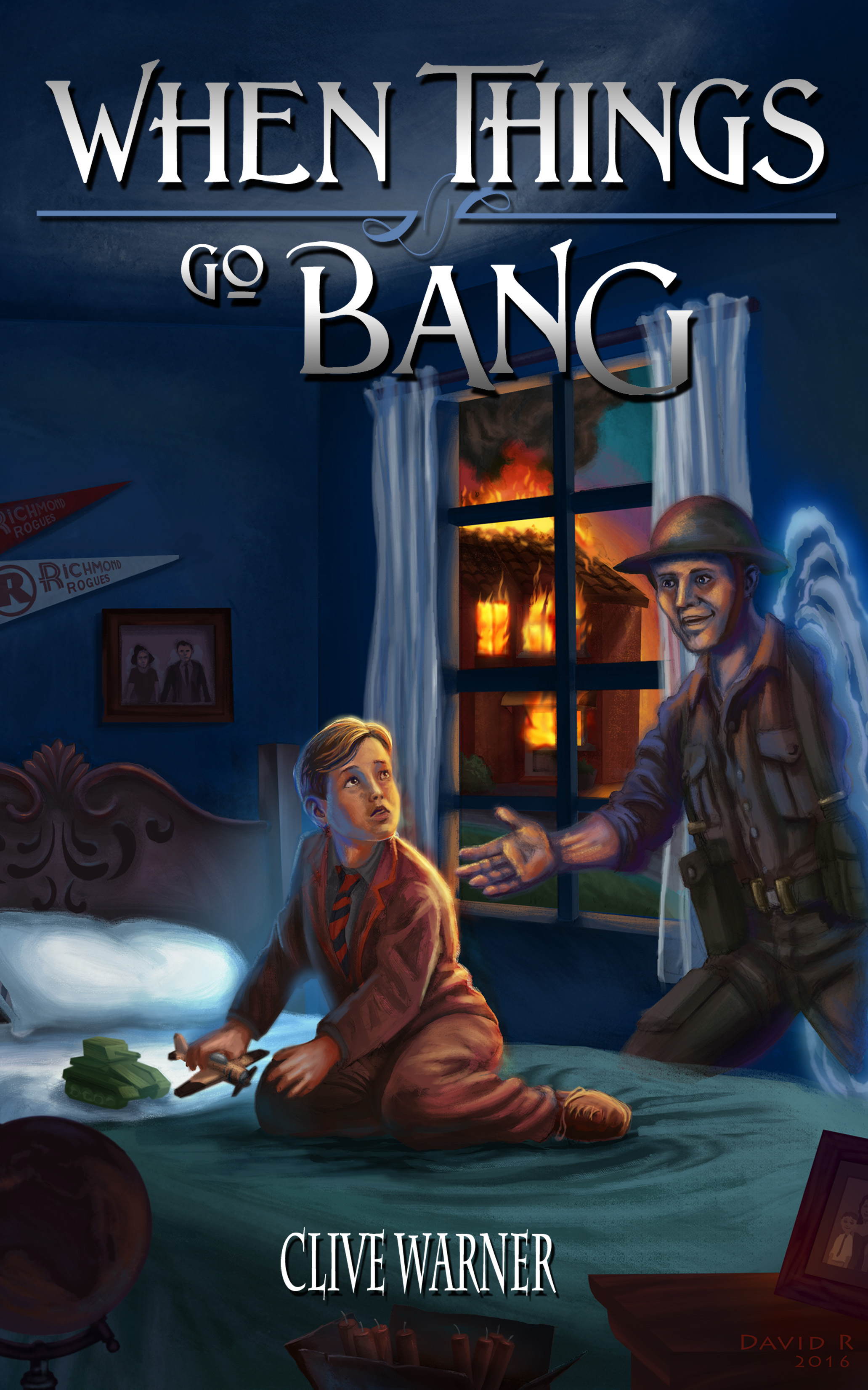
It’s 1959, in the village of Hightown, north of Liverpool. Soon it will be Bonfire Night, and Jim’s making his own fireworks. Crazy Joe Materson says there’s an unexploded bomb in his garden, and Dad’s in league with him to blow up the sand-stealing excavator. When dead Uncle Buddy appears from out of a stain on the wallpaper and takes Jim back to World War 2, that’s bad enough – but then Old Beardy, the Beach Hermit, gets involved.
Genre: Fiction, historical (1959 / 1942)
Nathan says:
I think the biggest problem here is that the artwork isn’t up to snuff — specifically Uncle Buddy. If you could get the artist to rework him (and perhaps simply re-tinting him all in spectral colors would work), you’d have it.
Other comments?
It makes me think of a novel/graphic novel for older children. Is it?
I thought it was when I wrote it, but adult readers like it a lot, so I have to assume it’s historical fiction.
The art needs some tweaking. As long as it’s for older kids it’s fine, but Uncle Buddy could be less opaque to suggest his spectral nature, and the thing behind him looks like an angel’s wing but then I thought it’s a portal.
I’d like to see a cleaner title without the divider and ‘GO’ being larger, and the byline is far too small. Hiding your name tells the reader you’re not proud of the work.
The story also seems to have trouble with its identity. Is it about two crotchety men planning to blow up an excavator, or the ghost taking Jim back in time? Who is Jim and how is he making fireworks if Crazy Joe Materson and “Dad” are exploding the bomb? Who the heck is the hermit and how does he fit into the story? Too much going on for a blurb, and possibly the story as a whole.
Well, to answer your questions, it is about two crotchety men planning to blow up an excavator, but that is the background plot that joins with the main plotline, which is Jim and his struggle to “fit in”; he is taken back in time and becomes his dead Uncle Buddy in WW2, thus realising why certain things are never spoken of by his parents. (It is 1959 after all, only 14 years after the end of WW2). The hermit takes the part of the “wise person” in the story, saving Jim’s life and providing him with a perspective on what happens in war – in the hermit’s case, World War 1, which we see briefly through his eyes, giving the narrative a third historic time period. The burning house is indirectly caused by Jim’s experiments with making his own fireworks, so the cover does reflect the story, I think.
That’s a lot and is fine. Make sure you pair down the blurb to the basic elements.
Why is the little boy wearing a tie and suitcoat? And why is the word “Go” smaller? It seems like a mistake.
The tie and blazer look like they’re part of a school uniform to me, particularly an old-fashioned one appropriate to the setting. Maybe seems slightly odd that the kid would still be wearing this in the evening, but I don’t think it’s too weird.
Meanwhile the detail that bothered me (possibly unjustifiably) is the pair of sports pennants on the wall. I think of these as a purely American thing, I have never seen any in a British context? But I think the author is also British so it’s probably my oversight rather than a case of an American author assuming a local thing is universal.
I, too, figured it was a school uniform.
It’s set in 1959, a much more formal period of history when rationing was still taking place in England; he is wearing his school uniform, which would have a tie.
Actually, I’d say the artwork is almost up to snuff; it’s just that the quality of the painting is a bit crude. Back in the days before digital photography, this is what we used to call being too “grainy” in a photograph that had been enlarged; basically, the analogue equivalent of what we tag as pixelation over on Lousy Book Covers. Mostly, it just needs some refinement to make the details a little clearer, either digitally or (if your obviously fairly talented artist is willing to go that extra mile) with maybe some colored pencils or a much narrower paintbrush.
All in all, this wouldn’t be a bad cover for an R.L. Stine novel, but again: finer details needed. The title and byline should also be a bit bigger, and use slightly more legible fonts. Other than that… very intriguing, especially since I’m also wondering why the kid’s dressed so formally while playing with his toys; and why nobody seems to notice there’s a house on fire in the background for some reason. (“Motivated seller!”)
I have one all-important question: Is this children’s fiction?
If it’s middle grade fiction, you’re set. The art is generally really good, although the faces need refinement (Buddy’s eyes aren’t level, and the two characters should be looking at each other).
But if it’s for adults, which is what it means when you label it as simply “historical fiction,” then this is all wrong. Modern adult historicals don’t have illustrated costs.
PS the type treatment is spot-on either way.
The art would be OK as a sketch for the cover…but absolutely not for a finish. It needs much more than tweaking…it needs finishing. And some thought needs to be put into the composition. There is no reason for the upper right-hand quarter of the art to be empty. Everything needs to be moved to the left and probably made larger as well.
The typography is simply misbegotten.
I meant upper left-hand quarter.
One of the main reasons for moving the entire image to the left is that I had no idea what was going on behind the soldier. Far too much of that portal effect is running off the edge. The first thing I thought was “wings.” It needs to be much more immediately clear what is happening. Understanding the cover should not require a reading of the blurb.
I agree with Gwen that the typography is nice…but I am unsure why there is a device separating “When Things” and “Go Bang.” (Nor, for that matter, why “Go” is as small as it is.)
The entire image should have been reversed so the unimportant elements are along the variance. During print trimming most of the wing portal and Uncle Buddy’s left arm will be lost.
See…to me, while nicely done, the Typography feels all wrong. Genre-wise, I mean. To me, that feels like type for a romance novel or saga. Not a time-travelling boy’s adventure book.
Is it me? I freely admit it could be, but I am not feeling it. Yes, nicely done, for a change, but I’d be looking more in the area of action-adventure, in fact, looking to the 40’s or so, for a font that yells it. Hell, Adventure would be nice for this, perhaps, even though it’s a trope. Traveller Adventurous, would work. Bsakoja might work–I’d have to see it.
I’d try a few, see if they convey the look/feel/genre a bit better. I don’t like disagreeing with Gwen–she’s right in that it’s nicely done–but it simply doesn’t feel right to me, for this book.
And yes, the byline is about 20pts too small, I think.
Sorry, brain fart–that one font is just Traveller. It’s on Creative Market, not to be confused with another font with a similar name.
Thank you for the interesting insights – much appreciated.
Like this:
https://i.imgur.com/PFcvpFl.png
When commissioning art or selecting stock images for a book cover the text, bleed, and trim variances must be considered.
Truer words have seldom been spoken.
Oh, god, yes! I see this ALL the time. We get lots of folks that show up, manuscript and image in hand. Not cover–image, and near inevitably, there’s just never any damn room on the image for the title, the byline, or for that matter, a freaking freckle.
(sigh).
Much improved! Though I wish the artist had matched the perspective of the “portal” to that of the wall.
It occurs to me that there could be yet one more improvement to the type. There is no reason to add a gradient to the word Bang. Not only do you lose contrast with the background, you blunt the impact of the word.
Wow, very interesting, thank you!