The author says:
Instead of going for the next book in the Dark Star series, I’ve decided to publish the prequel first. This book revolves around a child being enslaved due to his father’s debts. However, he plots against those people who has wronged his father and uses implements some carefully laid plans to weaken their enemies. According to his plans, he gets freed soon enough. But in a twist of fate, he ends up enlisting in the most elite army of the world, where his talents at formulating strategies are recognized. Due to being such an outstanding tactician, he is sent to coordinate a war to settle a dispute between two Kingdoms. But throughout the carefully laid battle plans, he keeps his eyes set on the one Kingdom that he seeks to destroy to exact his revenge.
Nathan says:
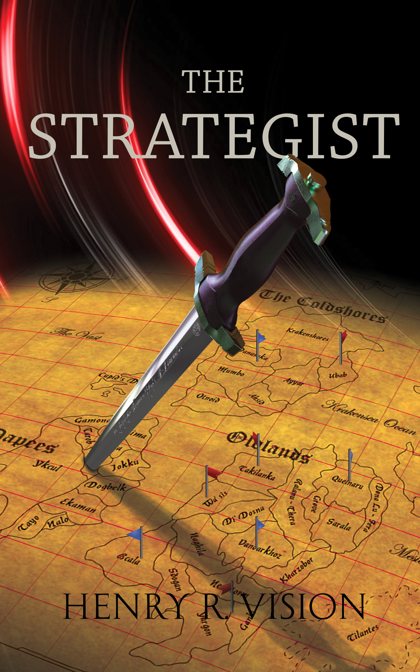
For a refresher, here is the published cover of the first book in the Dark Star series:
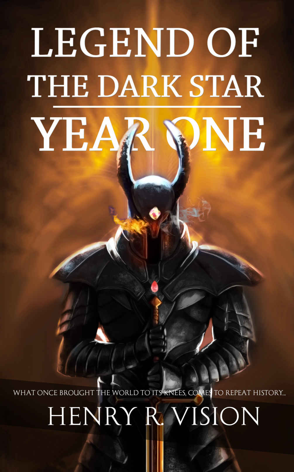
(Looks great, by the way.)
So what is there that can alert a fan of Book One that this prequel is right up his alley? The title typeface is the same, yes, but it’s a pretty flexible one that isn’t immediately identifiable as a “brand” (not like the Harry Potter typeface, for instance). Beyond that, not only does it not communicate clearly that it’s part of this series/franchise, it doesn’t even look particularly like a fantasy. Honestly, when I saw “map and stiletto,” my first thought was something set during World War II. Even a mailed glove resting on the map would be helpful. And there’s nothing wrong with putting “A Prequel to the Legend of the Dark Star Series” above or below the title.
Also, the byline ends up practically invisible.
Other comments?
To be honest, the first thing seeing the map with the dagger in it brought to mind was this clip from the intro to Command & Conquer: Red Alert, albeit with a more medieval feel. If you were trying to imply this book is mainly about wartime politics between two quasi-medieval kingdoms, then you’ve pretty much got the right image for your cover there. A word of caution, though: this does place the emphasis more on the milieu than on the character. Again, if that’s what you want, that’s fine; otherwise, not so much.
Your title and byline are also appropriate for consistency in the branding, but to ensure legibility, you should try tinkering with the color of your text; especially the (currently nearly invisible) byline. You do also have plenty of room for a dividing line and subtitle or tagline just like on your original book, so feel free to put something there telling your prospective readers that this is a prequel to that other book of yours they may have previously enjoyed.
It’s a decent cover, but not the right cover to go with the published one. The common color palette ties them together, but only loosely, and the map is not recognizable at a glance as a fantasy map, so it doesn’t solve the genre issue. Possibly you could magic-up the dagger, a burning blade charring a bit of the map where it pierces perhaps.
You could arrange the title as “Legend of the Dark Star – The Strategist” to provide common branding with the published cover by identical text placement. It doesn’t seem critical that it be listed as a prequel, especially if further installments will be ‘Year Two’, ‘Year Three’, etc. This will still require a work on making the byline visible, since just switching to the other cover’s color won’t improve matters much with the differing background.
If you have the art chops, consider a human figure of the strategist at a map table placing pins and moving markers around the battle map. This would fit with the branding better while still incorporating much of the intent of this cover. I am uncertain how to give the fantasy element in this case, however, unless the character in question can appear in some sort of robe with runes.
I agree on the lack of branding. A font would have branded it, had a unique or noteworthy font been used for the first cover, but it wasn’t, as that cover was so remarkably driven by the great piece of artwork.
I do have an idea, though, that’s relatively affordable, I would think–what about making the map area smaller–after all, nobody is going to read the map titles, cities, etc.–leaving more black area, for the title, and put a dim outline of that amazeballs helmet top, behind the title? IOW, an outline of the top “half” (ish) of the helmet, behind the text.
That would brand it, IMHO. It also enables you to add the tagline or subtitle so that the dim amongst us would say “oh, yeah, THAT book!” if they don’t see the helmet outline or the coloring, or your name, etc.
About the byline–yup, that’s gotta be fixed. You can TRY white, but I think it’s still going to blend right into the map. I think you’re going to be stuck using a dark background banner, to make it visible. That, or, can you put a big dark lake, on the map? And plop your name inside that dark lake?
I’m a bit underwhelmed by the purple hilt. The color, I mean. Also, that knife appears to be QUITE modern, not remotely medieval. Can you age it a bit? And I gotta say, ain’t nobody gonna notice the engraving along the blade, if you had that done deliberately.
Overall, I don’t hate it, but I do think it needs a bit of tweakage. The outline of the helmet behind a larger top portion, making the knife a bit more suitable for the time period, and fixing the byline issues would, I think, work pretty well.
I would rate this as “adequate.” The image would be serviceable with some small improvements (those little flags appear to have been added in Publisher), but it’s always going to be a very generic image with a map that looks more like a random map generator than a real place.
But the main thing is consistency. If you wanted to do CG Objects On A Desk for all your covers, that would be fine, but you went with Photoshop Paintings of People (which I think is the stronger choice anyway), so I think you’re pretty much locked in to Paintings of People from here on out.
I also concur that a tagline mentioning the series name is a must.
Thanks for all the helpful suggestions.
I will definitely add the series title or a blurb, linking this book with the other one. However, it’s worth mentioning that although this book is a prequel to the other one, this one isn’t focused on the fantasy elements as the Legend of the Dark Star. This is more based upon introducing the character and the world that the story is based upon. Should I still go for a fantasy setting?
2. What can we do about the flags? Should we recolor them? Make them bigger? Increase their numbers? Add shadows like the dagger’s?
3. I have two concepts that could be added: A part of a crown showing up on the bottom right corner (I wanted to incorporate this idea in the beginning but then I though it was better not to clutter anything). Or we could place two gauntlet wearing hands on the bottom of the map, as if the strategist is leaning on it off screen.
But if we need to add more fantasy element, that dagger could be made to glow in a fiendish aura, I guess.
Henry:
Why do we care about the flags? Do you think that people will read the map, in a thumbnail, or even on the larger version on the Amazon webpage? I have to tell you, I don’t think that they will. I think that perhaps, someday, if you have LOTR-type fame or fans, they might be interested in a map, or the flags, but I’d be shocked if you could find one person today who was remotely interested in them at all (who isn’t also related to you, that is).
I take it that my idea of an outline of the helmet from the first book, behind the title, is not doable? Instead, you’re going to try to go for a crown? Do your readers have a strong visual, of a specific crown? Are you thinking to revamp the first cover, to incorporate this? (I hope not, but if you don’t, how will it be branding?) Perhaps instead, again, the helmet’s outline, in the lower-right-hand corner, if that’s where you want to put it? Something recognizable from the first book?
I don’t think making the dagger glowy will address the fantasy element. I mean…it can be read too many ways. I’ll let others address it further, but I think the bigger issue here is making the branding obvious. That’s why I suggested making use of that very distinctive helmet, but if that’s a no-fly-zone, I’m not sure I have other ideas, at least, not yet.
I’m interested in hearing why you’re focused on the flags.
Because I believe that the flags are the only thing that’s creating the distinction between a “war room map meant for strategic planning” and a “regular map with a dagger shoved into it”.
Perhaps, then, the answer (on the map) is to zoom it a LOT. Don’t make it so all-encompassing. Make the focus smaller, by making it larger, so that you can have larger flags or a larger flag, like a single targeted town?
Then you could do the burned edges and perhaps the maille glove. BL is right–because your first cover did come out so amazing, you’re kinda stuck living up to that. 😉
I can’t add to much substantial to the discussion. The art is nice but does fail to convey the basic idea that the book is a fantasy. It is clear upon close examination, but a cover needs to communicate immediately.
The dagger-in-the-map would work much better if absolutely everything about the map were larger: the borders and names and especially the little flags. If the latter were three or four times larger they would not only be more readable, but would help alleviate much of the cover’s blandness. But even if all this were to be done, it still would not be immediately apparent that the book was a fantasy. There needs to be at least one additional visual element to convey that.
Since your Year One cover turned out so good you have a high bar to maintain.
LEGEND
of the
DARK STAR
_______________
THE STRATEGIST
A Prequel Novel by
HENRY R. VISION
Lose the modern-looking circles and add something else, perhaps very translucent fire, or let the map full the cover but fade out at the top and bottom to better accentuate the text.
Shadows for the flags. Pretty easy to add.
I really like the ideas presented of having a maille glove and the map being scorched where the blade penetrates to add a fantasy element.
On a side note, I didn’t recognize this as one of your books until I saw the Year One cover Nathan posted
https://imgur.com/U1BEUqw
Here’s another concept though. Let me know if it makes any difference. I’ve asked the artist to incorporate Ms. Hitch’s idea as well. Let’s hear your thoughts while that one is being prepared.
Better in some significant ways. The glove definitely helps, and the fact it’s stabbing the map adds drama.
I still don’t like the very modern-looking circles. A simple gradient like Year One would be better
You ended up with a great first cover so embrace it. Keep “Legend of the Dark Star” the same for all the books to make them instantly recognizable. Your tag is consistent, so I’d suggest not mentioning prequel unless that’s important to know ahead of time. In that case you could rewrite the tag to include that information or open the first chapter by posting a date or “X years earlier…” Another option would be to change the subtitle to “The Beginning”. Then the series continues with Year One, Year Two, etc.
If Oldlands is important, zoom into the map a bit more and move or remove the flags hiding it.
The smoke or ‘magical mist’ doesn’t work for me, especially being green. I still like the idea of the knife tip starting to burn the map to show it has powers or serve as a metaphor for the character’s power.
Ok, I definitely don’t love the green smokey stuff. There’s something sickish about it, so..nope, don’t think so.
I do very much like the gloved fist (mailled). Good work there. Good work on the byline, much more effective.
So, you’re two for three there, as far as I can see and say. 🙂
https://imgur.com/PDcNOgy
https://imgur.com/Br4F122
The first one is with a more realistic fire while the second one is meant to give it a more fantasy feel. We’ve also removed those “modern looking red circles” and replaced it with a medieval looking wall. Any thoughts?
The realistic fire is definitely better than the mystical smoke
I still think you need to keep Legend of the Dark Star the same for all books.
https://i.imgur.com/2OSkFAz.jpg
When THE is smaller, line it up with the top of the main word.
Is it necessary to label this a prequel? One of my Arosil books is a prequel but that is never indicated.
What is your trim size?
BL, conceptually, I like the idea, but, man, you are taking up a lotta, lotta real estate with that. I’m not sure that’s the best use. I get where you’re going, and I don’t disagree in concept, but ouch on the space.
I agree. I was going to have the subtitle in three lines but it’s far too cluttered as is. Another reason I’d like to see the prequel mention go away.
Even in my example the image would have to be lowered more than I was able to do.
Trim size: 6 inches x 9 inches
I didn’t label it as a prequel at first, but Mr. Shumate suggested that I should. And honestly, “The Strategist” made the design a bit “empty” with a lot of blank space, that my previous book didn’t have. It’s more for branding reasons.
I was wondering if there was a way to retain the similar typography as the first one, but focusing more on “The Strategist” than “Legend of the Dark Star”.
But I’d really love to hear Mr. Shumate and Ms. Hitchen’s thoughts as well, on this new design.
If you use CreateSpace (although I’m sure others use the same template) your full cover with trim variance and bleed should be 1837 x 2775.
I wouldn’t brand it a prequel if the book is written in such a way it can be read in any place in the order. If you wrote it to work best after reading other books then you might consider numbering them in some way.
SPOILER
Arosil is numbered 1, 2, and 3 but 2 is the prequel. Even so, 1 and 2 can be read in either order and still work, and both end leading into book 3 (2 leads into both).
I live to serve. 🙂
Alrighty, first, I think you definitely want to use BL’s idea, of the layout of the title text, with “Legend of the Dark Star” featuring prominently, above the title–this retains the typography of the first book, and happily, works in your favor for branding this one, too. I would try to marry BL’s layout, with a teeny bit less real estate used up, with one of your newer concepts.
Now, the new concepts…I would use whichever of those two is the most visible, fire and smoke-wise, at a thumbnail. I don’t believe that anyone’s going to see the eerie purple-shaded smoke, in thumbnail, not effectively. (One of the things I really hate about Imgur is it’s such a PITA to try to easily resize an image, quickly, to see how it appears in various size views.) However, this is MUCHO betterer.
I think if you incorporate BL’s suggested Typography (as I said, with a squince less real estate, if you can, used up), and then step back and use whichever layout looks best and most effective at thumb, you’re there.
Oh, one last comment–I don’t think “a prequel” needs to be so big. Arguably, the clickbaity-ness of the cover will get people to click through to the sales page, and THERE, they can read in smaller print, on the cover, and on the Sales page description that it’s a prequel. After all, presumably, it’s the LOTDS stuff that’s drawing them in; or, if they are new, they won’t care that it’s a prequel, right? either way, no point in making it larger and weightier than it needs be.
Well done, IMHO. I think you’re pretty much there. We’ll have to see what the others say, but…yeah, I think it’s nearly done. 🙂
I wonder whether, for a house style, you could keep the background of the first book and put a new image in front for the second book?