The author says:
*** Proof of Concept ***
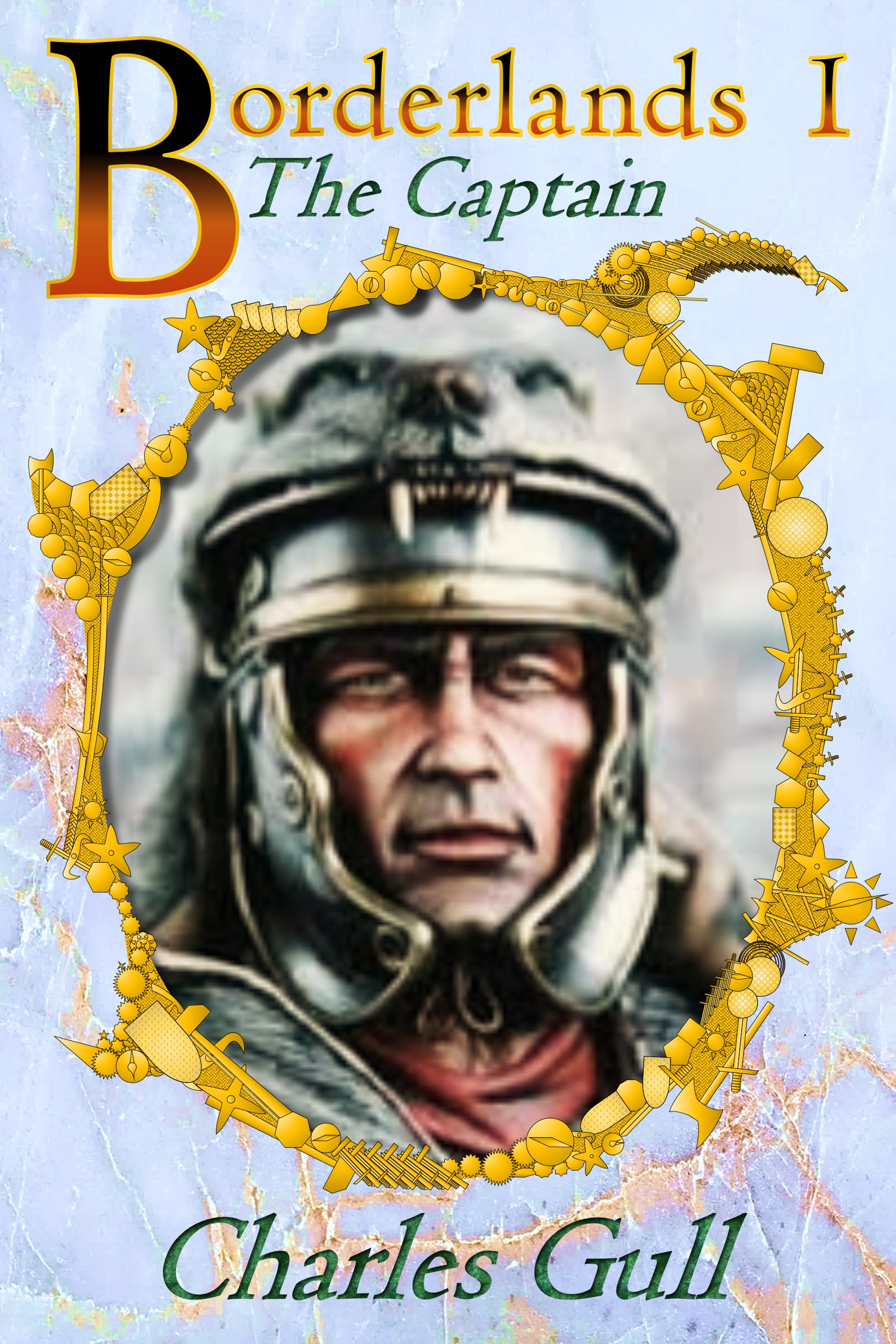
Title: Borderlands 1
Genre Keywords: Fantasy / Greco-Roman Punk / Creation Mythology / Existentialism / Transcendentalism
Narrative Style: 1st Person Present (but NOT specifically YA either)
Book Format: Story broken down into a series of short episodes. Each episode from a different / unique character perspective.
Intention: Establish a strong but flexible branding. Each book has the same basic cover layout. Main title number, Subtitle, Portrait and frame embellishments change each time.
Comments: I am interested in all your comments and suggestions and, to maximize their value to me, please be clear if you are talking about: this book cover as a stand alone piece; this book cover as the first in a brand; the execution of this example of a piece of artwork.
Book Blurb (early draft): The ambitious Cpt. Banak Doneir of the Aether Guard leads his men on patrols into the barren, inhospitable and forever corrupted Borderlands where they hunt down and destroy the encroaching Spawn of Chaos. Back home in the Rationalle there is no respite. He must battle against red tape and beurocracy, avoid the attentions of his powerful, yet mean spirited, family and win over the woman of his dreams. It only takes one slip for the delicate balance of his life to come crashing down. Can he protect his beloved homelands whilst remaining true to himself or must he become the thing he most despises in order to overcome?
Nathan says:
There’s a lot of good stuff to work with here.
Regarding the series branding elements:
- Lose the italics.
- Your choice of a light border on the series title, against a light background, makes the letters effectively thinner and weaker.
- Similarly, the light marbled background outside the oval frame matching the background inside the frame wastes an opportunity for contrast. Have you tried a dark background outside the frame?
- The ornamentation on the frame really doesn’t fit. You’ve already got a guy in armor as your main image element; surrounding him with itty-bitty martial ornamentation is overkill.
Regarding the artwork for this cover: The underlying artwork is good, but I assume that you have it in a higher resolution for the real cover, yes?
Other comments?
I especially agree with the ornamental frame being an ill fit. My eye is drawn to it first as I try to make out what it is, and then I am confused by the too-detailed artwork.
The marble texture background, the engraved treatment of the italicized typeface, and the over-stylized title add up to too much going on.
Okay, so I’m getting a ‘this has to calm the heck down’ kind of vibe here.
Noted. Thanks.
Uninteresting typeface. Go bold but period appropriate and lose the texture. Texture on texture is like stripes on plaid or belt and braces.
Bland color palette
Multiple illustration styles: Airbrushed portrait, line drawn border, photo background.
Fuzzy Main image. I see Nathan’s comment about a high-resolution version and raise it by hoping this is not the intended image since it seems to be a favorite among meme creators.
Why bother with the marble background and weird frame? A quality image can stand on it’s own. If you need a background, I also suggest going darker to highlight the inset. Search DeviantArt for Unrestricted Stock backgrounds. Many can be had free in exchange for credit and a link provided to the creator.
Side note:
I realize this isn’t about the blurb and it’s a first draft, but I can’t help myself. Let’s look at “He must battle against red tape and beurocracy, avoid the attentions of his powerful, yet mean spirited, family and win over the woman of his dreams.”
Including “red tape” and “bureaucracy” is redundant, as is “battle ‘against'”. Hyphenate multi-word adjectives and Oxford comma that bad boy no matter what pretentious new writers claim.
“He must battle the bureaucracy, avoid the attentions of his powerful yet mean-spirited family, and win the heart of the woman he loves.”
Also, the blurb should fit on the Amazon information page without requiring the potential reader to click ‘Read More” (about six lines).
Firstly, many thanks for giving me feedback. Also, I have no idea how to reply directly to Nathan’s comments so I shall roll them in here because there are some duplicates. I hope this is okay.
1. Artwork Image
a. Yes, the portrait image is of poor quality.
b. No, I was not intending to use it in the final version.
c. Yes, it was about number three on bing.com image search when I typed in ‘Roman Soldier helmet’ (or something similar).
d. Yes, I thought it was good enough for a proof of concept.
e. Yes, I shall almost certainly commission better bespoke artwork for the final version.
2. Background
a. Yes, it is a bit too bright and twee.
b. Yes, it is not nearly dark and brooding enough (it is the darkest and most saturated I could get it in Microsoft PowerPoint without it just turning into a grey block)
3. Typeface and Font
a. Is it a fundamental problem with italics or just for this particular project?
b. The title text does indeed stand out better on darker backgrounds. Together with the drop capital I was attempting more of a ‘guilt edged illustrated manuscript’ type feel. Looking back on this now, I can see how ‘period inappropriate’ that is. Nonetheless, nobody has trashed the drop capital itself so I might keep that. I was toying with a closing drop number but it looked a bit too ‘mettalica’ ish.
c. I am struggling to perceive what makes a typeface / font boring or exciting. Is there some measurement criteria or is it simply gut reaction?
4. Concept
a. I know I am not supposed to ‘defend’ my submission but instead try and absorb the good advice given. Nevertheless, I have been asked a direct question and so I shall answer it.
b. The motivation for the ‘weird frame’ and the general concept comes from the principle that each episode is very much a literary portrait of a single character within the story. I literally experimented with a ‘cameo portrait’ treatment. Several further episodes are cameos of other military personnel. I was, for instance, concerned that the distinction in uniform between a cavalry captain and a junior signalman might be difficult to get across in a portrait. With this in mind I experimented with embellishing the frame with artefacts. Each character would get a different, but appropriate, set of objects. Furthermore, extending the ‘punk’ aspect (perhaps to far), the embellishments also include clockwork or mechanical geometry. Next, I was experimenting with scaling effects. I was hoping that the same design could be scaled all the way from tiny thumbnail through to big poster. At poster size the embellishments were to bring pertinent fine detail whereas at thumbnail they should just collapse into a kind of texture. Maybe it was all just the dumb naïve idea of a noob.
5. Blurb
a. Yes, it is quite awful. I just threw it together so as to have something. It does need a lot of work.
Cherry-picking the points to respond to:
3(a) In general, the italic version of a non-italic font just doesn’t work well for a book cover; it removes the solidity and firmness of the original font, without replacing it with elegance/grace/what have you that a dedicated italic font conveys. (And in this case, elegance etc. isn’t what you’re going for anyway.)
3(c) As with every other element on your cover, the typeface needs to CONVEY something. Maybe it’s a historical flavor, or a mood or theme. Maybe other elements on the cover do most of the “heavy lifting,” so the biggest function of the typeface is its readability, but even if that’s the primary function, it should be doing something else as well.
4(b) Part of the problem is that any element of the cover which is ONLY intelligible at full magnification isn’t pulling its weight. The other part is that, with everything else on the cover being big and bold and easily understandable, the thin lines and tiny geometric patterns seem out of place — and then, when the reader has turned his/her attention to deciphering those small shapes, there isn’t any reward for that attention; there’s no real information conveyed in random martial images beyond what we already knew from the armor in the main image.
I see you have an eye for the juiciest and ripest cherries…. 🙂
Thanks for the clarification.
I do want to speak to the font. Nathan’s point is utterly legit–when you try to italicize a font that doesn’t have an italic face, it doesn’t work very well (yeah, I’m lookin’ at you, INDESIGN!!! [Sorry, little pet peeve rant there, not directed at you, Charles.]).
Secondly, the other problem is, it’s practically Times New Roman, with some fancy coloration and borders. It’s not telling the reader anything at all. It’s not saying “historical fiction” or “alternate universe martial fiction,” or “something-punk story.” It’s simply there. NO, it’s not awful, but it’s not helping you sell the story, either.
Question–and before you say it, yes, I realize it’s unique and all that, but–if you were going to say, this is this ONE genre, or sub-genre, or sub-sub-genre, and readers of these 3 other books would love this–what genre, sub-genre or sub-sub-genre would it be, and what 3 other books would YOUR readers also love? From your cover, I really have no idea what that is, (sorry) and your draft blurb isn’t really giving it to me, either. Fantasy? Sci-Fi? (The Chaos thing..?). You mentioned punk–do you mean Steampunk? The Roman Helmet makes me think not, but…
I’d like to make a few suggestions, but at the moment, I’m flailing a bit on fonts, because I’m not sure who your intended reader is. Or what other books s/he reads.
When you targeted that reader, whom did you see? What age, gender, and all that? Once I have that, I can probably help a bit with the fonts.
Ah, yes, flailing. That is probably my fault. I think you are in sympathetic oscillation with my own flapping on the subject of genre. 🙁
As far as ‘the whole series’ is concerned, discussions of genre are going to go nowhere. It is an interwoven matrix of several different and disparate genres.
Concentrating on the first bunch of episodes (of which Borderlands is perhaps the first 8), probably the best single genre designation is Grimm Dark.
On the matter of ‘Punk’. In my head, the suffix ‘Punk’ does not convey a genre in itself but rather a stylistic treatment or overlay for a base genre (others may differ in this point). For me, it conveys the intent to step outside the limits of what is possible in a strictly physical or period sense and mix in ‘higher’ properties or knowledge. In many ways Punk implies a form of magic, a subtle form of Handwavium that is never spoken of but permeates the background as an unseen enabling force.
Steampunk is certainly the first and best known example of this, but there are others (cyberpunk, dieselpunk, etc..). My direction with Greco-Romanpunk is to punk it up in the Classical era a bit. Even with a limited understanding of material properties, they were such fantastic engineers and builders. Imagine what they might have been able to achieve with high precision manufacturing technology…
Please Miss, may I change my answer?
After much thought and research I have adopted ‘Bronzepunk’ (and maybe ‘Ironpunk’ or ‘Mythpunk’) as genre descriptor least likely to cause confusion.
I am having a jolly hard time finding good examples of other bronze punk books. However, the film ‘300’ is considered to be within this scope. Nevertheless, the Blood Slasher typeface of 300 is quite unsuitable for this series. It isn’t quite ‘punk’ enough. Also I am going to have significantly fewer man-boobs on display.
Oh, and here I was all for the manboobs!
Sorry to disappoint. Imagine less Beefcake and more Treacle pudding. 🙂
It’s tough to hear criticism, but that’s why we include suggestions along with our critiques.
I’d suggest a simple fluted stone frame for the portrait and use the overall color and/or background color to differentiate each book rather then tiny unseen details on the frame. For an extreme example of using different colors for each book look at my series. You might not want to go that extreme but it shows how powerful color can be. Also, if you have outlines of the other books, try to get the imagery for all of them at the same time and build at least the base covers together. I created my current series covers side-by-side so they match perfectly.
If you still want a specific visual element to identify each cover portrait, find a simple frame with an integrated placard at the bottom and use that to individualize them.
The point of not defending your post is to encourage you to accept criticism. That being said, if you know a specific element is important and you’re passionate about keeping it, by all means defend that choice. Another of my covers is very different from the original, but I kept such an element which I felt is very important.
I posted the sample edit of your blurb to show how you can whittle it down without losing content. A good lesson for our books, too (and one I learned the hard way).
No actually, hearing your criticism is the easiest part.
What I am struggling with is not bursting into tears about how helpful, open and supportive you are all being.
As a writer I have experience of a lot of discussion/ self-help forums in all sorts of subject areas. Quite honestly, no-one/where else on the internet projects ‘protective play area’ the same way you guys here do.
I throw (my best effort at) a half arsed attempt of a cover at you and you all respond with professional decorum and enthusiastic energy.
If the internet had a “Best place to just try shit’n’stuff out” award, I would run a campaign to make sure this site got the biggest medallion.
A small side note, though this isn’t really a blurb critique site, ‘red tape’ is a fairly modern idiom and even bureaucracy has a lot os specifically modern connotations. Such verbage could act against the Greco-Roman ambiance you intend if you don’t use them carefully. Thought it could be a useful point.
I hear what you are saying. Though it was the Greeks and, even more so, the Romans that invented bureaucracy, modern usage has weakened the association.
As far as ‘red tape’ is concerned I am, however, guilty as charged.
Definitely bureaucracy was there, and they should be there. It’s the added meaning the word has accumulated over the centuries that could cause problems. It’ll be a needle threading to avoid evoking things that are more present in the modern psyche, soviet systems or the US agency structure as examples. I more mention it to ensure awareness than to make any complaint.
Absolutely, your comment was received in the spirit intended.
‘Tis but a shame that the sins of the fathers must be visited upon the children…
This feels dated in layout and detailed, it reminds me of 80s/90s series covers. Partly its simply that including a frame (especially a circular, decorative one) was popular then and and not now. Partly its the combination of decorative elements that don’t really meld. That feels very 90s – it verges on Vaporwave!
The layout is certainly easily improvable, taking into account the points mentioned abve: lose the marble backdrop, find a frame that better evokes the setting/genre and work on the typography a bit.
You’ll get a better cover, a servicable one. Though I have to say I question whether sticking with this direction is going to get the best possible cover for your book.
The current idea is pretty weak on communicating (let alone enticing) what your books actually is. This looks like straight historical fiction whereas your book is actually fantasy.
You might not actually need to lean into depicting the fantasy-ness. I’d say at your book’s end of the fantasy scale covers tend not to be so overt with that stuff. But the imagery you’ve chosen leans too far the other way, implying straight historical realism.
I’d look for imagery that picks up on the greco-roman influence more loosely. Less specific imagery that manages to convey a sense of greo-roman-ness and a touch of magic or spirituality. And rather than looking for literal images, look instead for graphic elements and styles that convey that sense just in their styling E.g.:
https://www.shutterstock.com/image-illustration/pencil-drawing-on-old-paper-angel-376308385?src=dJqiQwCK9dtEpJKiOAHAPg-3-84
https://www.shutterstock.com/image-vector/logo-roman-eagle-1110386975?src=D7g5kmZ9CKoNyuAiEZsnqA-4-63
https://www.shutterstock.com/image-illustration/chariot-full-colorful-deck-major-arcana-380995960?src=fMYAKjqdYvVANzuNmjsZ8g-3-34
https://www.shutterstock.com/image-vector/hand-drawn-antique-style-sun-face-661439881?src=fMYAKjqdYvVANzuNmjsZ8g-1-4
https://www.shutterstock.com/image-vector/ancient-soldier-spartan-warrior-tattoo-swords-1011603643
1. Hmmm, Vapourwave / Hardvapour is probably a good call on the look of this Proof of Concept. This probably stems from me throwing it together in Microsoft PowerPoint. There is indeed a lack of coherence. I was hoping that with sufficient squinting it might just blend together enough to communicate an idea. Any final version would get a far more consistent treatment in a proper graphics package (Gimp if I do it myself but ‘whatever’ if I commission a professional). This submission is as much about communication as it is about a finished cover design.
2. I am certainly not hard bitten and dedicated to taking this route. What I do need is a layout that is very flexible as far as genre is concerned. Though the first episodes are ‘Greco-Roman punk esque’ the series later spreads and mutates. There is going to be some Urban Fantasy that bleeds into Realism which in turn goes a bit Hard Sci-Fi eventually (before looping back again – yep it’s a mess!). One of the background ideas was to change the style / shape of frame as the series progresses. Start with something classical or familiar and then gradually become more and more alien and bizarre. The existence of a frame links them all but the nature of the frame demonstrates their differences.
3. The ‘iconographic’ or ‘symbolic’ treatment is certainly something I have also considered and played around with. I can certainly see it working across a limited sub set of episodes. However, I am struggling to envision how to make it sufficiently flexible so as to retain something in common as the whole series progresses. Otherwise, each episode shall just become a stand alone item with no branded feel. Any and all suggestions would be gratefully received.
Let me just remark on what you wrote in 4. Concept, b.
I think you have fallen into a trap that snares many authors: the lack of objectivity. Much of what you are describing seems significant to you only because you are intimately familiar with the story. To the uninitiated, however, they are meaningless or puzzling. The elements in the frame are a perfect example…aside from the fact that no one should be expected to spend even five seconds trying to decipher details on a cover. (Frankly, the same criticism applies to a poster.)
A book cover needs to get its message across in the briefest glance, and all that message needs to do is communicate with the potential reader something about the nature of the book or its themes. It should be neither a visual puzzle nor something that can only be appreciated by someone who has already read the book.
At the moment your cover is simply bland and uninformative. A portrait surrounded by a frame consisting of fiddly arcane detail conveys no sense at all of what your book is about.
I think you need to start over from scratch.
Yes, you are probably quite right. My ‘being on the inside’ does indeed inhibit my ability to ‘see it from the outside’. That is exactly why I created this submission. You guys ARE on the outside and that is what makes your advice so invaluable.
So, well, yes, lovely. I am not passionately committed to this concept so I would be quite happy to start over again from scratch. I would be even happier, if you could point out “Where’s North from here?” (sorry, couldn’t resist the Gorillaz quote)
I had an idea, maybe put the clockworks etc in the background instead of the marble. I’m imagining very subtle designs not big in your face graphics. I like the frame idea just not the frame you have. but a simple frame with the title as a plaque might rock.
Sort of like this
https://imgur.com/a/w5N0itC
Nice
Yup! Nice work from Savoy as usual!
But I still have no idea of what the book is about…or even if it is fiction for that matter! Like the original, it’s just a portrait in an oval.
Savoy greatly improved upon the original concept, but I think that is so fundamentally flawed that an entirely different direction needs to be taken.
Let’s treat this like one of your assignments. Assuming you had to use this format, — A framed portrait– what could be added/changed to make it more powerful?
I think BL was on a good track with a more active portrait than a close up on the face. Adding some background to the character could go a long way. Adding some lighting to the gears, maybe as if lightning was hitting them? or maybe making them bloody or having blood drip from the portrait? I think adding a clearly fantasy element to the background behind the guy , like a clockwork spire, mythical creature, etc would go a long way to saying fantasy epic.
I loved the Braveheart font, it has a much ‘harder’ tougher’ feel than the simple one I choose. adding a hint of glow could add some fantasy.
adding a colored drop shadow to the frame to give it more of a portal feel might help.
Maybe even a subtle recolor on the guy would work, to make his clothing the same style as romans but an unexpected color
Maybe adding some otherworldly jewelry? or effect to the armor?
First off, I would make the frame as large as possible, and make its details a great deal larger and of fewer, simpler and more recognizable elements. The portrait would have to be much more interesting and contain something that suggested the nature of the story. Working with the background behind the figure is very good suggestion.
Oooh, and putting my name at the top also strokes my ego. (and why not?)
It can be fun, creative and inspirational to shop for fonts using interesting search words. Pay a few bucks and get something unique.
A few I found:
https://creativemarket.com/Anthonyjames/2171323-Osgard-Pro-Font
https://creativemarket.com/kristian.koh/1412889-BRAVEHEART
https://creativemarket.com/graphiklee/1096569-Stalwart-Typeface
Of course, before you fall in love, be sure it’s readable.
My pulse did skip a bit at BRAVEHEART. Not only is it good for the Borderlands episodes but it would also be flexible enough for the Sci-fi stuff later on. Especially when used with appropriate back plating as shown in the lead image.
However, I am concerned that in terms of readability it might suffer a bit from the ‘Pepsi Challenge’ effect. A first glance is great but you wouldn’t want a whole gallon of it.
Hmmmm….it might be fine for a major title. Don’t rule it out. OTOH, it’s $18 to try, and that’s ouchy, if you’re not a designer and can’t use it someplace else. Hmmmmm.
I want to say, we need to find a perfect font for this–because of what you said to me, above, about the genres. If you’re crossing genres and all that, then you need branding—and as you’re going to go in various directions, then branding is probably going to be primarily done via font. If you can get one that rocks, then you can mess with the designs more than if you try something like Trajan Pro (I know, I know, with Roman-Punk, it’s gotta be tempting…just based on the name), which could be on any cover for any book in any genre. For something this different than the average bear, you’re going to need that font to stand up and scream “hey, this is MY series!”
I wouldn’t rule out Braveheart yet. Yes, it can have a bit of the Pepsi Challenge thing going on, but with enough contrast, it might work. My concern about it is that it might convey a different genre than you intend. It’s got a “knocked the edges off the Third Reich” vibe going on. So…let’s wait until you get your artwork a bit firmer, and then let’s do the fun part–let’s go font shoppin’. 🙂 (As you can tell, my fave part…)
There are thousands of fonts. To do something special takes time and effort and patience. You may end up trying dozens, but don’t give up. For your concept around this series, you’re going to need to take that time to get it right.
Here is a simplified mockup to show what I was imagining. The textures and frame would have more detail, of course.
https://i.imgur.com/Sqqzxe9.jpg
Nice
Yes, zooming out on the image is a good idea. With more body on show it is easier to convey rank and roll on the person themselves rather than through secondary information.
Again, you would be counting on a reader having the same information you do. How many potential readers—or any of the people responding to this thread, for that matter— are going to recognize the “rank and roll” of a Roman soldier?
Either the image in the frame or background needs to provide that information. I was also thinking the ‘stone’ frame might include a relief of an animal or other object which would be unique on each cover.
Okay guys, you have all given me so much to chew over and process. I think it is time we knocked this one on the head.
I shall confront you all with another (ill thought out?) attempt in a little while.
By the way, this is all having a positive effect on the writing too. Working on and thinking about covers forces you to think about the ‘essential essence’ of the writing. It is helping me to get the manuscript tighter too.
Tight is good. I removed 40,000 words from my first novel and lost nothing important. Even so, some think it’s still too slow and detailed, but I like it.
You’re dead right! I’m wiritng at the moment and don’t think I’d evenbe able to without my years of design and illustration under my belt. There are obvious reasons, like being a jobbing creative in one field has taught me discipline and how to work through perfectionism.
But it’s also just really helpful to be able to step outside your own field and reflect on it from a different angle. It’s great that you’re getting a lot from this process.
Your cover is a challenging one no doubt. There’s been some great advice here. I’m going to try and buil on what I wrote above and put together my own two cents for a potential way forward.
Same idea with slightly more effort.
https://i.imgur.com/SisAVAJ.jpg
The background and ‘stone’ textures are unrestricted stock from DeviantArt user ‘DivsM-stock’. The portrait is also from a talented artist called ‘LordHayabusa357’ on DA.
That looks really good!
Thanks.
Filling the space more and moved the medallion and placard up.
https://i.imgur.com/RK7OS6Q.jpg
This is a no, I’m afraid.
As Kata mentioned, frames are just not in right now, and it’s easy to see why: More than half your image by area is taken up by decorative elements that don’t communicate any information. And the actual image is just a centurion’s head. It communicates “Roman,” but that’s the only information I’m getting from this cover.
In particular, you really need something that hints there’s a fantasy/punk aspect. Historical fiction readers are a grumpy bunch if they feel like they’ve been tricked into reading fantasy. Conversely, fans of steampunk or whatever are not going to pick this up, because they don’t know it’s for them.
As for technique, the image is way too low-res; the marble background is low-res and also appears to be distorted. The vector frame is a no-go. Vectors look out of place on a raster image, and the overall impression I get from the frame is not “martial weapons” but “vector software default shapes” (the sun especially). If you’re wedded to the frame idea, find a nice premade frame that conveys the genre.
After some thought and mucking about I came up with the following:
https://imgur.com/WQUswup
this is with ‘The Captain’ front and centre.
For a laugh I also threw an Ugly Bugly at him as can be seen here:
https://imgur.com/eBeniaj
As previously discussed, I am clueless about Typeface and Font so they probably need a lot of work still.
I hope that this get the ‘Bronze Punk’ feel across better. Nevertheless, your direct and honest opinions matter far more than my induction.
Your textures, colors, and geometry are more “Game Show” than “Bronze Punk” to my eye. Everything is flat including the dimensional elements Get some shading going. I’m also not a fan of mixed case for cover text except taglines.
Are you planning to use the same framing for each book and only change colors, textures, and the portrait? If so will the titles of each book fit into your dial display? Have you considered not framing the portrait and only having the book title, number, and mechanism as a dimensional element?
Since we don’t know the story can you breakdown the significance of each element? Perhaps that will give them more impact or at minimum allow us to better help refine the image.
What is your trim size and who will be printing the paperbacks?
It might also help to secure the portrait, making sure it’s a 1:6 ratio.
Based on your frame design, here are two variations.
https://i.imgur.com/Ut8q9cf.jpg
https://i.imgur.com/AL9igR3.jpg
And one more
https://i.imgur.com/yilkk2g.jpg
Hoookay. I’m voting no, very, very loudly. Also, unless you are deliberately trying to convey that the series is intended for a gay audience–m/m erotica, etc.–I think that the purple is giving an effect you may not want. I suspect you were thinking of purple as in royalty, not sexual orientation, but in those two covers, with and without the Ugly Bugly, it’s screaming Gay Man Porn! It’s just how things have gone for poor old lavender.
Also…the textures, shapes…they’re simply all wrong. I am not a designer, so I will suck at explaining it, but hopefully the designers here can.
BL’s redo with the grey tones is a lot better.
Maybe you need to consider coming up with this frame, that you are thinking is going to limn each character’s image, and then work from there. I admit I’m worried about this, because the framing mechanism, as someone else wrote–katz, perhaps?–is very dated.
Could you consider something a bit different? Perhaps a stone wall, at the bottom of the cover, with each character’s portrait above it? Or an arch, through which they all walk? Something that gives a similar visual effect, but not quite a border/frame?
A few variations to show how each book can be individualized.
https://imgur.com/a/2voGXFM