Stumbling Aboard

The author says:

This is the true story of a first mate who agrees to a two-year voyage aboard a 44-foot, schooner to impress her new boy friend. She lacks basic sailing, seamanship, and swimming skills while he is competent but sometimes difficult. Their trip begins in California, continues down the west coast of Mexico and Central America, through the Panama Canal, to Colombia, Venezuela and through the Caribbean to Florida. Experienced blue water sailors will love the adventures. Travel readers will enjoy a book that uses sailing terminology sparingly.

upload

upload

Nathan says:

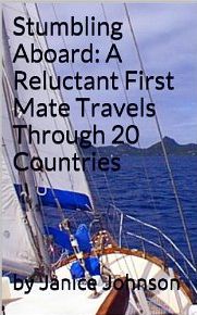
You’ve got a good cover photo — it’s obviously a sailboat, but not just a sailboat, and focuses as much on interesting landscape at the horizon as on the boat itself. So let’s change the type around so that it supports the photo instead of fights against it.

First: Take a look at the nonfiction books you know. 99 times out of 100*, the title and subtitle are separated not with a colon, but with a different line, a different type size, and often a different typeface. The title is more important that the subtitle, so make it look more important.

Second: The Verdana-esque font is too common and unremarkable to add anything to the cover. If the two-word title were large enough to extend from side to side, it would be large enough that a more ornate or complex font wouldn’t limit the readability (don’t go overboard, though). How about something strongly classical or historic-looking? Maybe something hand written? You can then render the subtitle in a font that’s clearly readable, but more interesting than Verdana.

Third: The way the subtitle slops down into the bottom half of the photo makes it look like the type was placed without knowing what image would go behind it. Don’t let the type fight against the photo; place it all in the top half of the cover so it doesn’t get lost against the mountains.

Fourth: “By” is unnecessary for identifying the author, and the added room gained by deleting it would allow the author’s name to be larger and more easily readable. (Placing a slight halo around the name will keep it from getting lost against the photo.)

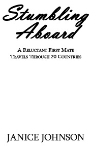
Here’s a five-minute mockup of the kind of fonts and type placement you could use (I didn’t have access to the original image, so just imagine this on top of the sailboat photo).  These are probably not the fonts I would decide one, but they were the closest ones to hand that approximated what I’m talking about.

stumbling

Other ideas?

*And the other one is an accounting report to the board of directors that’s supposed to look boring.

Beyond Price

The author says:

A young gypsy’s prophetic visions reveal there is more to her dancing than simple music and motion. When she draws the unwelcome attention of her caravan’s scheming master, she must confront the truth of her mother’s desperation that has trapped her. Only if she can come to terms with elusive nature of her own worth will she find real freedom. Beyond Price is a short story set in the same story world as two other fantasy series, and will be part of a set of short releases that further develop the history and characters of that setting. It will appeal to primarily older teen and adult female readers of authors such as Terry Brooks and Anne Elisabeth Stengl.

graphic profile with rose bkg

graphic profile with rose bkg


Nathan says:

Fantasy is one of the publishing genres in which ornate cover art is still the common presentation for books. You referenced Terry Brooks and Anne Elisabeth Stengl as having your desired readership; a quick Google image search gave me this:

brooks covers

9a3ae0330b8a53918dc4e57a87f7db31


Ask yourself: Is a reader who is used to finding the kind of books she likes behind covers like these going to assume that a book she likes is behind your cover?  You have some definite ideas of what you want as part of your cover image, but let’s be frank: Your skills are not such that they can render the kind of cover from which your readers would find you, and getting from here to there would involve years of study and practice.  (That’s no slight. I can’t do that kind of art either.)

I think the best options open to you are these:

1) Save up money, work with an artist, and come up with a cover of which you can both be proud.

2) Browse through DeviantArt.com, CGSociety.org or another artist portfolio website, find some pre-existing artwork which fits the feel/mood/theme of your book, and offer the artist $50-100 for its use.

Best of luck.

Paladin’s Odyssey [resubmit]

The author says:

Resubmit number three. A change of direction as I found an image that I think better conveys the story. It keeps the torn flag imagery but creates a new focus on the character and his odyssey.

PaladinCoverSample-2


PaladinCoverSample-2

Nathan says:

[Note: You can see the previous covers here and here.]

It’s a terrific cover. One thing I would experiment with is deepening the saturation at the very top and very bottom — enough to give the cover a bit of eye-catching color, but not enough to overpower the post-armageddon vibe of the rest of the color scheme.

Other ideas?

Saraphympire: Guardians of the Gateways [resubmit]

The author says:

The last and final re-submit, you all must be sick of my covers by now, but I greatly appreciate the feedback, and I do listen, I don’t know if you received my last cover, I have changed the positioning of the catch phrase, the last one I sent had blood on the ‘PHYM’. This book has adult content, it’s about Makayla Uriel, a vampire seraphim with a split personalty and a group of elite fighters known as the Shadow Seekers that protect hidden gateways on Earth, that lead to other planets in the Multiverse.

blended cover darker hair with TITLE skull moved

blended cover darker hair with TITLE skull moved


Nathan says:

[You can see the previous versions here and here.]

I think you’re getting it about as good as you’re going to get it. My only suggestion would be to move the tagline a little further to the right so it’s not crowding right against the sword.

Other thoughts?


The Magician’s Horses [resubmit]

The author says:

I’m resubmitting a new cover for my Young-Adult Science Fiction novel. Although the cover design doesn’t suggest science fiction, I feel that it captures the spirit of the novel more closely than my attempts at a more SciFi oriented cover. The Magician’s Horses is a time travel story, but the underlying theme involves shedding material possessions and returning to nature. It is a story about coping with death and being alone. It is a story about survival, friendship, and new love. How I’m going to word that in a blurb, I have yet to determine.

tmh

tmh


Nathan says:

Note: You can see the two previous iterations of this cover here and here.

The typeface chosen here definitely sells the “sf” vibe better than the original.  I would call this a good sketch for what you want to do. Now you need to roll up your sleeves and bring the magic.

– Look at the thumbnail. The horse silhouette gets lost, and the placement of type and other elements against the dark background seems arbitrary.  Perhaps a top-to-bottom fade of color in the horse silhouette (maybe the red from the second cover?) would give it some visual distinction.  The thumbnail comes across as monolithic gray.  Coule upping the color and saturation in the sunset (sunrise?) add some appeal?

– What detail can you add to the large version which doesn’t distract from the clarity at thumbnail size, but rewards the browser for looking at it larger?  (That’s one of the loose principles I’m seeing coalesce out of my exploration of good cover design: The full size version should give the viewer something beyond what can be seen in the thumbnail.) Could a slight bevel, glow, or shadow on the type make it more interesting (without reducing readability, especially in the thumbnail)? How about a subtle texture or pattern in the blacks and darks?

Other ideas?