The author says:
A young gypsy’s prophetic visions reveal there is more to her dancing than simple music and motion. When she draws the unwelcome attention of her caravan’s scheming master, she must confront the truth of her mother’s desperation that has trapped her. Only if she can come to terms with elusive nature of her own worth will she find real freedom. Beyond Price is a short story set in the same story world as two other fantasy series, and will be part of a set of short releases that further develop the history and characters of that setting. It will appeal to primarily older teen and adult female readers of authors such as Terry Brooks and Anne Elisabeth Stengl.
Nathan says:
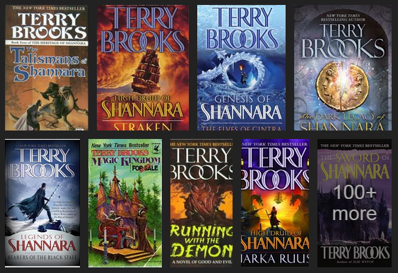
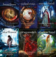
Fantasy is one of the publishing genres in which ornate cover art is still the common presentation for books. You referenced Terry Brooks and Anne Elisabeth Stengl as having your desired readership; a quick Google image search gave me this:
Ask yourself: Is a reader who is used to finding the kind of books she likes behind covers like these going to assume that a book she likes is behind your cover? You have some definite ideas of what you want as part of your cover image, but let’s be frank: Your skills are not such that they can render the kind of cover from which your readers would find you, and getting from here to there would involve years of study and practice. (That’s no slight. I can’t do that kind of art either.)
I think the best options open to you are these:
1) Save up money, work with an artist, and come up with a cover of which you can both be proud.
2) Browse through DeviantArt.com, CGSociety.org or another artist portfolio website, find some pre-existing artwork which fits the feel/mood/theme of your book, and offer the artist $50-100 for its use.
Best of luck.


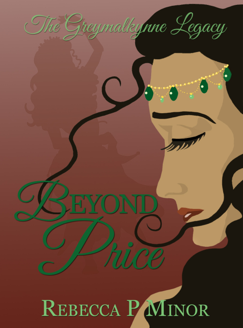
Considering this is for a short story, this artwork is not completely without merit. It vaguely suggests the subject and possibly the gypsy-camp setting and it’s not awful BUT it could be so much better:
1. The image is too generic. Could be gypsy, could be SE Asia.
2. The background color comes across as dull brown with a hint of red on my screen. You have all-green type on that. In thumbnail the type virtually disappears due to lack of contrast between the two colors plus the thin-weight font(s). Type either becomes illegible (thumb) or just sits dully on top of the other color (full size).
3. Lose that tendril from her forehead because…no, just lose it. The other one is okay.
4. Gypsy culture always strikes me as vibrant, glitzy (have you seen those dresses on the gypsy wedding shows!). This cover is neither vibrant nor glitzy. The colors are flat and the image lacks dimension (see Nathan’s comments).
5. This is about a woman who finds herself despite adversity and cultural limitations, if I read your description right. I don’t get any of that from this cover–that she finds strength and overcomes. It’s too flat–too much about her dancing perhaps and nothing else.
6. Brooks and Stengl are fantasy authors but I don’t get anything from your description that says this is fantasy except that it’s set in a fantasy world same as some other stories/novels you’ve done. You say the characters are gypsies but since that’s such an ordinary-earth term I can’t stretch to think how that fits into a fantasy realm, and the description gives no hints. Prophetic visions suggests supernatural or spiritual but that alone doesn’t get me to fantasy, nor does it narrow down degree of magic, swords, kingdoms or leadership. If this is fantasy the way the others are you reference, some of those elements or a suggestion of them needs to come across in the cover (see Nathan’s remarks).
Nathan makes excellent points about this cover not attracting the readers you seek. Granted you don’t want to spend a small fortune for this cover but I think you really need to take a new direction that better reflects the writers you’re emulating.
The title font I think is OK, but it needs more contrast with the background to make it stand out. At the moment it’s dusky sage against dusky pink, and it disappears and is pretty much illegible in the thumbnail. I would move the series title further down and have all the text at the bottom of the image, and perhaps consider matching the font and effects of the title to the author name and series title.
I don’t think the image itself is bad — it looks like the simple, bold style of cover that often appears on ‘chick lit’ books. It doesn’t look like it’s in the same genre as the books Nathan posted, though. The first author’s books look like high fantasy, and the second author’s books look like YA romances.
Hey folks–thanks for the gut check on this. This was submission was primarily an experiment in what the general response outside my group of friends would be to vector-style art for a short story cover. Sadly, you’ve confirmed my suspicions that you probably can’t go against expectation and not seem like you’re trying to perform a bait-and-switch.
The challenge involved for so many of us is paying a fair price for a genre-style cover and still having the work behind it earn out. My audience is loyal but small, so with the necessary 99 cent price point of this short…well, you hear what I’m saying.
Anyway, looks like this image will go live in the “for fun” file. Thanks for the feedback so far!
Not a terribly bad cover by any means. I have certainly seen much worse!
I will try to not reiterate the suggestions already made by some of the others.
There are a few problems which may not be too hard to address, since doing the cover over from scratch does not appear to be an option. The first is that the central image—the silhouetted dancer—lacks enough contrast to be easily distinguished from the background. At first glance, the space seems empty, or at best occupied by a faint pattern, with the result that the cover looks lopsided.
The green color chosen for the main title and the subtitle is too close in value to the brown background. If the cover were to be seen in B&W, the text would virtually disappear. You can see this occur just by squinting. (In any case, the terra cotta brown and woodsy green together make the cover seem awfully dull.)
The tendrils of hair are nice, but they seem tacked on…with the result that they look more like tentacles grasping for the title than anything else. They would look and work better if more of the gypsy’s hair were blowing.
Finally, be careful of tangents or near-tangents, such as where the “D” in “Beyond” almost touches the tip of the nose and, to a lesser degree, where the curves in the hair are nearly tangent to the “E” and “D.” They should clearly overlap or have a definite separation.
The main thing for me is that it doesn’t pop. Most of the color is dark, even the green isn’t bright, which will allow competing books, with bright color, stand out against it.
When I first saw the thumbnail in the sidebar, I thought the green beads on her forehead were eyes and her closed left eye was some sort of smiling mouth. But then I’m currently a little sleep-deprived. Definitely a weird moment, nonetheless.
The art is nice, but the text clashes against the background, and the dancing Romani figure in the background looks like a stereotype — imagine a book about a Mexican character with a silhouette featuring a prominent poncho and sombrero, for example.
You’ve got a series of related shorts, right? I’d just dish out for a single thematically-appropriate image to put on all of them, varying it up with small differences (colors, etc) for different stories. I don’t think anyone expects a full-on cover illustration for every short story you write. (You could also combine them into an anthology and then you’d only need one image.)
WRT your art: It’s pretty good, but the eye and eyebrow are too large.
The artwork is a good effort but… no. The face above the nose seems to be on a different scale than below (people’s mouths are rarely smaller than their eyes). It’s not instantly noticeable, but that something is slightly wrong hits the eye quickly. Also one hair-tentacle seems to sprout from her forehead. Maybe use a photo instead? You would need to just find a suitable one as a free stock photo: the layout with the profile picture etc seems like a workable idea.
I like that the Script font has been kept to a minimum in the book title – a touch of fanciness while keeping the rest plain and readable. But, that same restraint should have been applied to the series title too, which I find too hard to read at full size and thumbnail – especially for the middle, unfamiliar word.
And I like what the main image attempts to convey – ‘a woman having to make a hard decision and feeling torn about her options’, which could lead to pain and regret whichever way she chooses. That seems congruent with the author’s description provided about the book’s storyline.
What I don’t like about the main image is the sickly, greyish skin tone, which I associate with the elderly and dying. I found it too hard to look at her because of that.
I think the Author Name could be enlarged to close to double its current size, and have tracking adjustments.
In its current state, I wouldn’t feel motivated to purchase (sorry).