The author says:
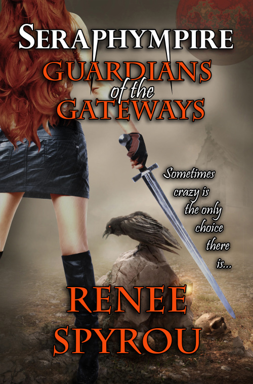
The last and final re-submit, you all must be sick of my covers by now, but I greatly appreciate the feedback, and I do listen, I don’t know if you received my last cover, I have changed the positioning of the catch phrase, the last one I sent had blood on the ‘PHYM’. This book has adult content, it’s about Makayla Uriel, a vampire seraphim with a split personalty and a group of elite fighters known as the Shadow Seekers that protect hidden gateways on Earth, that lead to other planets in the Multiverse.
Nathan says:
[You can see the previous versions here and here.]
I think you’re getting it about as good as you’re going to get it. My only suggestion would be to move the tagline a little further to the right so it’s not crowding right against the sword.
Other thoughts?


Agreed with Nate. I have to ask, though: The run-on sentences in the blurb aren’t giving me a good impression. Did you hire a professional editor for this book?
Yes I did Hire a professional editor, what I’ve written at the top of this post isn’t actually the blurb for book one it was just a brief unedited summary for those who may be a little curious. Cheers though.
My only suggestion would be to make “Seraphympire” a tiny bit bigger and “Guardians of the Gateways a tiny bit smaller, so it was more obvious which was the title and which was the subtitle/series title. (Unless I’ve got it backwards, of course, in which case please reverse my advice!)
I do like the effect of having the tagline follow the sword down.
This blurb is not the actual blurb for the book, and yes the book has been edited, TWICE! I’ve just reread what I’ve written above, and yes, I know there are comma’s in the wrong place, but the cover is what’s meant for critique not my unedited comments.Thanks to all who have given me great feedback, I hope you all have a great weekend.
It’s much easier on my eyes now. It doesn’t ‘attract’ me, but it’s a big improvement.
That’s a damn sight better than the other attempts. Congrats and good luck with your book. 🙂
Thanks Axolotl, it’s really nice to actually get some positive feedback, I really appreciate it Cheers.
I like it now. She fits in much better and overall it looks far less cluttered. The fangs help to read the word, which is great. It really helps.
Tom from you book agrees. He could escape now.
I am not a fan of orange, personally, so I am not keen on the text colour but other people are fans of orange, so I can’t hate too much on it.
Hey Waffles, thanks for the feedback, is there a colour you would be able to suggest. I did it orange because someone suggested it, what colour do you think would be better, because I’d prefer white text, and my daughter prefers the colours I had in previous versions, any ideas? Cheers Renee
PS. A big thank you also to all the people who left feedback 🙂
Red would fit the theme of the book better, and it did look nice when I swapped the colours.
I just did some experimenting! It didn’t fit the theme of the book, but dang, did this colour pop! 🙂
Golden Yellow.
C: 6
M: 31
Y: 100
K: 0
Getting there! My suggestion would be to make ‘Seraphimpire’ larger if you can, and change the orange text to red.
Much better!
The figure is certainly integrated much better into the rest of the art.
But there are still problems that should be resolved. I think a lot of them are due to the fact that the basic cover art itself seems to be locked in place.
I see nothing gained by the dark moon in the upper right corner–an impossibility in any case in the light of the realism with which the art is rendered. And I wish that huge mass of hair in the upper left were much more interesting.
The center of attention, however, is still the gloved hand–perhaps even more so than ever.
Unfortunately, you’ve said that you don’t plan on changing your cover any further.
So I did end up fixing the cover some more and now it is finished I minimized the body to the full view, there’s nothing I can really do about her hand,as Ron mentioned in his comment,if you’d like to check out the final cover here’s the twitter link to the cover,
https://twitter.com/ReneeSpyrou/status/520382153595445248
Once again I’d like to extend my many thanks to all those involved in critiquing my cover,it would not be what it is today without your input,thanx also for giving me your honest & most valuable feedback. I know many of you still aren’t happy with the final cover, but the truth of the matter is, I’m very happy with it, and I have had great feedback from all my friends & twitter followers. I did go with the orange font, due to the appearance of the red font getting lost when the paperbacks was printed, the red color isn’t as vibrant as it appears on the screen. Thank you all once again, have a great weekend, Cheers from Sunny Australia 🙂