The author says:
A science fiction writer struggles with his sanity when the parallel worlds he creates collide with reality. Theme: The observer effect from quantum mechanics. Conscious thought creates reality. Yes, I am a amateur attempting to design a book cover because my funds are going to a professional editor. Looking for input on title and pen name. I plan to republish a refined product on Smashwords in the near future.
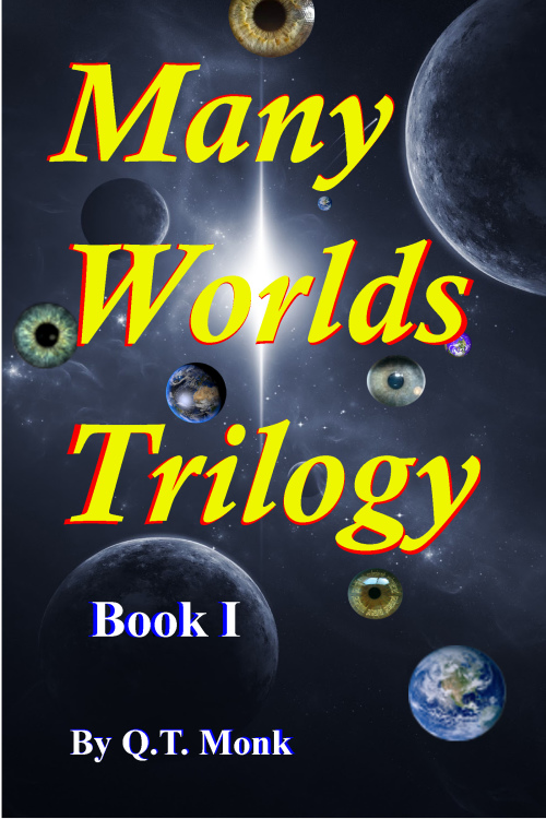

Nathan says:
Note: An earlier version of this cover ended up at lousybookcovers.com, where it got solidly punched around. This version lacks some of the main offences.
I’m formulating a new dictum for indie publishers designing their own covers (I hope to be presenting on that subject at an upcoming writers conference). It’s this:
“The two most important parts of your cover are (1) typeface and (2) color scheme.”
Looking at this cover in light of that advice, the first thing I see is that the typeface is common — “vulgar,” if one can be so bold. There are plenty of sci-fi/futuristic/mechanistic free fonts out there (make sure the one you choose is readable!), and it would only take a very slight texture or other distressing effect to give the “shaky sanity” vibe I get from your description.
Also: If I understand right, one of the central themes you’re trying to portray in the cover is “single observer/multiple realities,” yes? If so, then I submit that the various eyes actually work against that since they imply many observers. Something like a single person or head, overlapping as it looks in several directions at once, might convey the appropriate concept better. But doing that well might be beyond your technical skill.
Remember, the point of your book cover is to attract the readers who would enjoy the book. So what would tell the appropriate audience, “This is a book I want to read?” How do other books about fractured reality present themselves? That can be your best guide.
Other ideas, anyone?