Nathan says:
You remember those Reese’s Peanut Butter Cup ads where two well-meaning klutzes accidentally combine their peanut butter and chocolate? (I never figured out, in one of them, why a robot was eating peanut butter, but there you go.)
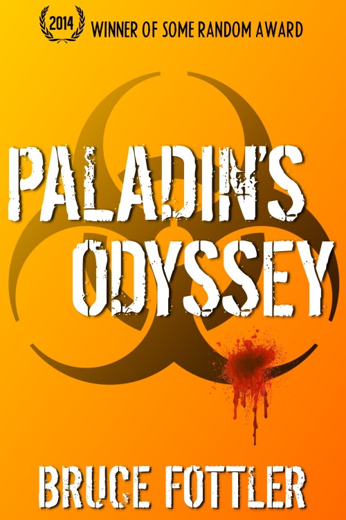
I think neither of the cover you’ve shown us individually work as well as you want. But if you mash them together — if you add the biohazard symbol of this one in behind the torn flag of the previous one, and similarly if you add an orange tone from this one to the cloudy texture of the previous one — I think you’ll really have something.
Anyone disagree?


I like the flag one better. My brain goes – journey – bioharzard – blood – is Paladin a person, ship, or knight – orange? Even though the layout is okay the choices seem confusing.
bio-hazard
and I forgot to say the orange seems too solid and heavy
I’m going to concur with this, but for different reasons. Orange is indicative of summer, sun-drenched fun, at least in mine (and likely others’) opinions. It would make for a good pop album cover, colorwise, but not for what is trying to be conveyed here. If you must use a gradient, I would go along the lines of a cooler, more muted tone, possibly purple fading to black.
I like the flag cover better, but I wouldn’t mind seeing Nathan’s suggestion just for comparison’s sake.
Sadly, I missed the first version so I’m unable to comment on it. All I can do is discuss the current version.
Right off the bat, there is not enough contrast between the typography and the art.
The art is simply too ambiguous, with nothing to draw the eye. The bleeding bullet wound might be nice…but it looks like an afterthought It’s far too small to attract attention at first glance.
But even at that, the biohazard symbol and bullet wound are simply too unspecific, especially give the ambiguity of the title (which could just as easily be applied to an Arthurian romance). You need to focus a little more tightly on the theme of your novel.
If you put the book’s title in the search box in the upper right hand portion of the page, you’ll get links to both.
It looks like a run of the mill zombie book now. I think tweaking the original was the way to go.
I thought the flag was much better. Can’t quite visualize the combination, though… (What’s with the random award?)
Thanks everyone for your feedback. While it’s not what I wanted to hear, it’s what I needed to hear. I can always depend on you guys to keep us authors grounded.
Waffles – zombies? Ugh, that’s the last thing I want to project. Thanks for pointing that out.
Gp: The “Random Award” line was just a placeholder to see how something like that would look. Many thriller covers tend to have an accolade of some sort at the top. I’m not sure if I’ll ever have anything to put there, but I noticed how empty the space looked without something occupying it.
Overall, while I always liked my original (flag) cover design, and was willing to try a combination, I just discovered some bad news. I performed an image search and found another published book cover that used the same flag picture – and in a similar way! ARGH!!
http://www.amazon.com/Lowe-Nelson-DeMille/dp/3455403069/ref=la_B000AQ2RZ0_1_52?s=books&ie=UTF8&qid=1409264674&sr=1-52
Oh well, back to square one. I suppose I’ll start banging my head against the wall to see if any new ideas get jarred loose.
Thanks again for your input.
I don’t think that use of the flag is similar enough to yours to cause any problems.
Agreed.
True, it’s a bit different, but isn’t it a principle of cover design to avoid using a stock photo that’s already been used on another book cover?
And, no, I’d never try to take my own amateur photo of flag – not that torn flags are easy to find anyway.
I saw somewhere a collection of bookcovers – from reputable publishers all – using the exact same old photograph of a misty city street – so it hardly seems a commonly followed maxim. Though i guess it is a bit embarrassing, like two women who show up in a party wearing the same dress. I mean two identical dresses, two women in one dress would be worse…
I liked the original cover, the only problem being that it did not look in any way scifi, so Nathan’s suggestion seems a good one.
That’s the problem with using stock photos. If it’s a good one, you can bet your boots it’s been used more than once. Why not take your own picture of a flag and see what you can do with it?
Danger! Mayday! If you are not an experienced photographer, it will look like poop.
LOL.