The author says:
The Magician’s Horses is a Sci-fi novel built heavily on mystery and suspense. My intention is to extend beyond the usual Sci-fi audience to reach any young adult reader, while also appealing to the older, more sophisticated Sci-fi fan. I am still working on the wording for the back cover, but envision it reading as follows: “Follow Dave as he is drawn out of his solitary life by a mysterious couple who introduce him to a world of adventure far beyond his television remote. Science and thought combine to form a magic act that breaks the boundaries of time and changes Dave’s world forever…”
Nathan says:
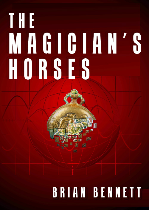
This is definitely a much stronger cover than the original. Strictly from a design standpoint: I think there’s too much dead space. Make the amulet bigger, and strengthen the grid/sine wave pattern in the background so it can be seen in the thumbnail. (It’s the only SFish element on the cover, and while I understand you don’t want to pigeonhole the book as sci-fi, I think the hint needs to be stronger.) Also, I’d toy with the font so it’s a little less common; Impact has been so overused (especially with LOLcats and such) that it’s lost a lot of its effectiveness. Here’s a five-minute redo to illustrate what I mean: 
You could experiment further. Maybe make the background pattern bigger; there’s no reason the text can’t overlap it. I kept my font choice to the same general feel as yours, but maybe a more ornate font will fit the bill better. Make a couple of different versions; look at them big, look at them small, look at them side by side with books that you think they’d be shelved with. Other ideas?


I usually don’t disagree with Nathan’s assessments, but on this one I do. I actually quite liked the original, but if we’ve moved beyond that, this one loses me. The amulet which is not a high quality graphic IMO and apears to be poor chopped in over the background. It is also not plum vertically (perhaps intentionally?). The amulet does not say magic to me and there is nothing else here that does either. And horses? The difficult to make out engraved horses might get the attention of a horse whisperer, but it’s not enough for me. I would have to say my recommendation would be retool the original to make it pop. However, if you stick with this one, listen to Nathan on the layout stuff, but try to get a better amulet graphic if you can.
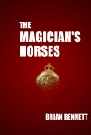
The central image doesn’t seem to have a strong role here. I can barely make it out in the thumbnail. Even in the mock-up redo, I can’t quite tell what I’m looking at. To be most effective, it should create a stronger, clearer signal, and do so in the thumbnail.
Yeah to pretty much all that’s been said here. Nathan’s redo of the background (and font) is spot-on, but I want bigger and clearer horses.
Nathan’s redo definitely improved things, but this cover just confuses me from the start. I agree with Adrian: the amulet is too low quality to be of any use. I would keep Nathan’s enhancements but change the amulet for something more representative.
The pattern behind the amulet was a good idea but it so faint I totally missed it, even full scale on my 20 something-inch screen. It took Nathan’s redo for me to find it. If it’s worth making a showing on the cover, it deserves to be visible.
I really like the colour choice and contrasting lettering. You just need to be proud of your title and use all the space available to show it off.
I’m with Lucie, this cover is confusing. It took me a while to realize that the thing in the center was an amulet with horses. Karl is right, bigger and clearer horses please!
Another vote for what Nathan did but with a better amulet.
It appears that the title, blurb, and cover have misrepresented my intentions, so I will try to clarify a few points to see if that sparks some ideas.
The “amulet” in the picture is actually a pocket watch. I originally wanted to show the face of the watch, but then there would be no visual reference to horses at all.
The pocket watch is not the source of the “magic”, it is the recipient. I’m trying to imply that the watch is fading out of existence, the laws of physics falling apart, that sort of thing.
Maybe a better image that says both pocket watch and horses would help? A better technique for fading it away?
The magician is a scientist and the magic is a fantastic application of science. There are no horses in the story except for their use as symbolism.
Sorry if this is vague, but I’m trying to let the picture and blurb talk without my descriptive influence since I won’t be there in the book aisle with a potential reader.
Brian
The grid does suggest sci-fi. But it doesn’t suggest laws of physics to me (as that usually looks like smoother curvature — Google “picture of spacetime” and you’ll see what images commonly show this). This grid looks like the latitudes/longitudes of a sphere adjoining a plan with a Fourier series on top of all that; it seems confusing to me.
I also don’t see it as the laws of physics breaking down. It looks like the amulet is breaking down. The grid seems to be doing nothing. It also seems odd to me for the amulet to be causing curvature to spacetime (if that’s how the image should look, like the amulet is warping spacetime). It’s so common to see a very massive object, like a star, bending spacetime, to me this seems out of place.
Maybe the intended message is too specific. For one, it’s hard to pull off breaking the laws of physics (though if I wanted to do this, I’d use a smoother form of spacetime curvature, then have the grid fade away radially). Kind of like wormholes. I see tons of wormholes on sci-fi covers, and at least 99% of them don’t look like they were pulled off to my eye.
The main message you want to pull off is, “Hey, this is sci-fi,” which your grid presently kind of says (again, I’d go with a smoother grid, which seem be less confusing and more in-line with what the audience is accustomed to seeing), along with, “This image will hypnotize you to check out my book,” which means you need a much stronger central image. If the central image is going to be an amulet, you want it to be large, clear, and to have wow power.
If there are no horses in the story, perhaps you should consider a different title. Yes, I’m sure there are a million novels where the central noun in the title is used in a symbolic way (there’s no Ulysses in “Ulysses”), but that might be too subtle and oblique for a novel that includes YA in its target audience.
And it also gives you a difficult problem with regard to your cover. If the genre is (mostly) SF, you want a cover that announces that genre, which will be tough to do with horses. But if your cover lacks any horse imagery, it will be hard to avoid a sense of disconnect between the title and the cover. (“Hey, that’s not a horse; it’s a space ship!”)
Hey Brian! Thanks for explanation, it helps.
See, I didn’t realize there were horses on the watch/amulet until you said it. The idea is really good, you just need a better quality image for it.
Thank you for the explanation, Brian. A better quality image of the watch would convey your idea. As for the “fading away”, if you are using Photoshop (I’m sure other programs can do it as well, just not sure of the terminology for them), perhaps slice the image into pieces, and then adjust the opacity/brightness/saturation for the individual slices, with the slices getting more and more faded as you move from the center to the bottom of the watch.
I hope that made sense…
Here is what you might be looking for in your “amulate”. If so, you are welcome to use it. The one without the red background in a .png alpha channel image, so you can easily insert it should you choose. If nothing else, it might give you ideas.
Damn, the site doesn’t take the html code.
Try these links:
<a href="http://i531.photobucket.com/albums/dd359/JamesSavant/amulet.jpg"
<a href="http://i531.photobucket.com/albums/dd359/JamesSavant/amuletalpha.png"
Facepalm.
One more time. Sigh.
http://s531.photobucket.com/user/JamesSavant/media/amuletalpha.jpg.html
http://s531.photobucket.com/user/JamesSavant/media/amuletalpha.png.html
I give up. It shouldn’t be this hard.
I give up. Email me if you want to see them. Nothing links right here. Adrian.harbinger at gee mail. It shouldn’t be this hard.
Agree with Nathan’s improvements but with a bigger, clearer amulet.