The author says:
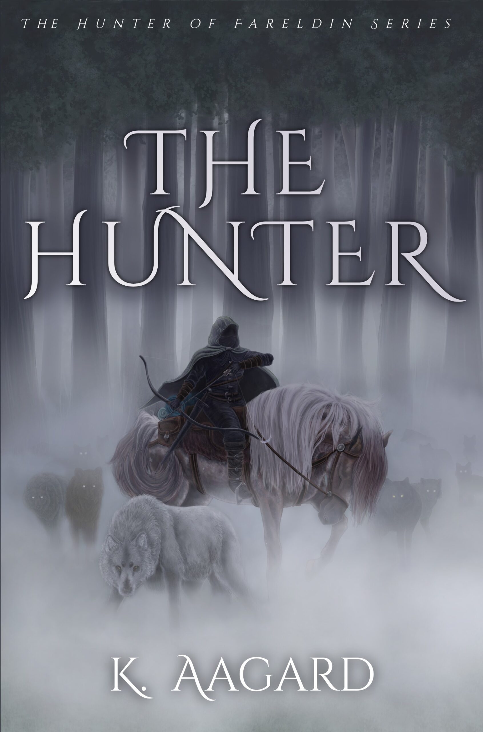
An epic fantasy set in the medieval world of Fareldin. The story follows a man content to die, who begins to find new meaning as he helps a kidnapped teen girl return to her fiefdom. But protecting her may prove fatal as dark plots threat All because he can’t say no to his wolf. This book would appeal to adult readers of Tolkien, John Flanagan, and Micheal J. Sullivan.
Nathan says:
While there’s nothing specifically wrong here, it’s very murky, and strikes me more as a gritty medieval historical novel (or, at most, grimdark fantasy) rather than epic fantasy. And at thumbnail size, it all fades into a gray that can be easily overlooked in favor of the book covers that will appear to its left and right on Amazon.
My advice: Up the contrast, crop it so there’s less gray space, and keep looking at fonts until you find one that gives a more epic feel.
Other comments?