[original submission and comments here]
Nathan says:
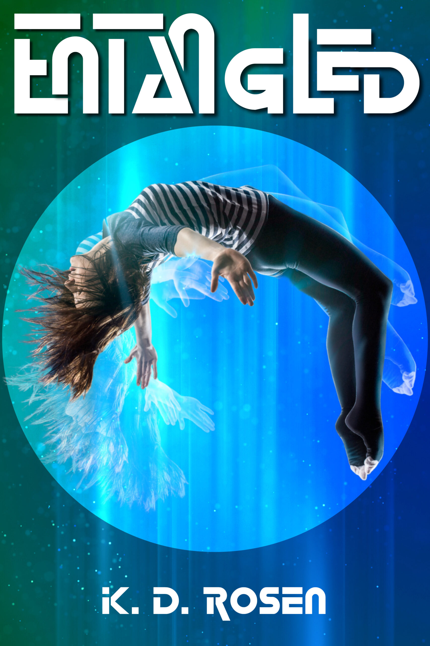
Much clearer, but that title font still detracts as much as it adds — if I didn’t already know what it says, I (as the potential reader) wouldn’t be able to puzzle it out before I looked on for another book.
Differing reactions?
Hi:
No.
As Nathan says, you’re killing it with unreadability.
And there is still zero intimation as to the genre, or anything. This entire cover concept really needs some thought. IMHO, naturally.
Hitch
Don’t like the typeface.
Don’t like the photo.
Don’t like the circle.
It needs some sort of sales copy on the front. Like Hitch says, the reader has no idea what’s inside.
Aside from being in a nearly unreadable typeface, the title is crammed into the top of the cover. The art doean’t really convey much of anything to me, other than a vague sense of science fiction or fantasy…and that is much too generic. All of the superimposed effects over the figure seem gratuitous. You need to find an image–or some additional visual elements—that better convey some sense of what sort of book this is, it’s nature, theme and idea.
Different problem, same effect. Another idea:
https://i.imgur.com/uHVNtVT.png
AT least that one clearly says “sci-fi!” 🙂 I like it, actually.
I’m…ambivalent (leaning toward negative) about the fold treatment on the title, but mostly, I like it.
Hitch
I have an idea in my head but can’t articulate it. The title isn’t folded, it’s two versions intertwined. Not the most clear concept.
From what you’ve submitted so far, it looks to me like you’re trying to do something like Steven Gould did with his 1993 novel Jumper. So all right, that’s not a bad idea on the whole: while that book was a smashing success that was reissued several times and ultimately even got a movie adaptation, it’s been almost thirty years now since it first broke into the mass market, and we’ve not seen anything quite like it again since then. Particularly to your younger target audience, the whole concept of a teleportation adventure will seem quite fresh and new.
I can also appreciate that you’re looking to make your work more up-to-date and put a little aesthetic distance between it and previous works like it; excellent as the original cover on Jumper was, the clunky old analogue video camera and full-frame television monitor on the original mass market novel do date that book to its time. That said, you shouldn’t disdain imitating your predecessors altogether. Even assuming you’re making an admirable effort to be original with both your book’s cover and its contents, you should definitely pay attention to what the cover designers for those previous books did to attract their target audience’s attention (and money) and try to do the same for yours.
For starters, kindly note that although the title fonts on Jumper did change somewhat from cover to cover every time it was reissued, none of them were incredibly fancy, even for the 2008 movie release tie-in. While I know a fancy (and somewhat chaotic) futuristic-looking font may seem like it should make your novel look sophisticated and futuristic as well, to those of us having to take some time to decipher it, this just makes you look like you’re trying a little too hard to get the youngsters’ attention. While you did say your “ideal” reader is about twelve years old, (A) you should leave about two years margin in either direction for the many different rates at which your prospective readers on the cusp of puberty are maturing mentally and emotionally (i.e. approximately ten to fourteen years of age) and (B) what looks “cool” to newly pubescent children tends to change at a neck-breaking speed, so it’s better to pursue something that’s agreeable to their eyes than whatever’s popular at this (fleeting) moment.
In other words, if you’re looking for some way to dazzle your prospective readers and add a little glamour to your cover, don’t try to do that with the font; keep it simple and elegant and immediately legible. What you should be trying to make look artistic and futuristic and sophisticated is the cover’s imagery. A gal (the protagonist I presume) drifting in the middle of a glowing bubble in the middle of a colorful space isn’t a bad start, but I’d want to add a little more energy to the entire image in general; right now, one can barely see those “ghost” patterns presumably intended to leave the impression that the gal was positioned there only tiny fractions of a second before.
If the “entanglement” to which your title refers is specifically quantum entanglement (because, like the “cyber-” prefix in the 1990s and the “-tron” suffix in the 1980s, the word “quantum” is pretty much science fiction’s contemporary equivalent for the adjective “magical” as used in fantasy novels), having “ghost” patterns behind the girl on the cover to show where she so very recently was makes sense—but if that’s how you want to portray teleportation, make sure your prospective readers can actually see those “ghosts” in the thumbnail; if they can’t see them until they take some time to look closer, you’ve already lost them. Another potential way to add some energy to the cover is to add literal energy: electric sparks and lightning and the like are adequately flashy and still quite representative of extremely quick motion in most people’s minds. Showing your character seemingly in two places at once (by either splitting or duplicating her body) and energy arcing between those two locations might provide a more immediately accessible and aesthetically pleasing image to clue your target audience to this novel’s contents. (“The gal flashes from place to place? She must be a speedster like the Flash, a teleporter like Nightcrawler, or both.”)
Again, look to your predecessors: artists for Marvel and DC have both found ways to portray various superheroes speeding and/or teleporting from place to place in their comic books for decades now. Study up on the various ways these artists have portrayed such motion within the stasis of their illustrated panels over the years, and then go do likewise on your cover.
LOL…
I had to think about this one.
The title font is def. not readable; and I did a quick redesign based on what’s currently selling to your target market. I think your teleportation portal (I’m assuming that’s what the circle represents) could do more work, whether it’s a mysterious, magical process or a mechanical, scientific process.
https://imgur.com/wrfPmVW
Re-reading your initial submission, you don’t actually say what the book is about, so maybe you aren’t looking for any opinions on the artwork itself. If not, oops!
Syd:
I like that mockup quite a bit!
I do have to add, though, that those toe-caps on the socks really crack me up.
Thanks! I honestly don’t think we were given enough info to make good recs or comments on the art, and they specifically said they only really wanted to know if the title was readable.
We’re only told it’s about teleportation. I don’t really think the existing art conveys that very well. Is this a story about an emerging psychic talent? Discovering the cons of a new teleportation station system that will make train/bus stations obsolete? Finding a magical amulet that allows teleportation to anyone holding it (“all magic has a price”)? Other?
If we weren’t told it was about teleportation, would we get that from the existing art? At least a more obvious portal suggests moving from one place to another. Just my thoughts!
When I first saw the cover I liked it immediately. Yes, the font as art is a little hard to read but I enjoyed the puzzle and gratification of figuring it out within a few seconds. I like the oddity of the position of the floating figure. I can imagine this in the sci-fi section. My only suggestion is to use the large area of blank space inside the circle with a very brief teaser statement.