 The author says:
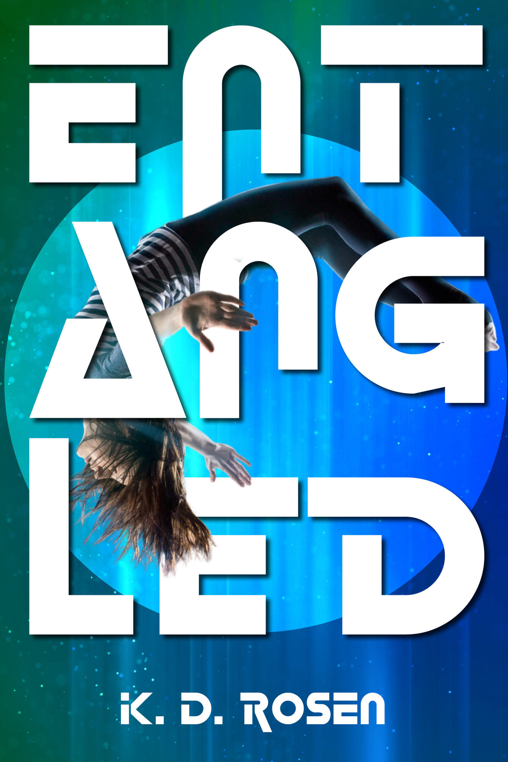
Young YA (ideal reader: 12 years old) about teleportation. Most important question: is the title readable?
Nathan says:
Most important answer: No.
There have been successful books with cleverly unreadable covers, but (a) they usually have a big TradPub promo push behind them, (b) the author usually has an existing following, and (c) they’re not for a young YA audience.
I’m not a fan of breaking a long title into three lines to begin with, but the typeface also is not good. The A doesn’t look like an A; neither does the N or the E.
It did work for ANNIHILATION, though. The font has to be clean and more plain:
https://s2982.pcdn.co/wp-content/uploads/2015/10/515Q0Ciqm8L._SX331_BO1204203200_.jpg
Also, surely there must be a better image for teleportation?
https://www.istockphoto.com/vector/reaching-for-the-tiny-sun-gm1370511393-440047590
Breaking a title up like this is always an iffy proposition…but it’s exacerbated here by adding a decorative typeface on top of the problem. The cover just might possibly work if you find a simpler typeface…but it might still be a borderline case.
I like the art. maybe try putting an inner shadow on the portal to give it depth. Maybe even a hint of a beveled edge so that the circle isn’t sitting on the background but is instead one image of a hole behind the girl. you might want to put a layer mask on the circle and distress the edge a tiny bit to make it blend into the background so that it likes the circle appeared in the background, not like it’s a separate thing.
I’d also add some hair pieces by her hand and a tiny bit of shadow from her to the words. And a tiny tint of blue to her hair for the reflection of that portal
To me, the title is fine as is because it’s the art. It isn’t going to be easily readable written in 3 lines no matter what font is used, so typeface doesn’t really matter. I think the typeface you chose conveys genre so it’s fine with me. I think it’s interesting enough to make a browser pause, which is the goal. They can get the title from the blurb. The only thing I might change is the K in author name because somehow it makes the word read KID to me…. but thats probably just me…lol
See, I’d blow right past that, if I can’t read the title. Now, that could just be me, but…that’s what I’d do.
And even if there are those readers like Shelley for whom it isn’t a deal-breaker, there are enough for whom it IS that this cover would be alienating a sizable chunk of the potential audience from the get-go.
With SO many books to choose from, I don’t bother with books whose covers I can’t read.
And the other thing is–what’s the genre?
Who knows? Sure, it might be Sci-Fi, but it might not. It could be almost anything, other than Regency Romance. This cover’s problems are greater than the incoherency of the title, well and truly. If you can’t tell the genre, that’s always the first and foremost issue.
IMHO, provided for what it’s worth.
I get teen angst, not teleportation.
I had an idea but couldn’t quite get there, so I made this instead:
https://i.imgur.com/r9YBw0m.png