 The author says:
Greetings, you all helped me with my Call Numbers novels, now after three successful releases, I’m branching out with my first standalone novel, Redeye. Here’s the summary…
Nate and Cynthia Durant were a happy, loveable, full-figured couple. But then they both decided to live healthier, with him having weight-loss surgery and her losing the weight naturally. Now both turn heads wherever they go, fighting off advances from everywhere. And while everything looks amazing on the outside for them, each of them can’t shake the insecurities of their former selves.
Determined not to go back to how he was, Nate has become a renaissance man, with many jobs. From podcasting, to photography, writing, DJing, and even doing stand-up comedy, he has a lot on his plate. Meanwhile Cynthia lives off her wealthy parents as a former substitute teacher in-between jobs. With their 10th year wedding anniversary coming up, the couple’s appears to be passing each other like ships in the night. When Nate stumbles upon a picture online of someone from his past, a series of events leads the couple on a journey far from home, where their relationship will endure the ultimate test.
Nathan says:
Glad you’re finding our advice helpful.
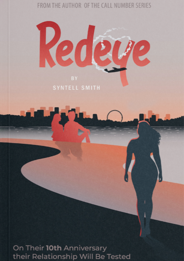
My first impression of this cover is “not stark enough.” Both in terms of readability, and as a subtext to the theme in the novel of a hard choice, there needs to be more contrast between light and dark.
My second impression is that the title font gives a much more light-hearted, even comedic impression than your description does.
And my third impression is that there’s not enough of a visual focus. There are many disparate parts, but there’s not one place that the eye goes to and branches out from there.
My suggestion would be to have the couple central, with the man more clearly distracted by something to the side (a female silhouette).
Other comments?
This is by no means meant to be a replacement for your cover, but just to show how a simple bump up in the contrast makes a difference.
https://www.dropbox.com/s/x1ja1msc14nd4pr/Redeye.png?dl=0
That really is a remarkable difference!
I also wonder, should the protagonists now be “seen” (“in silhouette”) as full-figured? Aren’t they now svelte?
Perhaps the silhouettes should be full-figured shadows, instead? or something similar, something around them and clinging to them, maybe? Vestigial past, made visible in a way?
Just a thought.
Good eye, the “Other” woman is full-figured, which is a reminder of Nate’s former self. I stressed this to the graphic artist.
Hmmm, yes this contract improves things, you can’t see my name and the cloud writing from the plane in the title, but those can be fixed with color changes.
Yes, you can see how CCParticipant handled that in his submission, below. 🙂
Hitch
Not a bad idea, generally, but the cover seriously lacks enough contrast. This includes the text as well as the art. You do not need to add “by” and the tagline needs to be moved away from the bottom edge. (And there is inconsistent capitalization in the tagline.) The sun would be better as a disk than a circle (and make the shadows from the figures go in the right direction). The fancy little stunt with the airplane and the title looks like cleverness for its own sake.
https://i.imgur.com/KoST0p0.png