The publisher says:
Deserted by her mother, Lydia, as a high school student, Melissa Streeter vowed never to see her again – and never has, until a letter from Iowa arrives, imploring her to visit her dying mother before it’s too late. The ask comes from a man named Gabe, Lydia’s husband. A dairy farmer in beautiful northeast Iowa, his urgent words compel her to break her long-ago vow.
Nathan says:
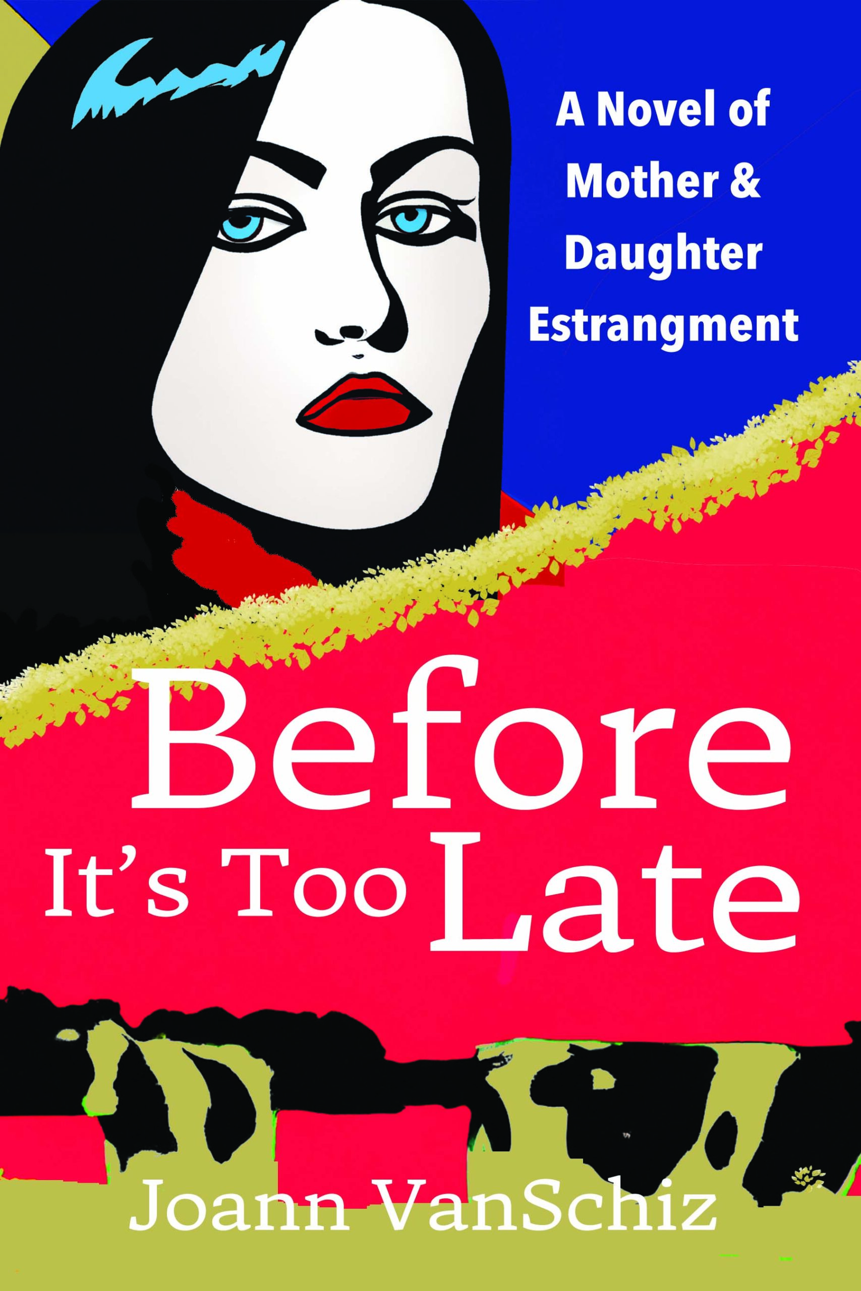
Assuming that the inciting incident leads to drama and reconciliation, I think the cover’s very wrong for this novel. The face looks like Lichtenstein-lite pop art, and it took me far too long to realize that the blotchy shapes at the bottom were in fact cows.
I just don’t think this is going to attract readers who would like the novel. Your best bet is to go to Amazon, figure out what category this novel would fit in, and look at the covers against which this book would be competing — figure out how the target audience is used to being wooed.
(Also, “estrangement” needs another “e.”)
Other comments?
Right off the bat, those cows are not working. I realize that at least part of the story takes place on a dairy farm, but one would have to have already read the book to know that—or at least the blurb. But a reader has to want to get as far as the blurb…and I think they would just pass on the book with such confusing imagery on the cover. I like the style of the art—that’s great—but get both women into it and in a way that suggests visually something significant about the book.
Hi Ron,
Thanks for the feedback. Lose the cows, use 2 female figures.
I’d recommend losing the cows. It’s too niche to appeal to a broad audience, so they aren’t going to boost sales. Your color palette is niche too. Unless this story is set in the fifties, I’d recommend changing that too.
I haven’t posted a mockup in awhile so here goes…lol
https://imgur.com/a/A3dq00w
a more ‘modern’ take
If your story has a happy ending and it isn’t a ‘dark’ sort of story, do something like this with hints of country. (a stamp on the corner would further clarify this is a note) If your story is dark with violence, then use a sans serif font or a ‘horror’ font and change the color tone to dark colors. and maybe used a concrete or cracked wall. or maybe some bloody fingerprints on the paper or wall. pick elements that a reader will recognize on a subconscious level like leaves turning indicating time passing, a pressed flower for remembrance, etc. things like that.
You want the cover to set the tone, not tell the story.
Hi Shelley
Thanks for the feedback on color pallet and cow shapes. Also I appreciate the mockup with your suggestion for a modern feel. The story has a bittersweet ending.
A few tear drops on the paper would convey bittersweet.
Another way is to shade the background a hair, adding some darkness.
It can be helpful to go to a site that sells images and use broad keywords and see what pops up. It gives a good sense of what other people think of when they think words like regret or reunion and can spark the imagination.
I’d recommend avoiding a red background and picking a color more in tone with the book. Save red for an accent. It can really add a lot of drama. Like maybe use it for one of the words to give that word weight.
An image of a woman in a doorway carrying a suitcase with her back to the room would probably be great. you could have the doorway show glimpses of a farm.
While you seem to have some idea what kind of imagery you want, how to assemble it properly on your cover evidently eludes you. The one gal on this draft of the cover (who does indeed look like one of Roy Lichstenstein’s adapted-from-old-comic-books paintings) does look appropriately unhappy, but at what and for what reason is not immediately obvious. As for the cows (your way of trying to link this to the dairy farm setting, I presume), too much of them is out-of-frame for them to be readily identifiable; they just look like abstract blobs.
From your summary, the principal conflict of the story seems be the longstanding feud and alienation between mother and daughter, with the daughter’s relationship with her dairy farmer husband playing a complicating secondary role. While some of my colleagues’ suggestions involving a tear-stained letter or some such might work if you’re playing this as something of a highbrow romantic story with a strong emphasis on familial love (i.e. “Do you love your husband enough to reconcile with your mother?”), they seem a little too abstract and vague to grab a prospective reader’s attention to me. Having people on the cover allows you to use some still-abstract-but-very-immediately-accessible-and-recognizable body language to convey the gist of the story: by herself in her current pose, Lydia (that’s her, right?) just looks vaguely peeved at nothing in particular; but what if you put her mother on the cover, and maybe her husband as well?
While—as our esteemed host points out—Roy-Lichtenstein-style pop art probably isn’t appropriate unless this story is set sometime around his art style’s 1950s heyday, a little contemporary vector art could certainly make the story’s gist apparent to your target audience at a glance. When two people are in severe disagreement with each other, one common way to show this is to have them standing back-to-back with their arms folded. (Most stock images I’ve seen of this show a man and woman; all you need to do to indicate the feud is between a mother and her married adult daughter is to swap her mother—presumably a bit silver-haired by now—in for the man in this vector image, or any similar image). Some more body language that is immediately understood to mean that while two people are in disagreement, the one is trying to persuade the other is showing the one with her arms crossed and the other with his arms at his side and his hands open with his palms up and facing her; can you see where I’m going with this?
If this were my cover to make, I’d probably go with vector art showing the daughter in the middle and mother off to one side, back-to-back with their arms folded to show they’re in dispute and not too willing to reconcile. Then, off to the other side, I’d have the husband facing the daughter with his arms at his sides and his hands open and palms facing up at her to show he’s trying to change her mind about being unwilling to reconcile. Any other vector art (e.g. maybe some cows and/or a bucolic-looking dairy farm in the background, and maybe the husband very specifically dressed in overalls and a straw hat to indicate his occupation) would merely serve as secondary details to hint at the story’s setting while keeping the main focus on the characters and situation central to the conflict driving the story.
Of course, if you wanted to produce a live-action image with people posing in a photograph instead of with vector art, that would work just as well. Setting up such a photo shoot would require more skill and likely be considerably more expensive than manipulating some vector art, however—and I presume like most people seeking advice from us, you’re not exactly flush with spare cash. The point is: body language is immediately recognizable, it’s visual, and it’s immediately accessible to your target audience at a glance; so use it.