The author says:
This is NOT the blurb: It is hard sci-fi set in the 25th century in a city covered with a dome. Much of the world population is decimated. Loads of new (imaginary) science, themes of human nature, relationships, politics, nature of power… Our protagonists live in the welfare dormitories encircling Dome 91-110.
Nathan says:
You’ve got some great elements here. Let’s fine-tune them.
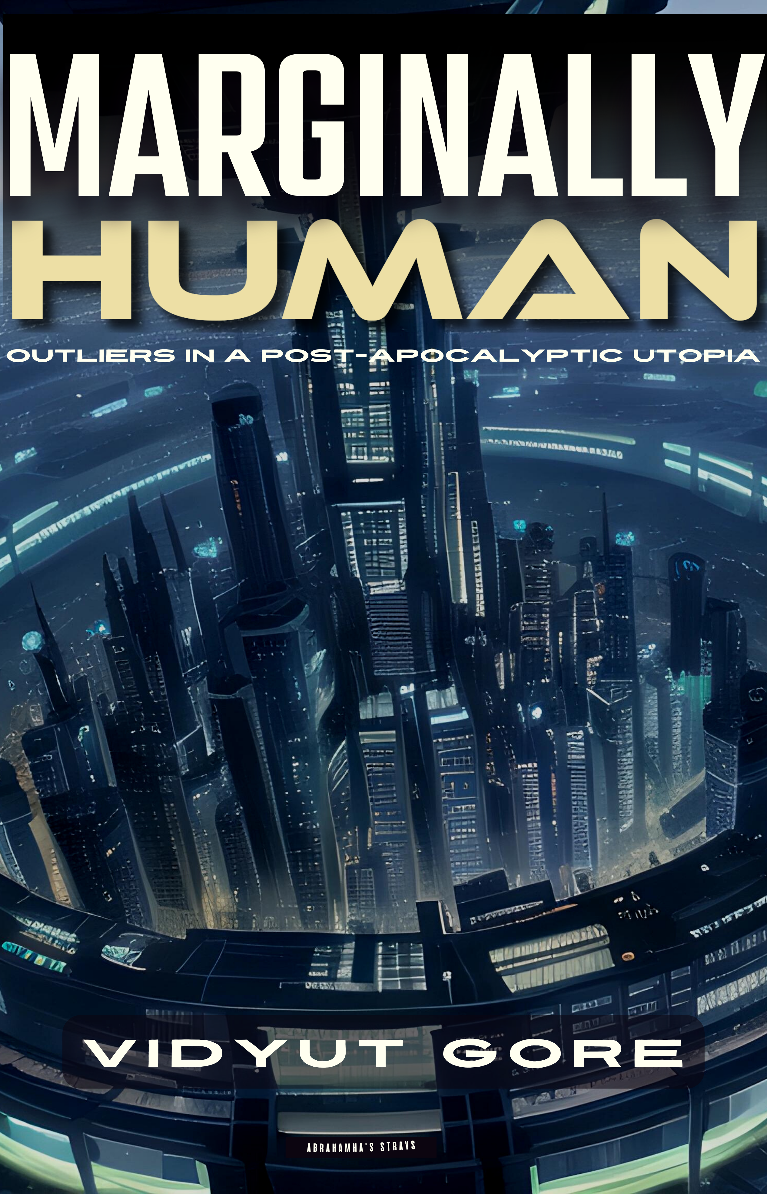
First up, I think it’s a shame that the main tower is obscured, as that’s the focal point of the underlying artwork. Have you tried putting the title at the bottom as well, so that the tower is intelligible in thumbnail?
Second: I think the artwork and the futuristic type for “Human” does enough to set the mood/genre/milieu that you don’t need to use the same futuristic font for the subtitle as well. Remember that the smaller the type is, the more easy-to-read it needs to be. Does the byline font have upper and lowercase?
Other comments?
I completely agree with Nathan regarding the typography.
My only issue with the art is that all it really does is convey “science fiction” generally. It doesn’t really suggest anything specifically related to your story, its idea or theme…other than the broad suggestion that it takes place in a city.
Me three on the typography. Having said that, I would strongly consider using BlackPast Regular for the title. https://www.myfonts.com/collections/blackpast-font-sarid-ezra (FWIW). It’s lighter, admittedly but it has enough weight to carry the title, IMHO.
I would then switch it up to a far more readable tagline font. If you want to keep the sci-fi vibe going for that, you could use, say…hmmm Kallisto Medium, which has upper/lower case options. Or Black Anchor Normal (or regular) but I don’t think that’s got enough weight. (For a front cover, I mean.) BluPurple might work, too, for the titling. But there’s always a nice simple serif or sans-serif. For the latter, Armin Grotesk or Assemblage Sans; Avenir book, of course; Bahnschrift is a nice condensed face, title case which would work here.
Or as I said, you could go a bit more traditional and use serif faces. Caslon SmallCaps, let’s say, or Bembo MT Pro Extra Bold. Blacker Display or Blacker Text. LOTS of choices.
The four lines of typography are all different–even if they are the same face, here and there, they are kerned and tracked differently and it’s a bit….discombobulating.
I agree with Nathan’s suggestion to try to get more of the top of the image included. I would definitely give that a go. Or hell, although I know you would hate to sacrifice this, move the titling over the bottom curvature of the ring, leaving the top visible.
And yes, also I concur with Ron that although it’s better than a lot of what we see here (thank you for that!), it could use a bit more…somethin’ somethin’ to set it part from the others. Yes, it implies Sci-fi but it could also just be futuristic fiction.
I have one last comment of my own, which is there’s a lack of contrast there that I don’t think is helping you. I would consider trying out some other colors for the typography, see if you can get some oomph going. An “old lace” yellow or an ice-blue blue (very very light blue) . Maybe change up the orangey-yellow to something more demanding like #FFA971.
That’s everything I have. FWIW.
So, is this a collection of stories, or maybe stories-within-a-story? Your pitch mentions “protagonists” (plural) and nothing about any plot or what exactly these protagonists do, so I couldn’t help wondering. If this is some kind of multi-story book, then the imagery doubtless is quite the appropriate advertisement of the contents, as everything in it presumably takes place in this futuristic arcology (as such enclosed mega-cities are sometimes called). Offhand, this reminds me specifically of the science fiction anthology How To Save The World which featured a similarly futuristic-looking city on its cover.
As for the titles and bylines and any other captions, the cover for that anthology might provide you some pointers on that subject as well. Note how the title for How To Save The World is overlaid mostly on an empty patch of sky while the byline is at the bottom covering a mostly unremarkable part of the city. These areas are basically “dead space” on the cover, i.e. stuff prospective readers don’t mind the captions covering because it isn’t all that interesting.
On your cover, the “dead space” mostly seems to cluster around the bottom: you’ve seen one of those welfare buildings on the outer ring, you’ve pretty much seen them all. In contrast, that tower in the middle to which any prospective reader’s eye will immediately be drawn looks to be important and somewhat unique; probably the city’s administrative center. Obviously, you should probably move both your title and byline down to the bottom; and while the tagline does seem to fit the general theme of the contents, the title seems quite descriptive and intriguing all by itself, possibly to the point that you might not need that tagline. (I mean, if “Marginally Human” is intended to be a description—literal or figurative—of your protagonists, of course they’d be “outliers” in any future human civilization; and if this “post-apocalyptic” society has built something so technologically advanced as an arcology, that suggests it has long since fully recovered from whatever that “apocalypse” was, and the apocalyptic event in question won’t be too important to anything else in the book except as backstory.)
So—all things considered—yes, that’s a beautiful image of the city you’ve got there, but let people see it properly. I know you told us those outer parts are where the welfare cases—including your protagonists—live, but that doesn’t mean you shouldn’t cover them with your captioning anyway. If anything, if the point of your story (or stories) is to draw the readers’ focus to this futuristic society’s more marginalized peoples, covering up their living spaces on the cover will simply enhance the intended effect: “See those towering spires there? That’s where all the city’s most prominent movers and shakers and their families live and work and play nowadays. This, however, is not their story; this is the tale of the people whose families and homes and workplaces are in the places you aren’t looking, because like the people themselves, you don’t usually care to pay very much attention to them and their plight.”
I don’t know if this is the norm for authors to reply here, but I find your suggestions very useful.
The top of the tower isn’t shown because it is rubbish to look at and also there are some background elements that don’t fit my world. Oops. But also I had another design with a better tower, but the tower distracts from the main title if I bring it down.
I can try fixing it, but I’m not sure I’m that good an artist.
I’ll try playing with the fonts more.
Thanks a ton! Keep the ideas coming. i promise I won’t waste them.
Yes, indeedy, authors reply here all the time, feel free!
Why don’t you show us the original image–the one you say has that rubbish top, or both of them, or …whatever? Maybe one of the gang will have an idea you can run with. 🙂
Hitch
First, it is definitely appreciated when the author reacts (respectfully) here. It can open a great dialogue that benefits everyone.
For me, the cover tells me “future city tale/s” and nothing much more. I worry about the tiny text near the bottom and the strange rectangles near the top and left side. Those should either be cropped out or made more prominent depending on their importance.
Generally, though, I agree with what’s been said previously.