The author says:
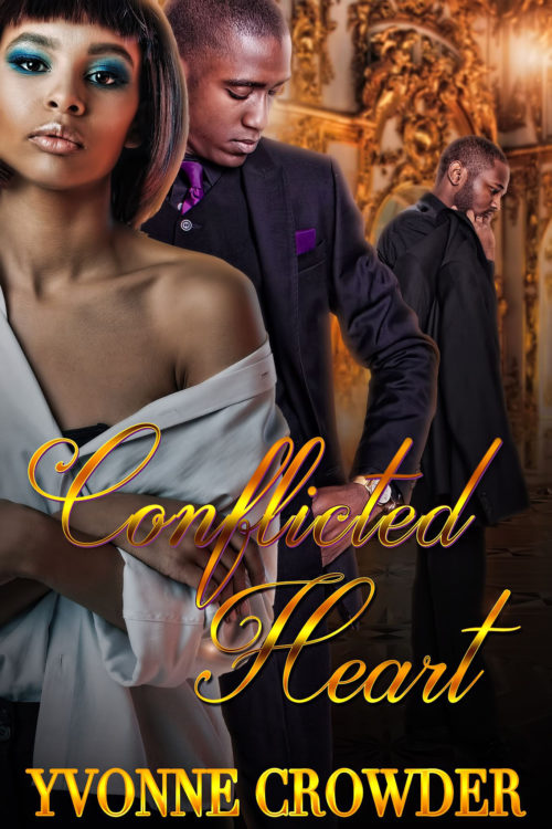
The story is a Urban Romance Fiction which targets Females 25-35. The story is about a female and her longtime boyfriend. Secrets are revealed that rips their relationship apart. As a possible knee jerk reaction she winds up falling in love with a new man. She has to try and resolve her conflicted feelings and decide who she is love with and wants to be with.
Nathan says:
From my perusal of the genre online (since I’m doubly not the target audience), I’ve seen that the covers of urban or African-American romance are generally more color-crowded than for Caucasian audiences. That’s fine, but even within that framework, I think there are things that you could do to make the image “pop” more.
- The figures don’t have enough contrast with the background — the poor fellow on the right gets lost in the wallpaper. Dimming the background, even just immediately behind the heads, would help the people stand out.
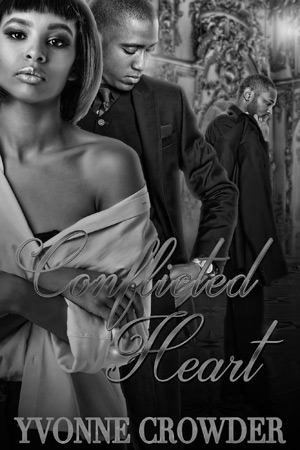
- In the same vein, the title lacks contrast from the background, especially the word “Conflicted.” Yes, they are different colors, but the values (light and dark) aren’t contrasting enough; in fact, the variations in color tend to camouflage the word instead of helping it stand out. You can see that more clearly if you see it in monochrome:
I would lose the gradients in the title, and darken the image ever-so-slightly from the woman’s shoulder on down to let the title stand out.
- The other problem you can see in the title, especially in the word “Conflicted,” is that the letters aren’t quite linked. This is a cursive font; the tails of each letter should run into the next letter completely, instead of having those itty-bitty breaks.
Other comments?
